
Handmade Vintage Sand & Script Trio Free Download
Is Handmade Vintage Sand & Script Trio free to download?
Handmade Vintage Sand & Script Trio is a commercial font sold on Creative Market, so the full version needs a paid license. Get it from the official listing: Handmade Vintage Sand & Script Trio download.
Need something free? These handwritten fonts from Google Fonts are free for personal and commercial use:
Design style
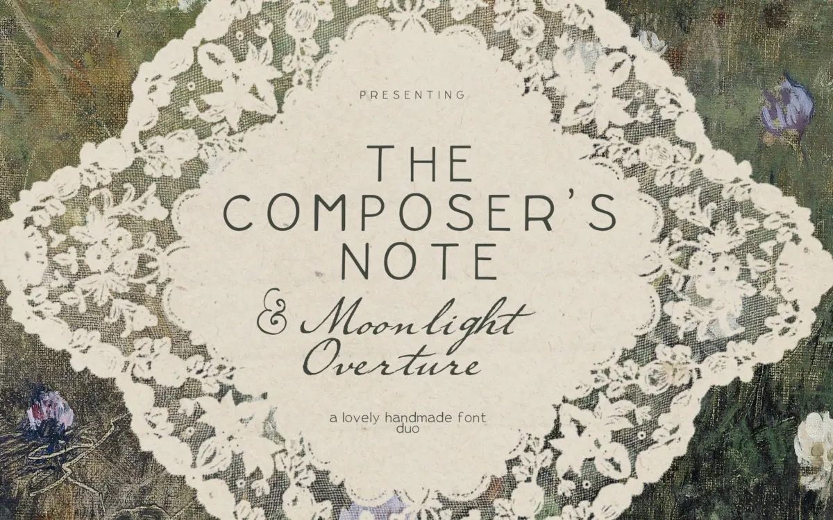
This is a bundle of three related but distinct hands: a typewriter-inflected sans, a flowing ink script, and a looser, quirkier handwriting face thrown in as a bonus. The through-line is a deliberately unpolished, handmade quality — nothing here is drawn with geometric precision, and that’s clearly the point. The sans has the slightly uneven stroke widths and soft corners you’d associate with an old mechanical typewriter, rather than the crisp uniformity of a real grotesque. The script leans into ink-pen behaviour: strokes swell and thin as if pressure changed mid-letter, joins are loose rather than mechanically consistent, and the baseline drifts slightly, which reads as handwritten rather than templated.
The bonus handwriting font is the roughest of the three, and works best as a small accent rather than a workhorse. Together the trio is built around a warm, nostalgic mood — think old letters, vintage stationery, hand-lettered signage — rather than any kind of contemporary sharpness. If you want clean and neutral, this isn’t it; the whole set trades precision for character.
Character set and features
Each of the three fonts covers standard Latin punctuation and figures, enough for typical branding, invitation, and short editorial copy. The script is the one doing the heavy lifting stylistically — its connecting strokes and varied letter widths suggest some alternate forms and ligatures are present, though how deep that OpenType support goes isn’t detailed by the seller, so treat any swash or contextual alternate as a bonus to test in your own app rather than a guaranteed feature.
The sans is the most functional of the three and reads best as the anchor typeface: it has enough personality to feel vintage without wandering into illegibility. The bonus handwriting font is the least controlled — expect irregular baseline and letterforms that vary noticeably in width, which is charming at large display sizes but not something you’d set a paragraph in.
Use cases
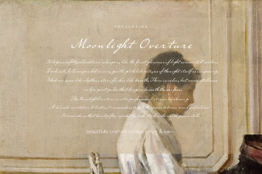
This trio is built for projects that want a handmade, nostalgic feel rather than corporate polish: wedding invitations, packaging labels, small-batch branding, letterhead, and editorial pull quotes all sit comfortably in its range. The script is suited to headlines, signatures, and short romantic phrases — anywhere you want a handwritten flourish rather than body text. The sans can carry slightly longer passages, subheads, or logotypes where a lightly aged, typewriter-adjacent tone is wanted. The bonus handwriting face is best kept for accents: a single word, a stamp-like mark, a note in the margin.
Because none of the three fonts is neutral, none of them is a safe default for long-form reading or dense UI work — that’s simply outside their brief. Designers looking for a cohesive vintage voice across a small brand system, rather than a single do-everything font, are the intended audience here.
What we liked, and what we didn’t
Strengths
- The three fonts share a consistent handmade mood, so they mix well without clashing
- The script's ink-style stroke variation gives headlines genuine warmth rather than a generic script look
- The typewriter-inflected sans is versatile enough to anchor a small brand system
Trade-offs
- The bonus handwriting font is too irregular for anything beyond short accents
- None of the three styles suit dense body copy or interface use
A cohesive, handmade-feeling trio that does vintage warmth convincingly at display sizes, but none of the three fonts is built for long-form or neutral use. Good for small branding systems and paper goods that want personality over polish.

Tmfonts writes independent reviews of typefaces: what each font does well, where it falls short, what it suits, and where it is sold.