
Ethic Serif Font Free Download
Is Ethic Serif free to download?
Ethic Serif is a commercial font sold on Creative Market, so the full version needs a paid license. Get it from the official listing: Ethic Serif font download.
Need something free? These serif fonts from Google Fonts are free for personal and commercial use:
Design style
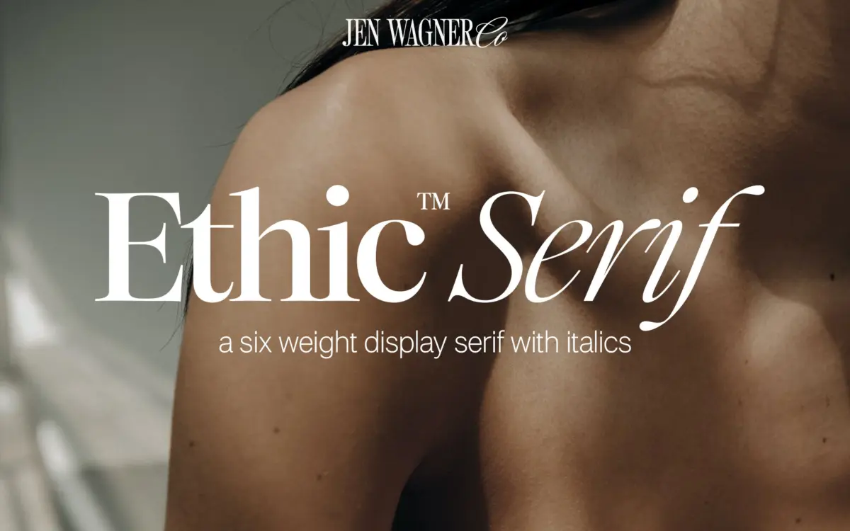
Ethic Serif sits in that familiar territory of high-contrast serifs built for attention rather than paragraphs. The thick-thin contrast is pronounced, the bracketed serifs are thin and slightly flared, and the curves have an organic wobble to them rather than the mechanical precision of something like a Didone revival. It reads as a contemporary take on classic serif proportions, tuned for the kind of branding work that wants to look expensive without tipping into rigid formality.
The italics are the more interesting half of the family. They’re sharper and more calligraphic than the romans, with narrower apertures and a visible pen-angle quality that gives them some personality on their own. Where the upright weights feel restrained and a bit generic in isolation, the italics carry more of the typeface’s voice.
Character set and features
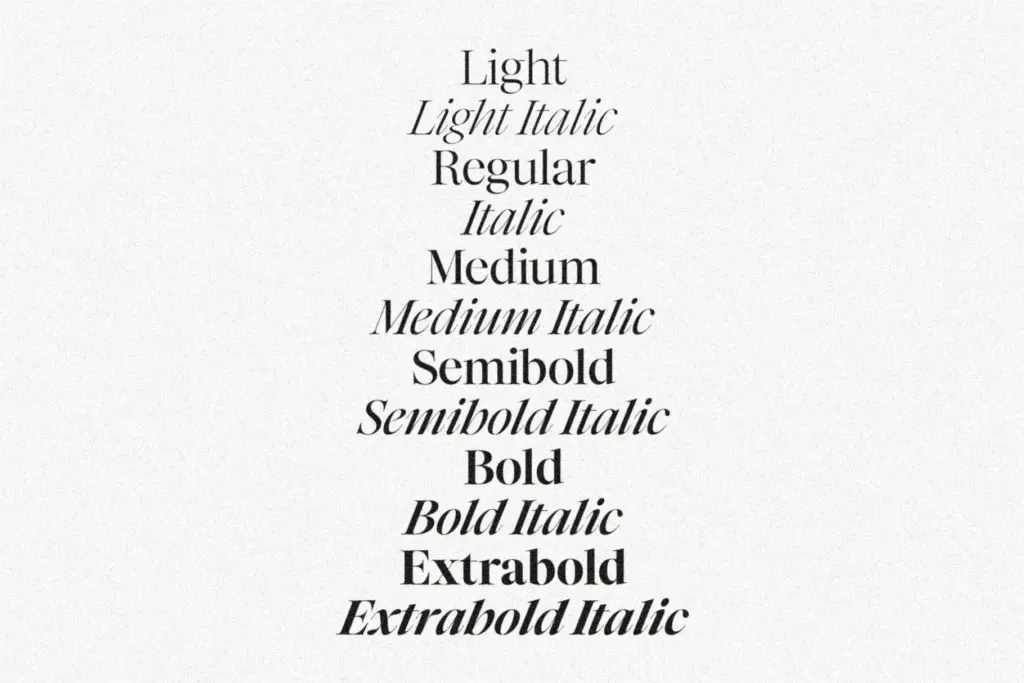
The family ships in six weights — Light through Extrabold — each with a matching italic, for twelve fonts total. That’s a genuinely useful range for a display serif: Light and Regular work for subheads or pull quotes, while Bold and Extrabold hold up as standalone headline weights without needing to be faked with software bolding. The jump between weights is even enough that a designer can build a hierarchy across three or four of them without visible gaps.
Numerals, punctuation, and foreign language support round out the set, which is what you’d expect from a family pitched at editorial and branding use rather than one chasing an extensive alternate-glyph system. There’s no mention of ligatures, small caps, or stylistic sets, so treat this as a straightforward, well-mannered serif rather than one with a deep OpenType feature panel. If your project depends on swash capitals or contextual alternates, look elsewhere; this family isn’t built around that kind of flourish.
At smaller sizes the contrast starts to work against it. The thin strokes thin out further and the hairlines can disappear in low-resolution web rendering or small print runs. This is a display serif in temperament even though the family offers enough weights to tempt someone into using it for body copy — resist that temptation past subhead size.
Use cases
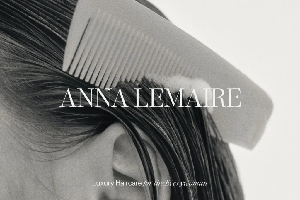
Ethic Serif is built for the moments where type is the visual, not just the message: a logotype, a magazine cover line, a hero header on a website, a big pull quote sitting alone on a page. The Light and Regular italics in particular do well for quote treatments and social graphics, where a single line of elegant, slightly irregular serif italic carries a lot of the design’s weight. Luxury, beauty, editorial, and lifestyle branding are the natural fits — anywhere the brief calls for “classic but not stuffy.”
It’s less suited to long-form reading. Use it for headlines and pair it with a plainer text face for paragraphs, captions, and interface copy. Six weights give plenty of room to build a full brand system around it, provided that system leans on Ethic Serif for the loud parts and something quieter for everything else.

What we liked, and what we didn’t
Strengths
- Six weights plus matching italics give real headline-to-subhead range
- Italics carry more personality and calligraphic detail than the uprights
- Even weight progression makes it easy to build hierarchy within one family
Trade-offs
- High contrast strokes thin out and lose crispness at small sizes
- No stated OpenType extras like ligatures or alternates for designers wanting more flexibility
Ethic Serif is a competent, good-looking display serif with a genuinely useful weight range and italics that have more character than the romans. It's not built for body copy, and the feature set is basic, but for headlines, quotes and branding work with a classic-but-not-stuffy brief, it does the job well.

Tmfonts writes independent reviews of typefaces: what each font does well, where it falls short, what it suits, and where it is sold.