
Kelin Eator Font Free Download
Is Kelin Eator free to download?
Kelin Eator is a commercial font sold on Creative Market, so the full version needs a paid license. Get it from the official listing: Kelin Eator font download.
Need something free? These serif fonts from Google Fonts are free for personal and commercial use:
Design style
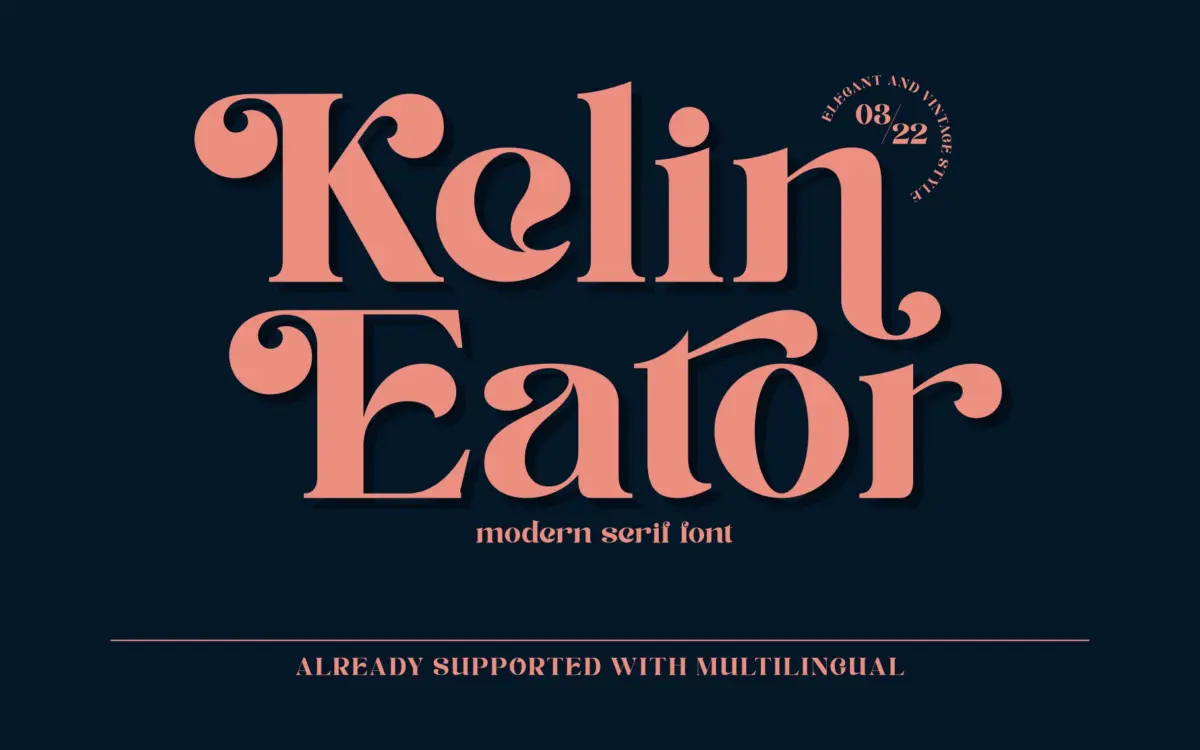
Kelin Eator sits in the crowded field of vintage-inflected serifs, the kind built to suggest an old printing press or a hand-set badge rather than a body-text workhorse. The letterforms carry moderate contrast and slightly irregular curves that give the face a worn, tactile quality without tipping into full distress-texture territory. Terminals are gently flared rather than sharply bracketed, which softens the overall tone and keeps it from reading as strictly formal.
The serif structure leans traditional, but the proportions have been loosened a bit — x-height is generous enough to keep the face from feeling cramped, and the stroke modulation avoids the extreme thick-thin swings you’d see in a more classical revival. It reads as a font designed to be noticed at a glance, in a headline or a logotype, rather than one built for sustained reading. That’s a fair trade for the genre it’s aiming at, but it’s worth naming: this is a display serif dressed as a text serif, and it should be used accordingly.
Character set and features
The built-in alternates are the most useful part of the package. Having several options for individual letters means you can break up repetition in a word or a short line of type — useful in logotypes where the same letter might appear twice and look mechanical if it’s identical both times. The seller also notes multilingual support, though the brief doesn’t specify which language sets are covered, so anyone with non-Latin or heavily accented copy should check character coverage before committing.
Beyond the alternates, there isn’t much detail available about ligatures, swash extremes, or a full OpenType feature panel — the marketplace tags mention swashes, but the brief itself doesn’t confirm the extent of that support. Treat the alternates as the headline feature and verify anything more elaborate before you build a project around it. Spacing appears even enough for short-line setting, but the vintage roughness in the forms means kerning pairs in display sizes deserve a manual check, particularly around round-to-straight combinations.
Use cases
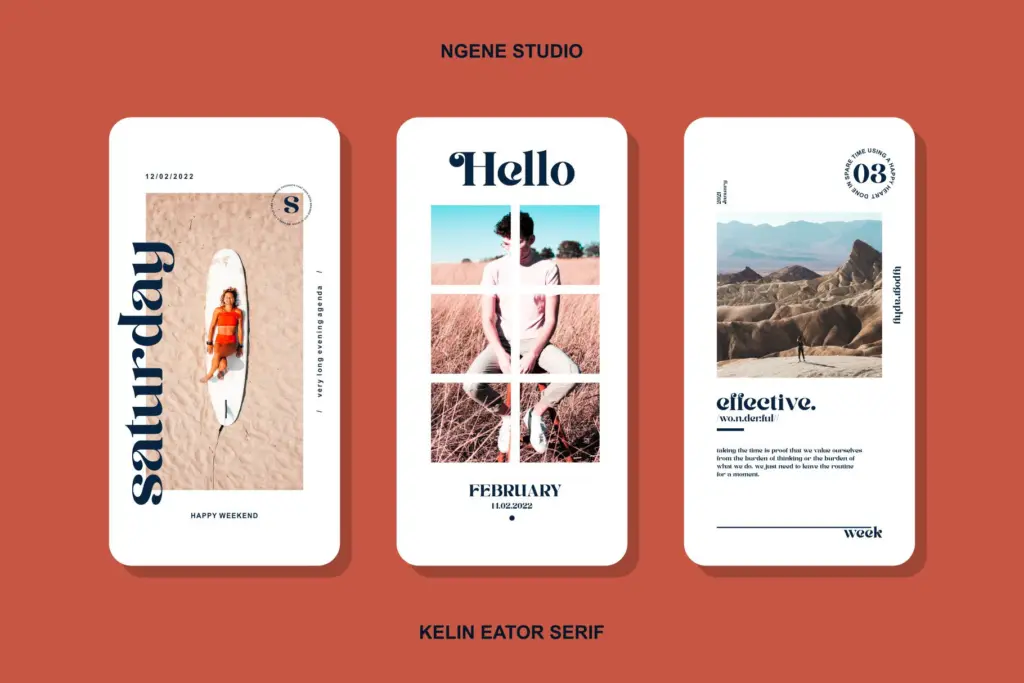
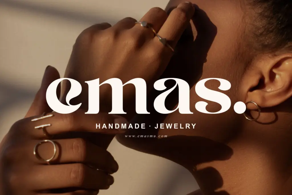
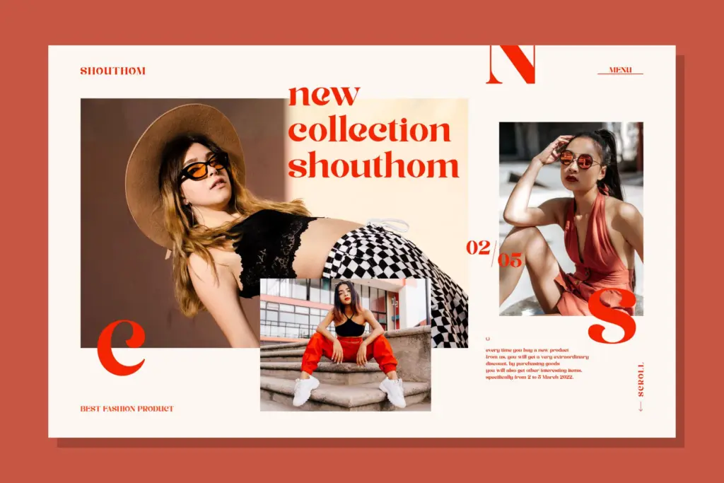
This is a font for surfaces where a handful of words carry the whole message: a logotype, a badge, a magazine masthead, a quote card for social media. It has the right temperament for packaging labels, clothing graphics, and invitation cards where a bit of retro warmth is the point rather than a distraction. Instagram posts and stories — clearly a target use given the tagging — suit it well, since that format rewards a face with personality at a glance rather than one built for paragraphs.
Where it will struggle is anywhere you need to set more than a sentence or two. The stroke irregularities and flared terminals that make it charming in a headline become fatiguing in a paragraph, so keep it away from body copy or long-form editorial text. Pair it with a plainer sans or a quieter serif for supporting text, and let Kelin Eator carry the one or two lines that need to do the attracting.
What we liked, and what we didn’t
Strengths
- Built-in letter alternates help avoid repetitive-looking logotypes
- Generous x-height keeps the vintage roughness from becoming illegible at display sizes
- Warm, tactile terminal shapes suit packaging and badge work without heavy texture effects
Trade-offs
- Not suited to body text or long-form setting; contrast and irregular terminals tire the eye quickly
- Feature documentation is sparse — ligature and swash claims aren't clearly verified in the brief
Kelin Eator is a competent vintage display serif with useful alternates for breaking up repeated letters in logotypes and short headlines. It's not built for reading at length, and the feature set beyond the alternates is thin on documentation, but for badges, labels, and social graphics it does the job it's aimed at.

Tmfonts writes independent reviews of typefaces: what each font does well, where it falls short, what it suits, and where it is sold.