
Hore Font Free Download
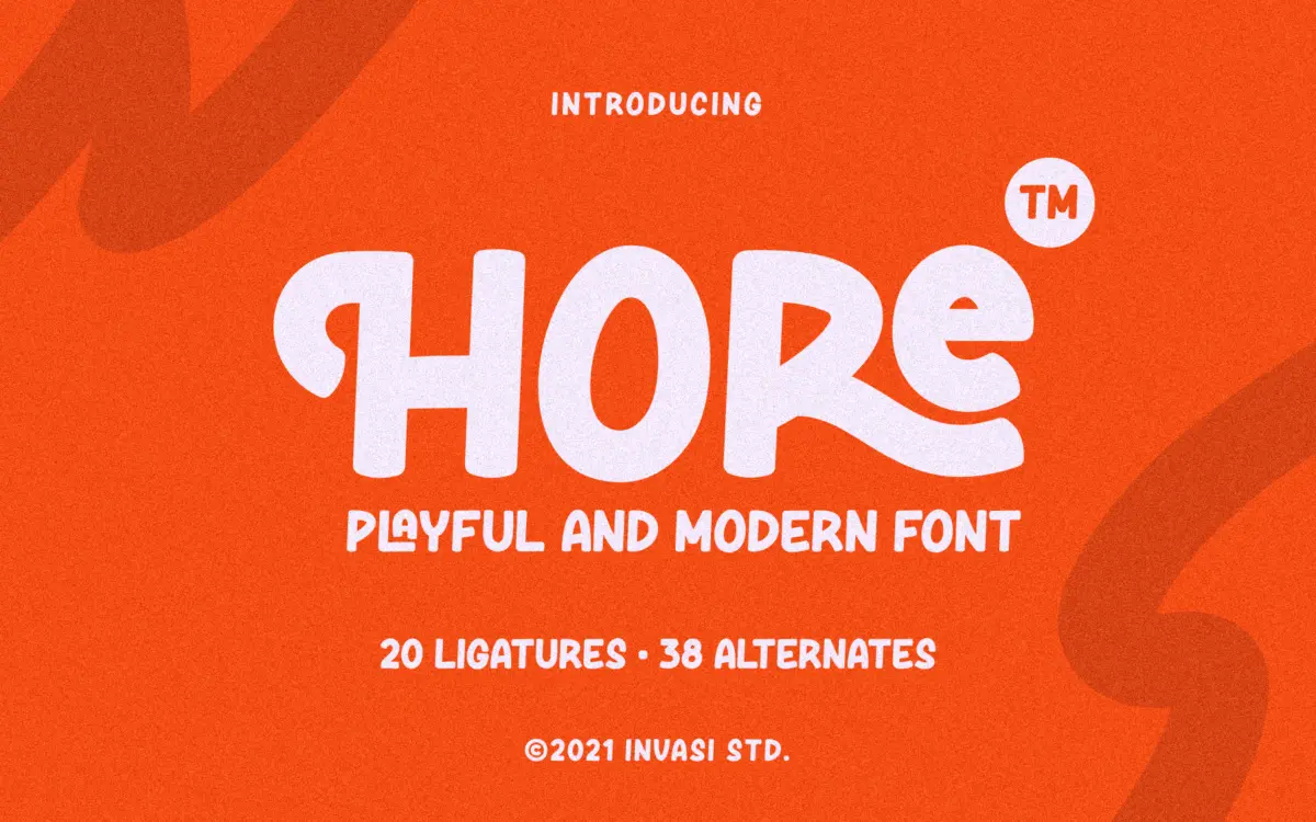
Is Hore free to download?
Hore is a commercial font sold on Creative Market, so the full version needs a paid license. Get it from the official listing: Hore font download.
Need something free? These script fonts from Google Fonts are free for personal and commercial use:
Design style
Hore sits in the loose, hand-drawn corner of the script category. The strokes have the slightly uneven pressure of a marker or brush pen rather than the polished swing of a formal calligraphic script. Letters lean and bounce off the baseline rather than sitting in a strict, connected ribbon, which gives the face an informal, sketchbook quality rather than a wedding-invitation one. Curves are rounded and a little wobbly by design, terminals are blunt rather than tapered, and the overall rhythm reads as friendly and unpolished in a deliberate way.
It’s not trying to be elegant. The letterforms have a quirky, almost hand-lettered logo feel — the kind of thing you’d expect on a coffee bag or a hand-painted sign rather than a formal certificate. That’s a fair trade for the intended market, but it means Hore doesn’t flex toward anything more restrained.
Character set and features
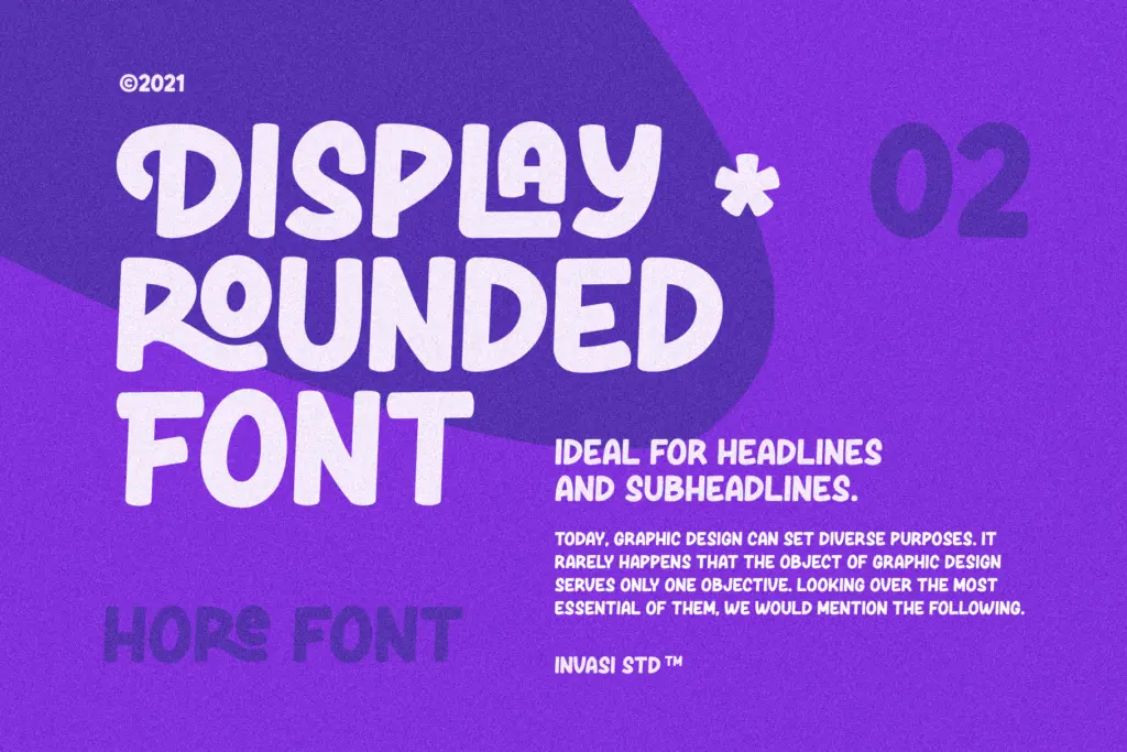
The set includes alternates and ligatures, which is where a font like this earns its keep — swapping in a different tail on a lowercase ‘g’ or a looser connection between two letters breaks up the repetition that hand-drawn scripts are prone to. Punctuation is covered, and multilanguage support extends its reach beyond English-only projects, useful for anyone working across a few Latin-based languages.
Accessing the alternates requires OpenType-aware software — Illustrator, InDesign, and similar — since the ligatures and swaps aren’t baked into a single default glyph per letter. Anyone setting text in a program without OpenType feature support will get the plain default forms only, which noticeably flattens the personality the font is built around. That’s worth knowing before you commit a layout to it.
The file comes in OTF, TTF, and WOFF, which covers desktop design work and basic web use without much fuss.
Use cases
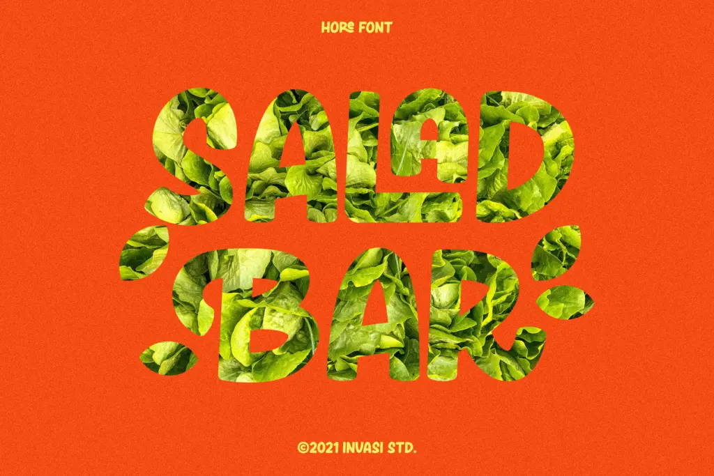
Hore is built for short bursts of text: a logotype, a product name, a hand-lettered quote pulled out on a package or a social tile. It has the kind of quirky, food-and-branding energy that suits small batch labels, cafe signage, or a playful headline on a website that wants to look less corporate. The alternates help here — used well, they let a short word feel individually lettered rather than typed.
It’s not a font for body copy or long-form reading. The irregular baseline and loose joins that make it charming at large sizes become fatiguing and hard to track once you’re past a sentence or two. It also won’t sit comfortably next to anything genuinely elegant or formal — its personality is casual and a bit rough around the edges, and pairing it with a refined serif will highlight the mismatch rather than smooth it over. Keep it to what it’s good at: short, playful, brandable moments, not paragraphs.

What we liked, and what we didn’t
Strengths
- Alternates and ligatures genuinely reduce repetition in short hand-lettered words
- Loose, marker-like strokes give it a distinct, unpolished personality suited to food and craft branding
- Comes in OTF, TTF and WOFF, covering desktop and basic web use
Trade-offs
- Loses much of its character in software without OpenType feature support, falling back to plain default glyphs
- Irregular baseline and loose joins make it tiring to read past a sentence or two
Hore is a casual, hand-drawn script that does one job well: short, playful branding moments like logotypes, labels, and pulled quotes. It leans on alternates and ligatures to avoid repetition, but it needs OpenType-aware software to deliver on that, and it has no ambitions beyond the quirky, informal register it's built for.

Tmfonts writes independent reviews of typefaces: what each font does well, where it falls short, what it suits, and where it is sold.