
Phantasmagoria Font Free Download
Is Phantasmagoria free to download?
Phantasmagoria is a commercial font sold on Creative Market, so the full version needs a paid license. Get it from the official listing: Phantasmagoria font download.
Need something free? These handwritten fonts from Google Fonts are free for personal and commercial use:
Design style
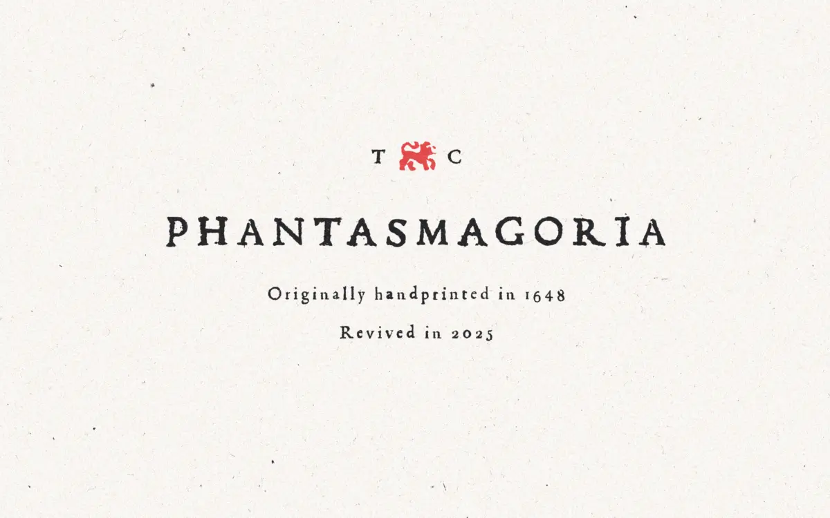
Phantasmagoria is a serif built on the bones of hand-set type, with the roughness of old letterpress printing left intact rather than smoothed away. Strokes wobble slightly off their axis, serifs are uneven, and ink traps and broken edges suggest a forme that’s taken a few too many pulls at the press. It sits somewhere between a period revival and a grunge display face, and it doesn’t pretend to be anything cleaner than that. The contrast is moderate, letterforms are narrow and upright, and the overall texture reads as printed rather than drawn.
What separates it from a generic distressed serif is the sense that the wear is structural rather than a filter slapped over a clean typeface. Each glyph looks like it was actually lifted from a printed page, imperfections and all, so the character comes from the shapes themselves, not just surface noise. That’s a harder thing to fake convincingly, and it mostly works here.
Character set and features
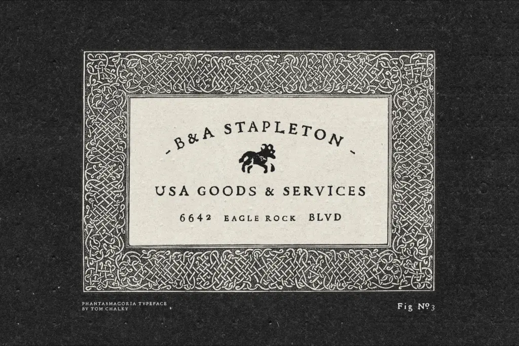
The headline feature is three alternates per letter, swapped automatically through contextual alternates, so repeated letters within a word or across a line don’t stack identically. This is the single most important thing to get right in a font like this, because without it a distressed typeface reveals its digital nature immediately — the same
What we liked, and what we didn’t
Strengths
- Automatic alternates genuinely vary repeated letters instead of relying on one distressed weight
- The wear feels baked into the letterforms rather than applied as a texture overlay
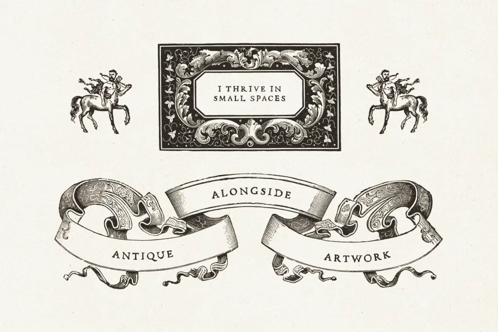
- Bonus era-appropriate symbols extend its use beyond straight typesetting
Trade-offs
- Legibility drops off quickly below headline sizes, so it's unsuitable for body copy or long-form text
- The heavy distressing limits how well it plays with cleaner, more contemporary design systems
Phantasmagoria delivers a convincing printed-letterpress texture without leaning on an obvious repeat pattern, thanks to its alternate system. It's a display and headline face rather than a body text option, and its charm is strongest at larger sizes where the imperfections read as intentional rather than muddy.

Tmfonts writes independent reviews of typefaces: what each font does well, where it falls short, what it suits, and where it is sold.