
The Roman Edition Font Free Download
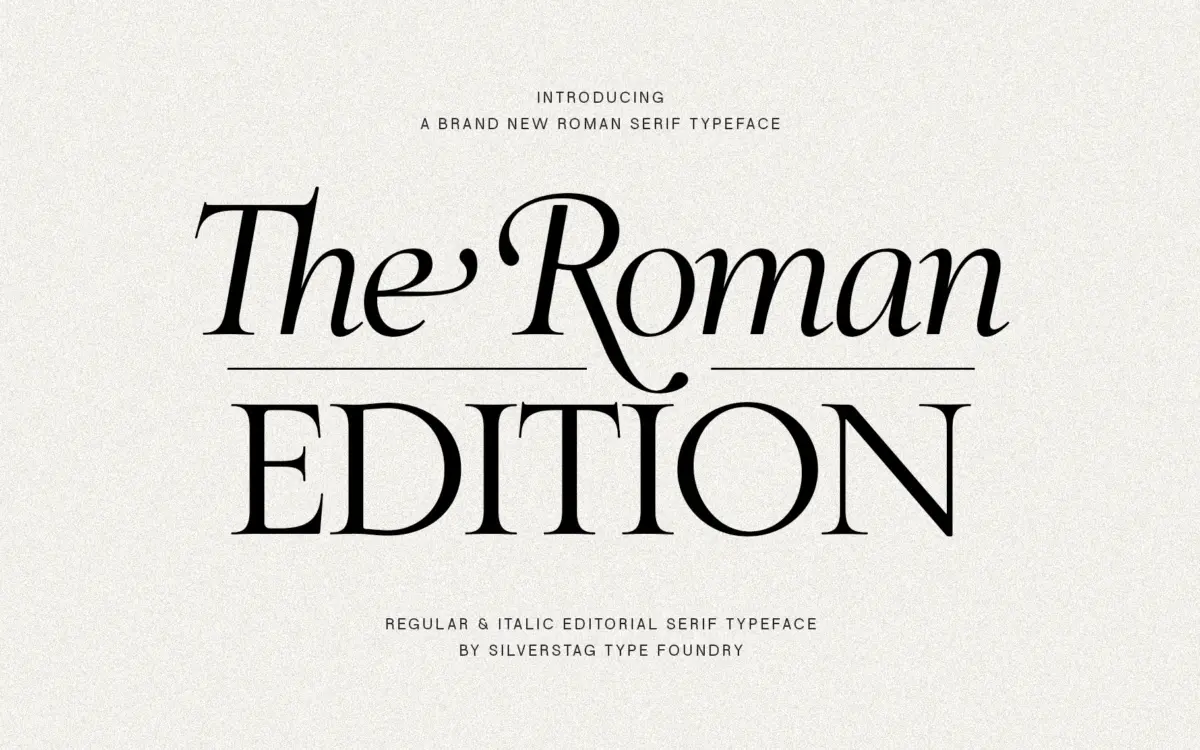
Is The Roman Edition free to download?
The Roman Edition is a commercial font sold on Creative Market, so the full version needs a paid license. Get it from the official listing: The Roman Edition font download.
Need something free? These serif fonts from Google Fonts are free for personal and commercial use:
Design style
The Roman Edition draws on the proportions of classical Roman inscriptional letterforms, filtered through a more restrained editorial sensibility rather than a strict revival. The capitals carry the bracketed serifs and moderate contrast you’d expect from that lineage, but the lowercase has been drawn with enough calm to sit comfortably in running text rather than shouting for attention on its own. Terminals are cut cleanly, not fussy, and the overall stroke modulation stays even enough that the face doesn’t tip into a fashion-serif register.
What stands out is the restraint. A lot of typefaces that reach for ‘classical elegance’ overcompensate with exaggerated thins or flourish-heavy caps. This one keeps its ambitions in check: the drama is in the proportions and the spacing, not in any single letterform doing tricks. That’s a deliberate choice, and it pays off if you want something that reads as considered rather than decorative.
Character set and features
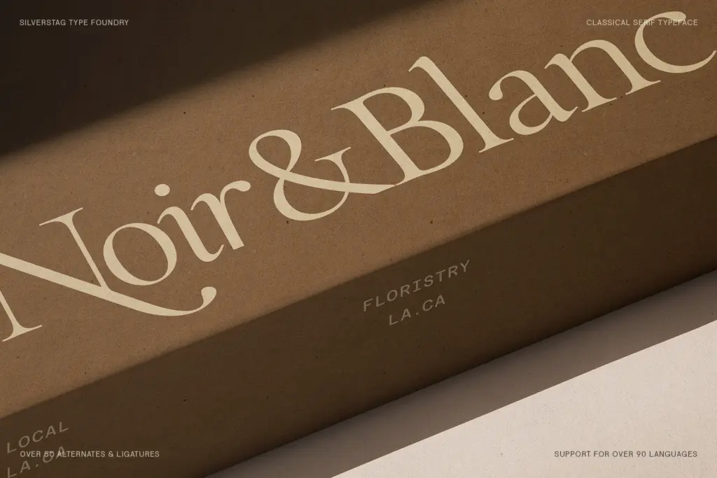
The family is built as a single balanced style rather than a wide weight range, so there’s no light-to-black spectrum to lean on for hierarchy within a layout — you’ll be doing that work with size, spacing, and colour instead. Ligatures are present and genuinely useful here, smoothing the awkward joins that classical serifs are prone to at common letter pairs, and the swash-adjacent details show up mostly in the capitals rather than throughout the alphabet, which keeps the text weight readable.
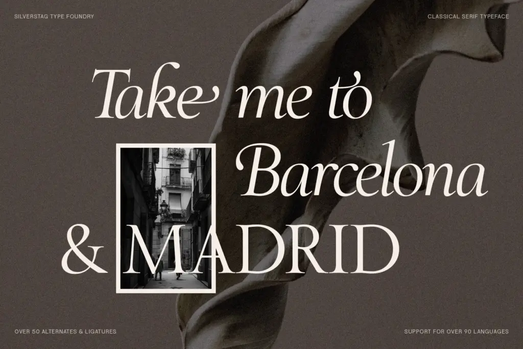
At body-copy sizes the letterforms hold their shape well; the moderate contrast means it doesn’t disintegrate the way high-contrast display serifs can once you drop below 11pt. Where it gets more interesting is in the setting of headlines and pull quotes, where the serif detailing and slightly wider proportions have room to breathe. It’s not a typeface built around an enormous alternate set or stylistic-set gymnastics — the character comes from the base letterforms doing their job well, which is arguably more useful day to day than a drawer full of swashes you’ll use once.
Use cases
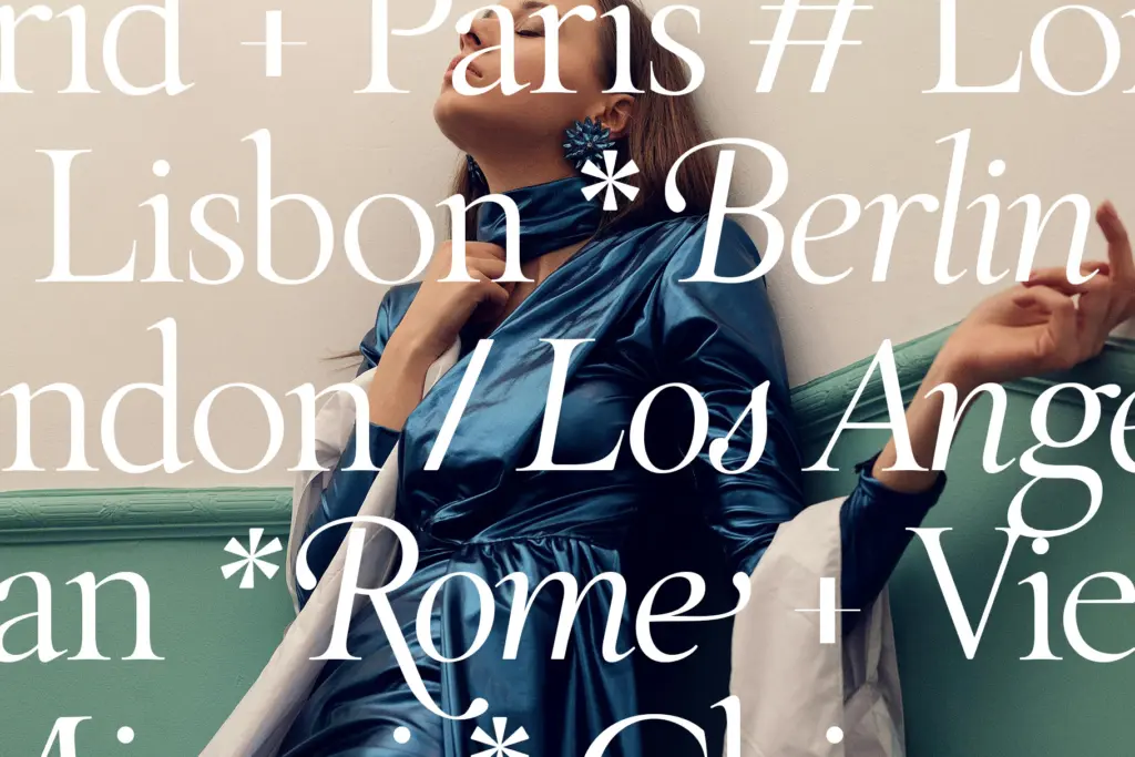
This is a font for projects where ‘classic’ needs to read as intentional rather than default. Editorial layouts — long-form magazine features, essay collections, anything wanting a literary tone — are a natural fit, since the text setting holds up at length. It also does well in branding contexts that want heritage without looking dated: packaging for a legacy product line, a wine label, a hospitality brand leaning into old-world credibility.
For wedding stationery and invitations it works, though designers should be aware it’s a fairly formal, upright classical serif rather than a soft romantic one — pair it with looser type or generous whitespace if the brief calls for warmth rather than gravitas. It’s less suited to anything needing a wide weight range for complex hierarchy, or to UI and small interface text, where its serif detailing is wasted. Think print-first: books, menus, stationery, and brand marks rather than app screens.
What we liked, and what we didn’t
Strengths
- Even stroke contrast keeps the lowercase readable at body-copy sizes
- Ligatures smooth over the awkward joins classical serifs often struggle with
- Capitals carry enough classical detail for headlines without derailing text passages
Trade-offs
- No weight range beyond the single regular style limits typographic hierarchy
- Serif detailing and formal proportions make it a poor fit for UI or small interface text
The Roman Edition is a well-drawn classical serif that resists the urge to over-decorate, which makes it more usable in real editorial and branding work than most typefaces chasing the same 'timeless elegance' brief. It's limited by having a single balanced style rather than a range of weights, so hierarchy has to come from layout rather than the type family itself. Best suited to print-led, formal projects rather than digital interfaces or anything needing flexible weight contrast.

Tmfonts writes independent reviews of typefaces: what each font does well, where it falls short, what it suits, and where it is sold.