
Details Font Free Download
Is Details free to download?
Details is a commercial font sold on Creative Market, so the full version needs a paid license. Get it from the official listing: Details font download.
Need something free? These script fonts from Google Fonts are free for personal and commercial use:
Design style
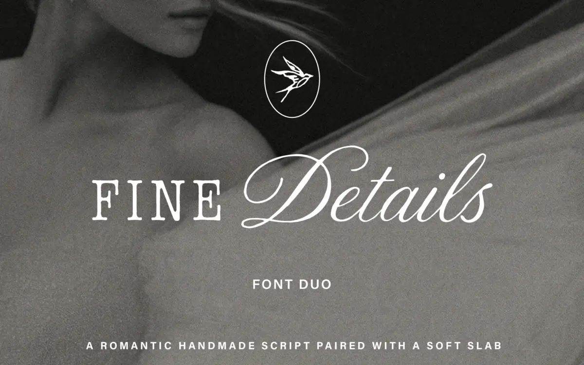
Details is a two-part release: a fluid, hand-drawn script paired with a soft slab serif. The pairing leans on contrast rather than matching — the script does the talking, the slab does the standing-still. That’s a familiar structure in font-duo releases, but here the execution has a bit more restraint than most. The script isn’t over-decorated; the strokes stay fairly consistent in weight, with a moderate slant and joins that look like they were drawn at a natural writing pace rather than digitally smoothed into blandness. The slab serif is where the calm comes from. Its serifs are rounded rather than bracketed, giving it a slightly softened, almost humanist feel instead of the blockier stance you get from true slabs. Together they read as a considered, boutique-brand voice — warm, a little precious, clearly aimed at a feminine-leaning luxury market rather than anything utilitarian.
Character set and features
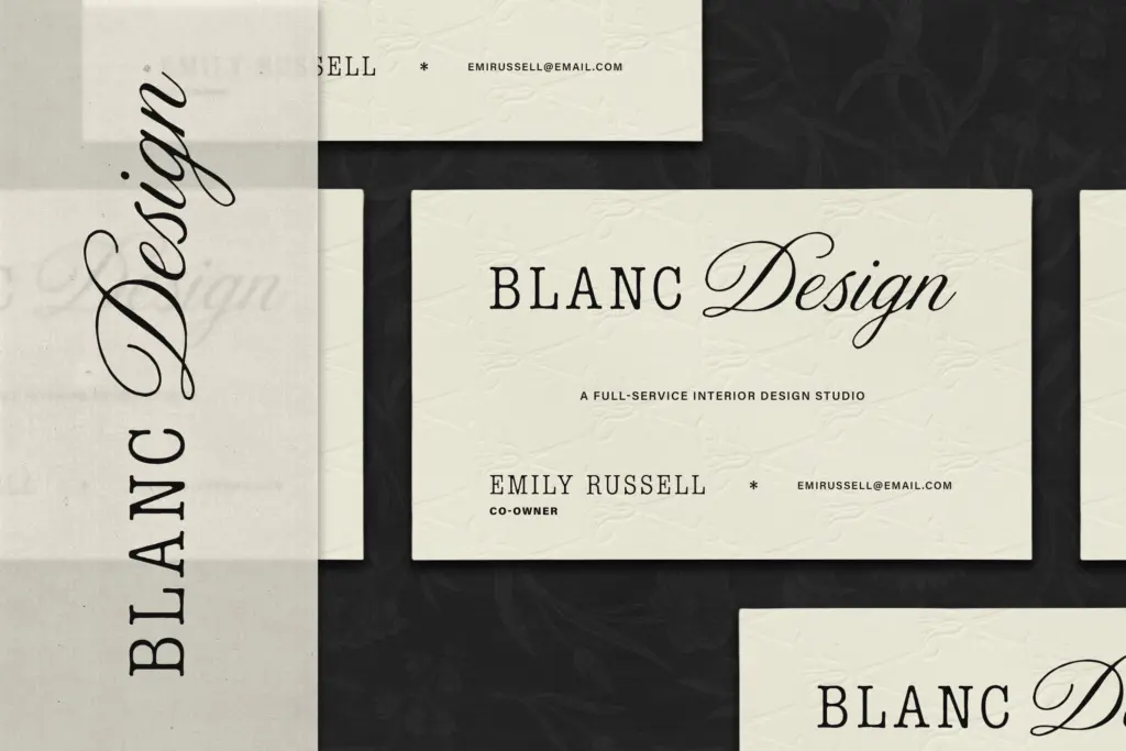
The script includes alternate letterforms, which matters more here than in most scripts because repeated letters — double l’s, double t’s — are where connected scripts usually show their seams. Swapping in an alternate breaks up that repetition and keeps a line of text from looking mechanically duplicated. Ligatures are part of the package too, smoothing over some of the more awkward letter-to-letter transitions that hand-drawn scripts are prone to at the joins. The slab serif is the more workhorse of the two: it’s built for actual reading, so its job is to stay quiet and legible rather than show off. Anyone testing this pairing should look closely at how the script holds its rhythm across a full sentence, not just in a logotype-length word — some hand-drawn scripts flatter short phrases and start to wander once you ask them to set several words in a row.
Use cases
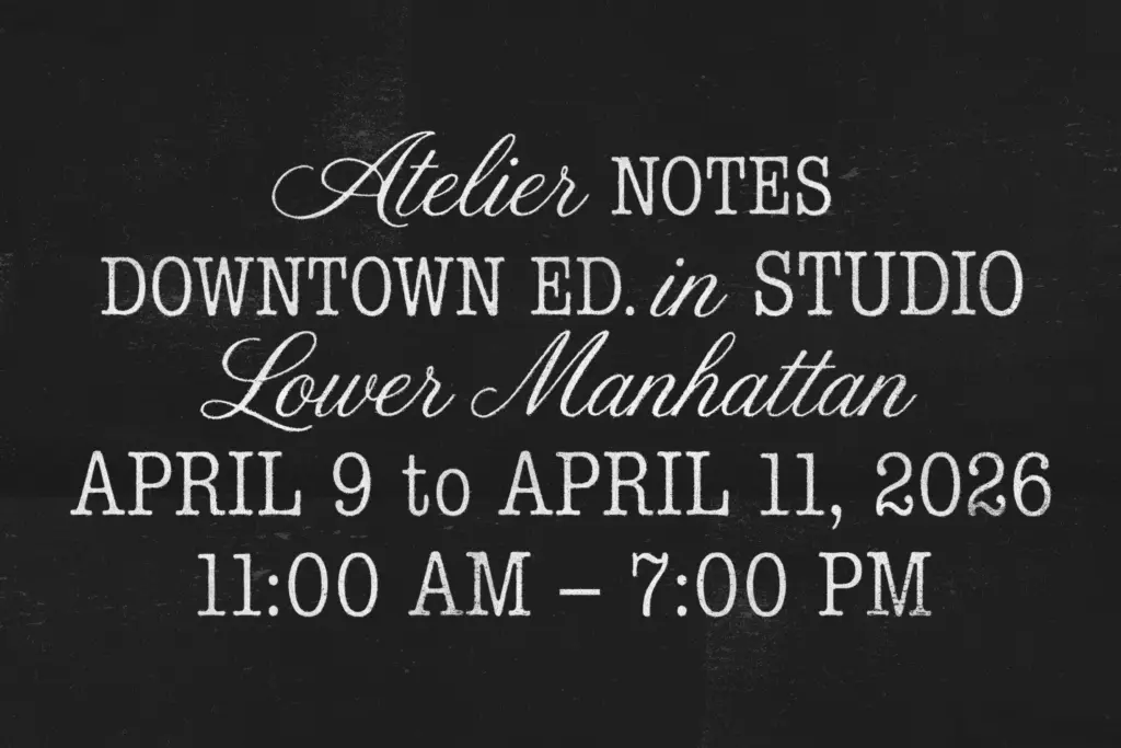
This duo sits most comfortably in the invitation-and-branding lane: wedding stationery, boutique packaging, editorial mastheads, social media identity work where a brand wants to feel personal and premium at once. The script is best used at a size where its alternates and ligatures can register — a headline, a monogram, a short pull-quote — rather than as body copy, which is standard practice for any connected script and no different here. The slab serif picks up the slack for anything that needs to be actually read: subheads, captions, product copy, the parts of a layout where the script would slow a reader down. Used together they cover a full identity system reasonably well — logo, packaging copy, invitation set — without needing a third typeface to bridge the gap. It’s not a font built for interfaces, dense text blocks, or anything that needs to feel neutral; the moment the context calls for restraint over character, this pairing will feel like the wrong tool. But for the boutique-brand brief it’s aimed at, it does the job cleanly and without unnecessary flourish.
What we liked, and what we didn’t
Strengths
- Alternate letterforms break up repeated characters in the script convincingly
- Slab serif companion stays legible and calm, doing real reading work
- Ligatures smooth over awkward joins typical of hand-drawn scripts
Trade-offs
- The script is only comfortable at display sizes, not for running text
- The overall look leans heavily into one boutique-luxury register with little range beyond it
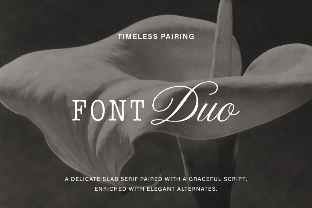
Details is a competent, well-mannered script-and-slab pairing aimed squarely at boutique and editorial branding. The alternates and ligatures keep the script from looking mechanical, and the slab serif is a sensible, legible partner rather than an afterthought. It won't surprise anyone who's used font duos before, but it does the job it's built for cleanly.

Tmfonts writes independent reviews of typefaces: what each font does well, where it falls short, what it suits, and where it is sold.