
VS Grandma’s Recipe Font Free Download
Is VS Grandma's Recipe free to download?
VS Grandma's Recipe is a commercial font sold on Creative Market, so the full version needs a paid license. Get it from the official listing: VS Grandma's Recipe font download.
Need something free? These script fonts from Google Fonts are free for personal and commercial use:
Design style
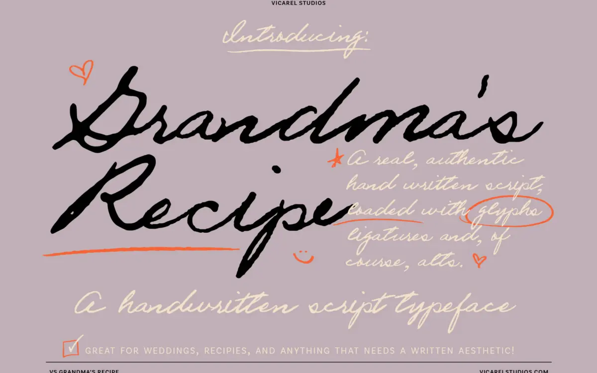
This is not a script built to look tidy in a specimen shot. It reads as actual cursive handwriting, the kind you’d find in a recipe box: baseline drifting slightly line to line, entrance and exit strokes that sometimes connect and sometimes don’t, letters that lean at slightly different angles depending on what comes before or after them. The line weight is uneven in the way a ballpoint or fountain pen produces unevenness, not in the way a stroke-modulation tool fakes it. There’s no exaggerated flourish or calligraphic swash pretending to be elegant — it’s plainer than that, closer to a grandmother’s grocery list than a wedding calligrapher’s hand.
That plainness is the point. Where a lot of script fonts chase a polished, uniform loop structure, this one deliberately keeps the wobble. Some readers will find that charming and human; others will find it a little too loose for anything meant to look considered. It’s a font with a specific personality, not a neutral tool.
Character set and features
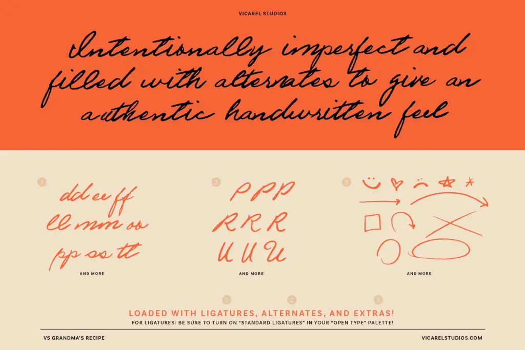
The set runs to 155 glyphs, which is where the handwriting illusion actually gets built. Most letters, numbers and punctuation marks come in two or three variants, so repeated letters within a word — the double b’s and l’s in a word like “baseball” — don’t look stamped from the same mould. That’s the feature doing real work here: without it, this would just be another single-weight script with a shaky baseline. With it, the repetition problem that gives away most handwriting fonts mostly disappears.
Whether you get the full benefit depends on whether your layout software actually cycles the alternates and ligatures via OpenType features, or whether you’re relying on manual swaps. In a basic text box without OpenType support switched on, you’ll just get the default glyph every time, which flattens the effect considerably. It’s a font that rewards a bit of setup effort and underperforms without it.
Use cases
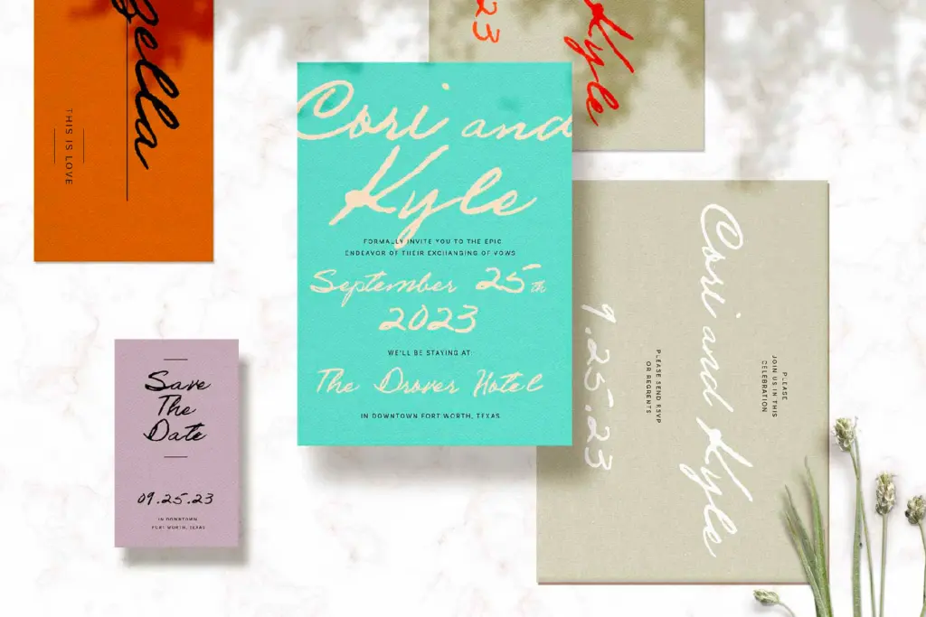
Recipe cards are the obvious fit — the name isn’t accidental — and it holds up well anywhere you want a food or kitchen product to feel handmade: labels, packaging call-outs, cookbook headers, farmers-market signage. It also suits informal branding where the goal is approachable rather than polished: a small bakery’s logo, a personal newsletter, a card shop’s seasonal line.
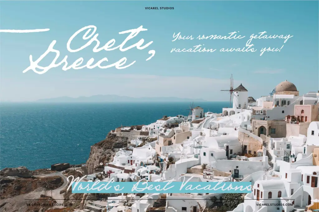
Wedding stationery is a plausible use, but worth thinking through — this script reads as everyday handwriting rather than formal calligraphy, so it fits a casual or rustic wedding aesthetic better than a black-tie one. As body copy it’s workable in short bursts, a paragraph or a card’s worth of text, but the irregularity that makes it charming at display sizes becomes fatiguing to read over several paragraphs. Best treated as a voice for headlines, short copy and hand-lettered accents rather than a long-form text face.
What we liked, and what we didn’t
Strengths
- Genuine letter-to-letter variation via 2-3 alternates keeps repeated letters from looking stamped
- Uneven baseline and stroke weight read as authentic handwriting rather than a digital approximation
- Well matched to food, kitchen and packaging contexts where a handmade feel is the goal
Trade-offs
- The irregularity that makes it charming at display sizes becomes tiring over longer passages of text
- Full effect depends on OpenType alternate/ligature support being active in your software, which not all layout tools handle well by default
VS Grandma's Recipe commits fully to looking like real, imperfect handwriting rather than a polished script pretending at spontaneity. It's well suited to food packaging, recipe cards and casual branding, but its irregularity limits it at long text lengths and in formal contexts. Worth it if you actually enable the alternate glyphs; underwhelming if you don't.

Tmfonts writes independent reviews of typefaces: what each font does well, where it falls short, what it suits, and where it is sold.