
Lucky Fish Fonts Free Download
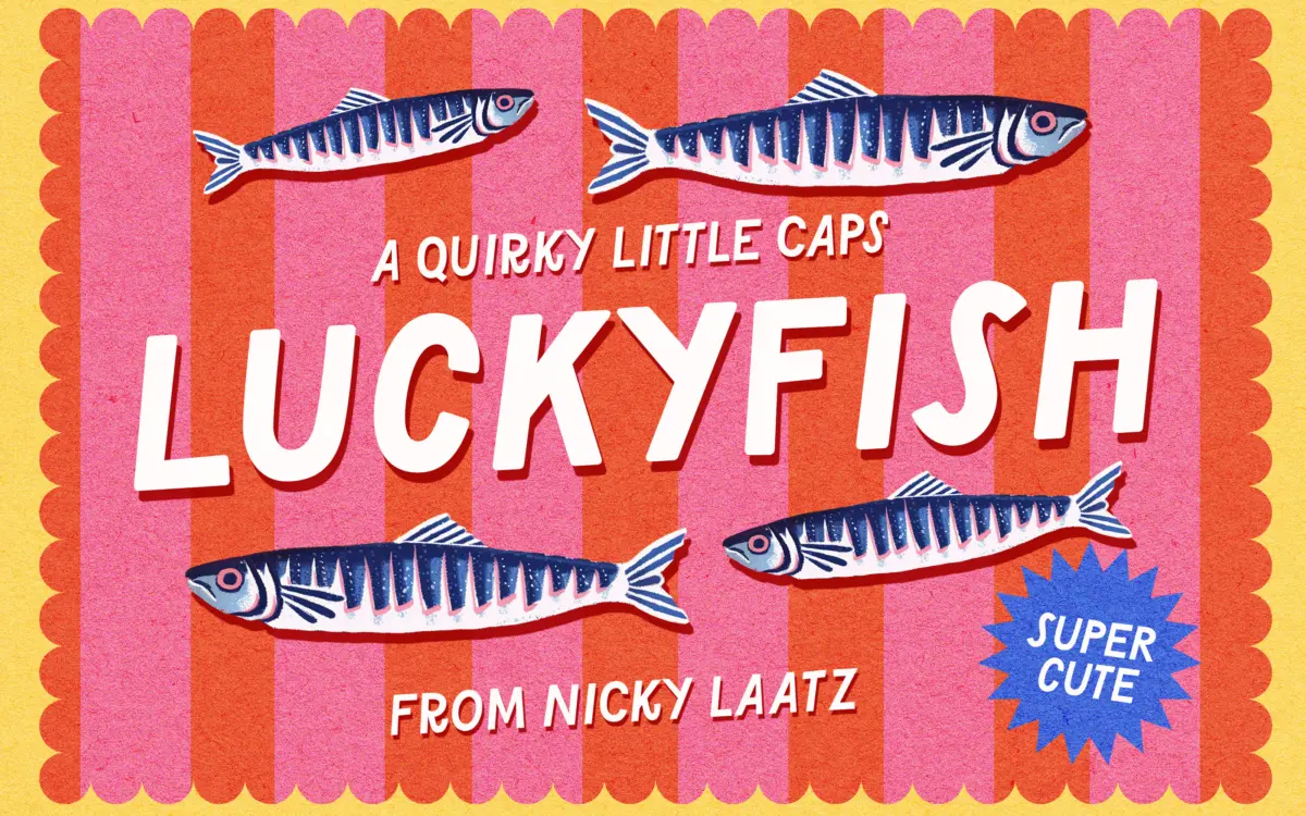
Is Lucky Fish Fonts free to download?
Lucky Fish Fonts is a commercial font sold on Creative Market, so the full version needs a paid license. Get it from the official listing: Lucky Fish Fonts download.
Need something free? These sans serif fonts from Google Fonts are free for personal and commercial use:
Design style
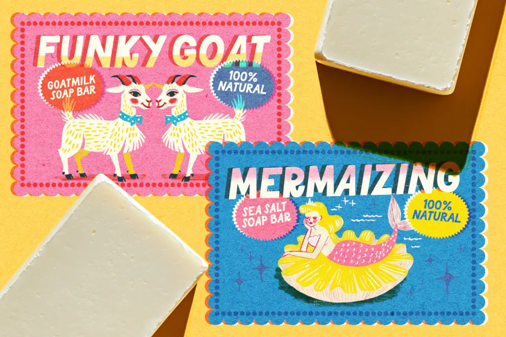
Lucky Fish is an all-caps display sans built for noise, not nuance. The letterforms are chunky and slightly irregular, with a hand-built wobble to the strokes that keeps it from reading as generic rounded-sans filler. Curves bulge a touch past where a geometric sans would stop them, and terminals are cut at odd angles rather than squared off cleanly, which is where most of its personality lives.
The family spans six styles: Regular, Rounded, Medium, Medium Rounded, Heavy and Heavy Rounded. The rounded variants soften the corners into a bubblier, friendlier shape, while the straight-edged versions keep a bit more graphic bite. Heavy is the one worth building a lockup around — at that weight the counters shrink down and the letters start to feel like they’re pressing against each other, which suits the font’s loud, cheeky brief. Regular is comparatively tame and loses some of the character that makes the heavier weights interesting.
Character set and features
This is a caps-only font, so there’s no lowercase to fall back on for contrast — every word sits at the same visual volume, which is fine for headlines and short bursts of text but becomes fatiguing over anything longer than a phrase. Language support covers English, French, German, Spanish, Portuguese, Danish, Swedish, Norwegian (both written forms), Luxembourgish and Swiss German, so European-market packaging and cards are covered without extra workarounds.
Spacing is generous and even across the six styles, which helps at small sizes where the wobbly strokes might otherwise clot together. There’s no mention of ligatures, alternates or swash characters in the brief, so treat this as a straightforward, no-frills all-caps set rather than a font built for elaborate custom lettering — the personality comes from the letterforms themselves, not from extra glyphs layered on top.
Use cases
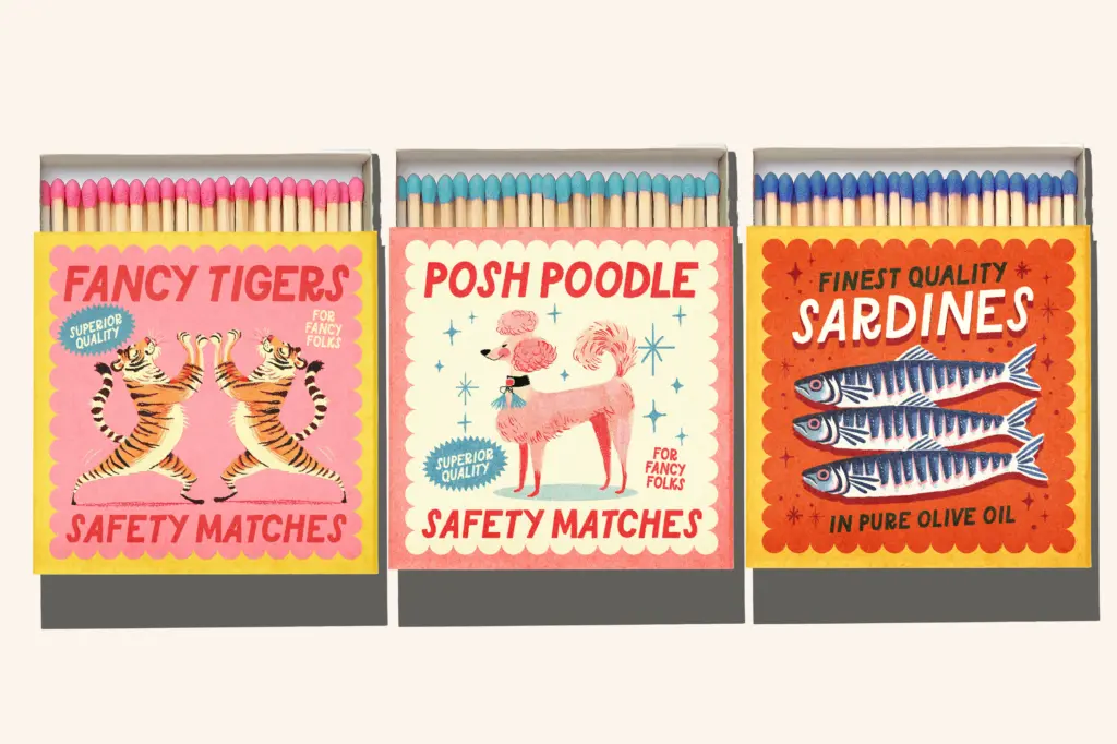
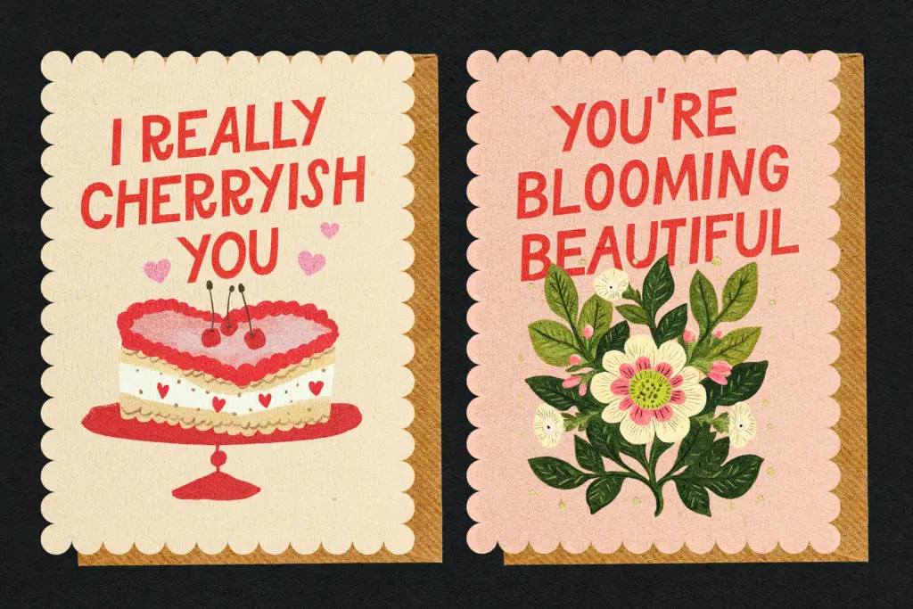
This is a font for short, shouty jobs: greeting cards, birthday invitations, packaging labels, party signage, kids’ branding, anything that needs to read as fun before it reads as anything else. The six-weight range gives some flexibility — Rounded styles for softer, baby-shower-adjacent work, Heavy for punchier logotype-style lockups, Medium as a middle ground when you need legibility without losing the quirk.
It’s not a font for body copy or long-form editorial work — the caps-only structure and irregular strokes make paragraphs tiring to read, and it will fight you if you try to use it for anything serious or corporate. Save it for headlines, single words, short taglines and display moments where the job is to grab attention for a second, not hold a reader’s focus for a paragraph. Pair it with a plain, quiet sans or serif for any supporting text, since Lucky Fish does not have a natural text-weight companion within its own family.
What we liked, and what we didn’t
Strengths
- Six weights give real range between soft rounded and blunt heavy styles
- Irregular strokes and terminals give it a hand-built, non-generic character
- Generous spacing keeps the wobbly letterforms legible even at small sizes
Trade-offs
- Caps-only structure makes it unsuitable for anything beyond short phrases
- No stated alternates or ligatures, so there's little room to customise beyond weight choice
Lucky Fish does one job well: loud, cheeky, all-caps display work for cards, packaging and party branding. It has no lowercase and no real text-weight companion, so its use is deliberately narrow. Buy it for headlines and short bursts, not for anything that needs to carry a paragraph.

Tmfonts writes independent reviews of typefaces: what each font does well, where it falls short, what it suits, and where it is sold.