
Belvare: a condensed retro serif built for headlines, not paragraphs
Design style
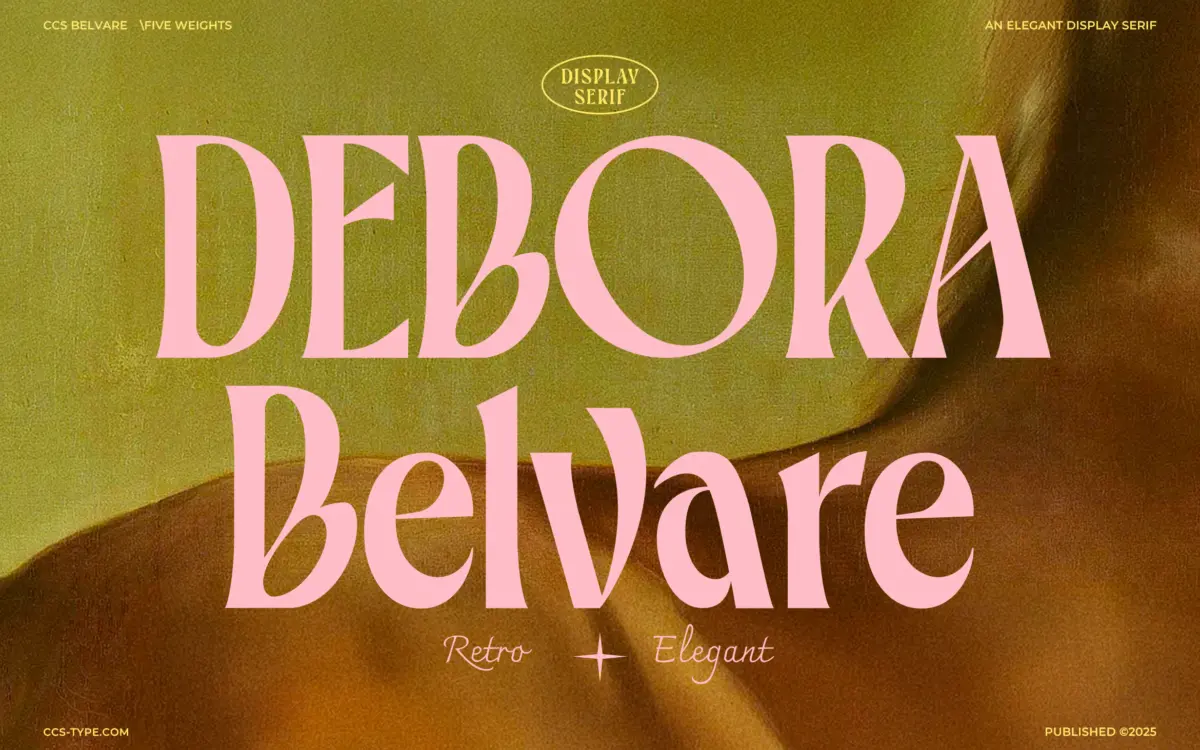
Belvare sits in that familiar seam between vintage advertising lettering and current editorial serif revival. The condensed proportions are the first thing you notice — glyphs are drawn narrow and tall, which gives the face a compressed, poster-like rhythm rather than the open, generous feel of a text serif. The rounded O and C are oversized relative to the rest of the lowercase, and that single decision does most of the work in giving Belvare its personality. It reads as friendly rather than austere, closer to a hand-cut sign than a formal book face.
The three weights — Light, Regular, Bold — track the same skeleton, so the character doesn’t shift much as you move up in weight; you’re mainly getting more ink on the same condensed frame. That’s useful for consistency across a layout, less useful if you were hoping Bold would open up or reinterpret any of the letterforms. The serifs themselves are modest, more bracketed nub than dramatic flourish, which keeps the retro references from tipping into pastiche.
Character set and features
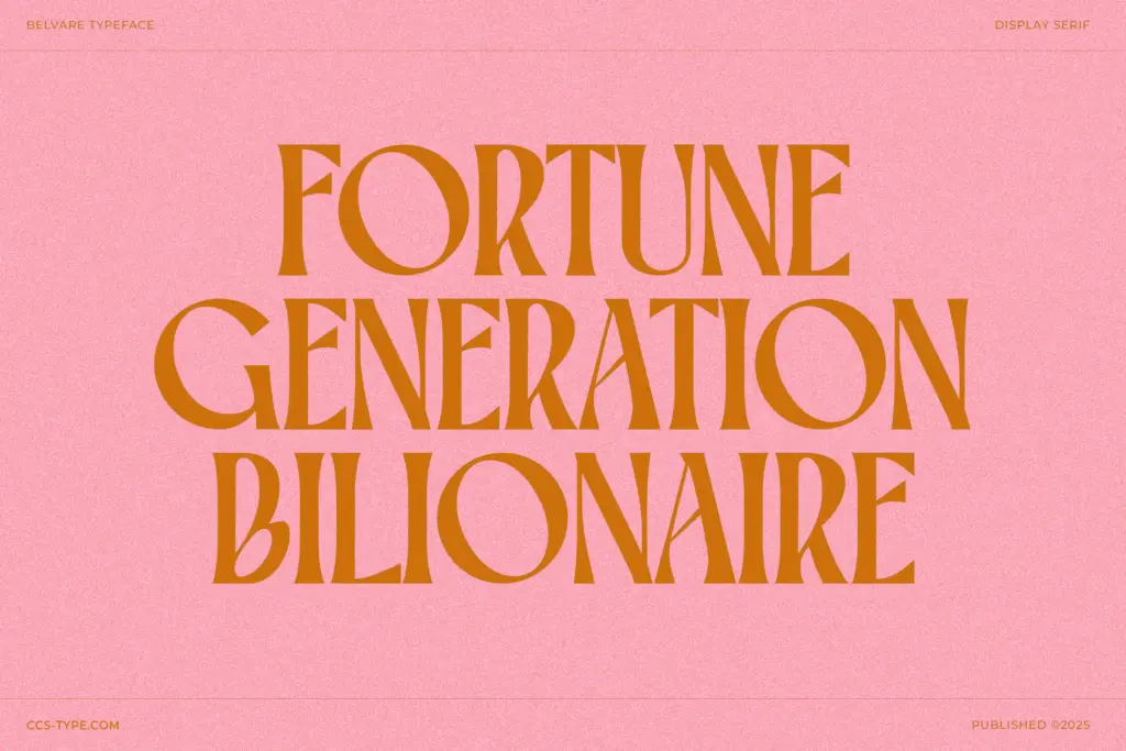
Belvare comes with stylistic alternates and ligatures, and they matter more here than in most serif families, because the base glyphs are distinctive enough that repetition across a headline can start to feel mechanical. Swapping in alternates for the rounded characters breaks that pattern and gives short lines of type more variation than the default set would suggest on its own. The multilingual support is a practical inclusion for anyone working outside a strictly English-language brief, though the brief doesn’t specify which language sets are covered, so check coverage against your own needs before committing to a project.
What Belvare doesn’t have is a wide stylistic range within the family — there’s no italic mentioned, and no expanded or extended companion to relieve the tightness of the condensed default. At small sizes, the combination of narrow counters and oversized round letters starts to work against legibility; the O and C in particular can crowd their neighbours when tracking isn’t opened up. This is a display font in temperament as well as in the seller’s own framing, and it behaves best when treated that way.
Use cases
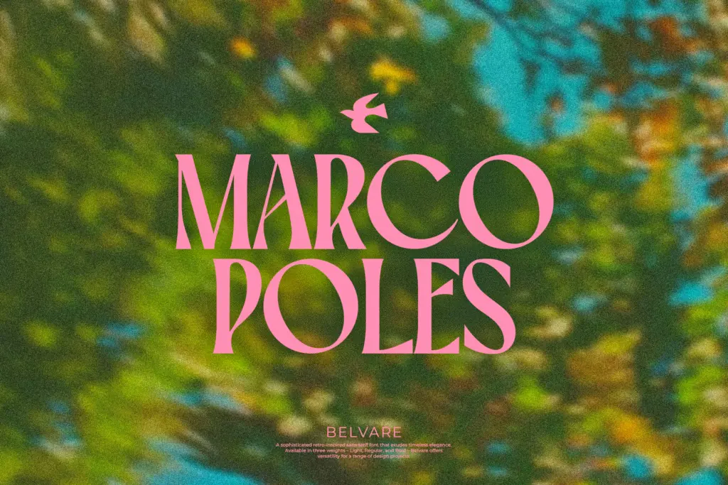
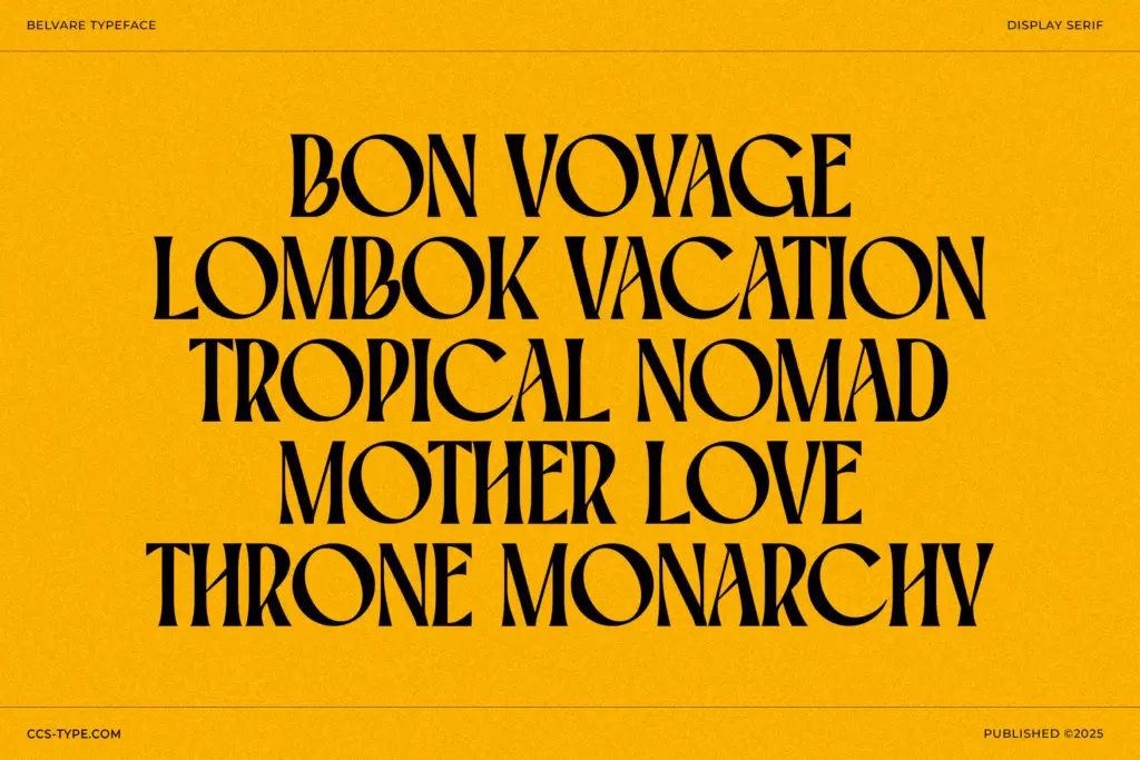
Headlines, packaging lockups, poster type, and short branding marks are where Belvare earns its keep. The retro condensed shape pairs naturally with the kind of magazine masthead or vintage-advert pastiche the seller’s own tagging gestures toward — editorial mastheads, retail signage, product labels with a nostalgic tone. Anywhere you need a handful of words to carry visual weight and a bit of period character, this does the job without much fuss.
It is not built for body copy or long-form setting; the condensed width and heavy round bowls will fatigue a reader well before a paragraph ends. Treat it as a headline-and-accent typeface, paired with a plainer working serif or sans for the supporting text, and it holds its retro charm without overstaying its welcome.
What we liked, and what we didn’t
Strengths
- Distinctive oversized rounded O and C give it an immediate, recognisable character
- Alternates and ligatures help break up repetition in short headline settings
- Consistent condensed rhythm makes it easy to slot into tight poster or masthead layouts
Trade-offs
- No italic or width variant, so the family has limited internal range
- Condensed proportions and heavy round counters hurt legibility below display sizes
Belvare is a confident, narrow-shouldered display serif with a strong retro accent, built entirely around its oversized round O and C. It does headline and branding work well but has no ambitions toward text setting, and the three weights don't add much variety beyond thickness.
Verdict

Tmfonts reviews typefaces in depth — every font is tested in real branding, editorial and screen layouts before a word gets written. 555+ fonts reviewed and counting.