
Royals Serif: a soft, rounded serif family for luxe branding headlines
Design style
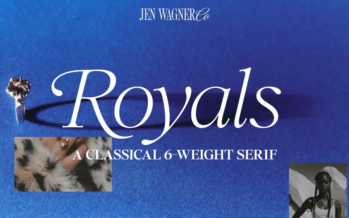
Royals Serif sits in the current wave of “editorial” serifs built for oversized display use rather than long-form reading. The cap serifs are rounded rather than bracketed, which softens the whole face and pulls it away from anything institutional or legal-looking. Curves in the bowls and terminals read as organic rather than geometric — nothing here is drawn with a compass. The italics carry that softness further: they lean gently rather than swagger, and pair with the uprights without fighting for attention.
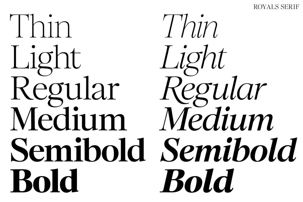
Across six weights, from Thin to Bold, the family holds its personality reasonably well, though the lighter weights lean delicate enough that they need generous point size and tracking to avoid looking thin and fragile on screen. The Bold weight is the most self-assured of the set — it’s where the rounded serifs actually get room to register as a design choice rather than disappear.
Character set and features
The set covers numbers, punctuation and Latin-based foreign language support, so multilingual European-language setting is workable, though this isn’t a face built for anything outside that range. The more interesting inclusions are the swash alternates on capital B, D, E, F, K, P and R — a modest but useful set that lets a headline or monogram pick up some flourish without going full script. Used sparingly, on a single initial cap, they do real work; used across a whole word, they’d fight the restraint the rest of the letterforms are going for.
The kerning alternates aimed at Canva users (pre-kerned combinations like “VA” or “Aw”) are a practical nod to how a lot of buyers of a font like this actually work — pasting text into a template rather than setting type in a professional layout app. It’s a small feature, but it addresses a real pain point for anyone using an app without proper kerning controls, rather than being a marketing bullet with no follow-through.
Use cases
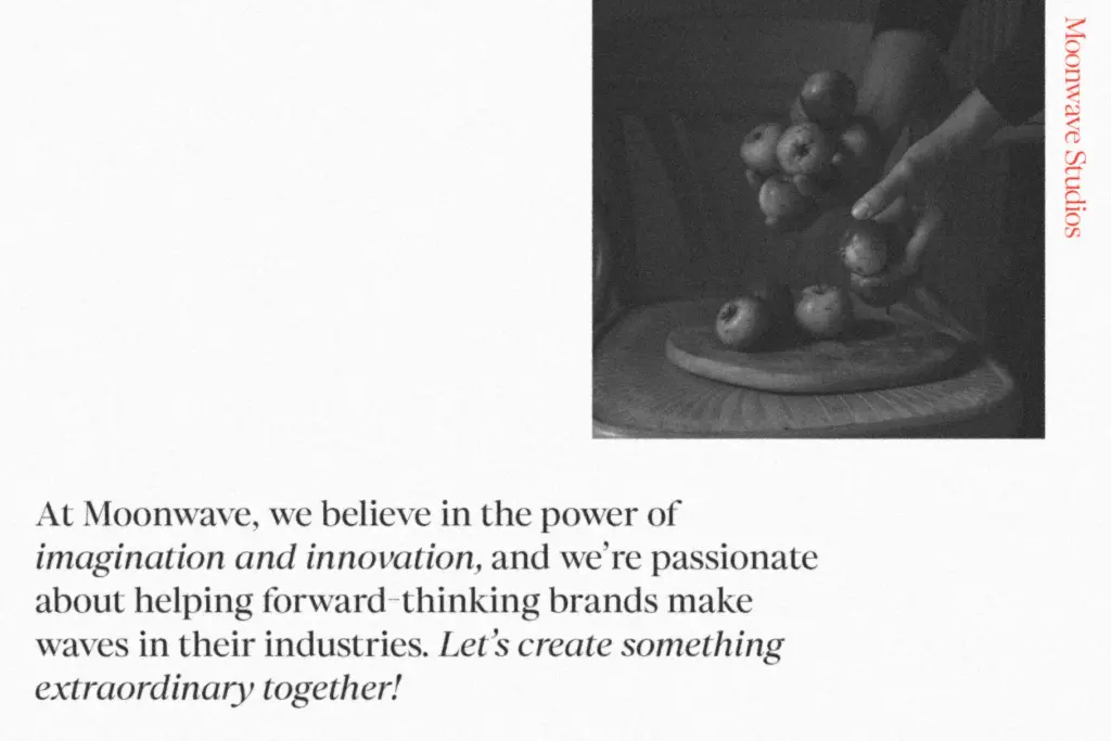
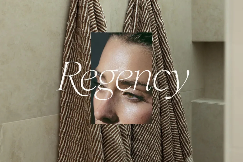
This is a display face first, and it should be treated that way. It’s built for large-scale headers, pull quotes, and short lines of branding copy — the sort of thing you’d see on a wedding suite, a packaging label, or an Instagram quote graphic. The romantic, refined character makes it a natural fit for beauty, hospitality, bridal, and lifestyle branding where a hint of old-world elegance is wanted without tipping into anything overtly ornate or gothic.
It is not a typeface for body copy. The rounded serifs and soft curves that make it distinctive at 60pt start to blur and lose definition at paragraph sizes, especially in the lighter weights. Keep it to headlines, logotypes, and short-form quote work, and let a plainer companion face carry the reading text. Within that scope — the
Verdict

Tmfonts reviews typefaces in depth — every font is tested in real branding, editorial and screen layouts before a word gets written. 555+ fonts reviewed and counting.