
Thistails Font Duo: a monoline script paired with a companion sans
Design style
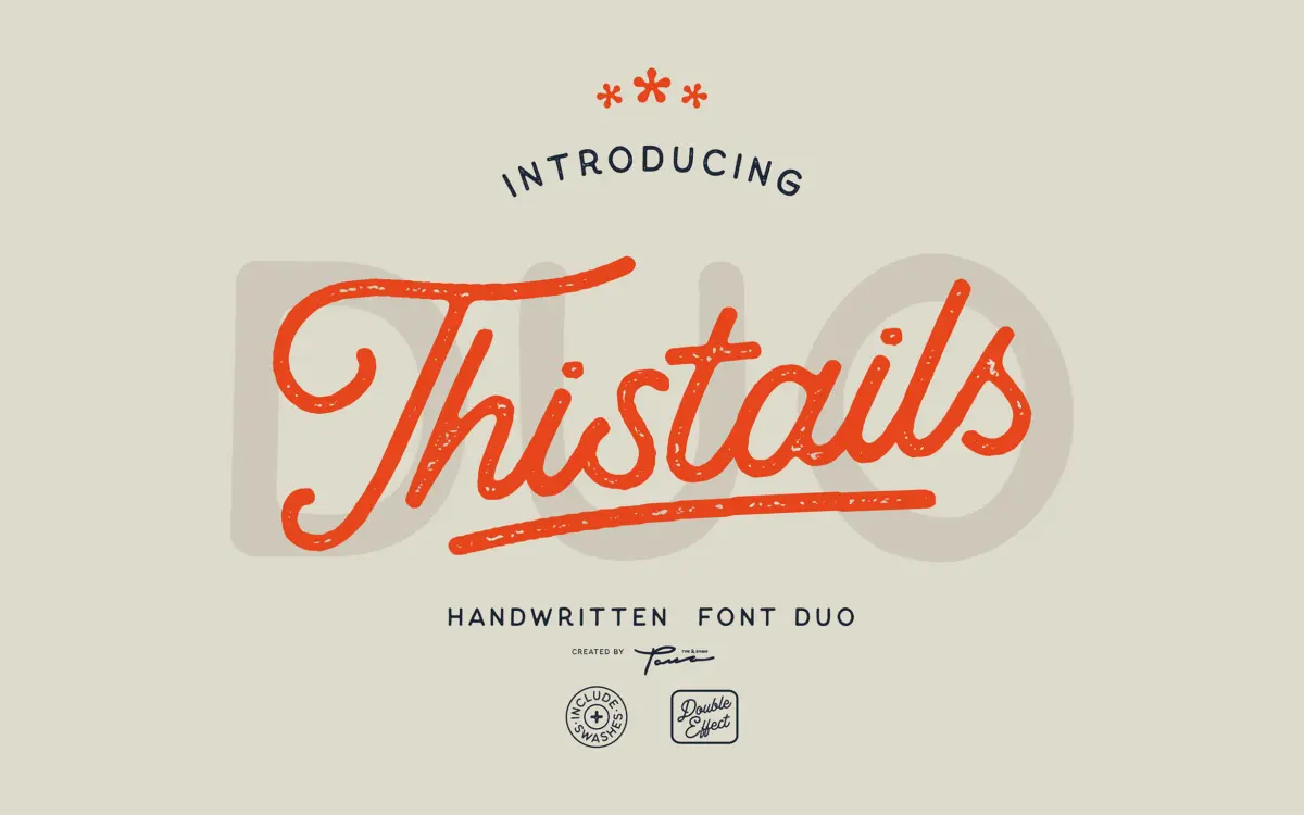
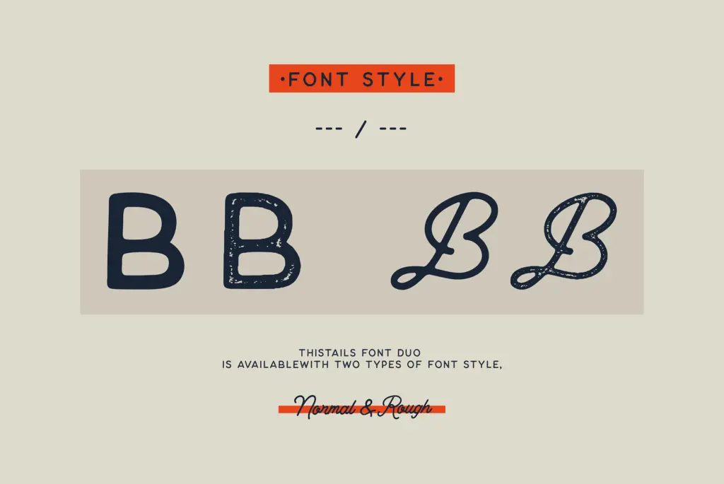
Thistails pairs a monoline script with a matching sans, each supplied in a clean version and a rougher, textured version. The script leans into a casual, hand-painted feel rather than formal calligraphy: strokes stay a single weight throughout, connections are loose, and letters tilt with a slightly irregular rhythm that reads as brush-drawn rather than ruled. The companion sans is plain and geometric by comparison, working as a quiet backdrop to the script’s movement.
The ‘Rough’ variants add a distressed edge — worn strokes, broken terminals — which pushes the pair toward a vintage, weathered look. It’s a familiar move in script duos aimed at the print-on-demand and craft market, and it’s executed competently here, though the roughing is fairly uniform across characters rather than feeling genuinely hand-textured letter by letter.
Character set and features
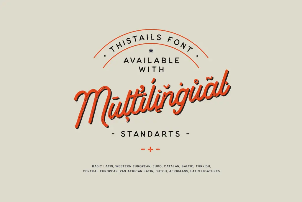
Each half of the duo covers the basics: upper and lowercase, numerals, and a set of swashes for flourished capitals or line endings. Stylistic sets and ligatures are included, which is what makes the connected feel of the script possible — without them the monoline strokes would look disjointed at the joins. The language support is broad for a script face, covering Western European diacritics along with Baltic, Turkish, and Pan African Latin sets, so it holds up for names and phrases beyond English.
The script’s monoline construction is both its strength and its limit. Because there’s no thick-thin contrast to guide the eye, legibility depends heavily on generous tracking and careful line breaks — cram the letters together and the swashes start to collide. The rough version needs even more room to breathe, since the broken edges of adjacent letters can visually merge at small sizes. This is a face built for short lines: a name, a word, a line of a quote. It is not drawn for setting paragraphs.
The sans companion is the more workaday of the two. It’s tidy and unremarkable, which is the point — it exists to carry information the script can’t, like addresses on an invitation or a tagline under a logotype. It won’t win attention on its own, but it doesn’t need to.
Use cases
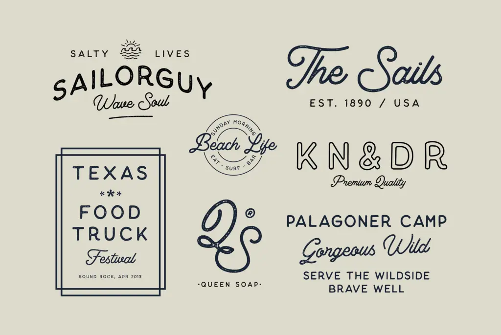
This duo is aimed squarely at the market it was built for: logotypes, packaging labels, t-shirt graphics, greeting cards, and quote graphics for social posts. The vintage-leaning rough version suits nature and outdoor branding, farmers’ market signage, and craft goods where a worn, hand-touched mark is the goal. The clean regular versions work better for wedding stationery and invitations, provided the script is used at display size — a title or a name — with the sans handling supporting text.
It’s less suited to anything requiring sustained reading or a highly polished, corporate finish; the looseness of the script and the plainness of the sans both signal handmade rather than refined. Designers wanting a script with more structural contrast or a sans with more character of its own will need to look elsewhere, but for quick branding and lettering jobs that call for a casual signature feel, Thistails does what it sets out to do.
What we liked, and what we didn’t
Strengths
- Ligatures and stylistic sets keep the monoline script's joins looking natural
- Broad Latin language coverage for a script typeface
- Sans companion gives the pair a practical, legible partner for supporting text
Trade-offs
- Monoline strokes and loose spacing mean it struggles at small sizes or in long lines
- The rough texture reads as applied uniformly rather than hand-varied letter to letter
Thistails does a competent job of the casual-vintage script-plus-sans formula, with useful swash and ligature support to keep the connections looking natural. It's built for short display use, not paragraphs, and the rough texturing is more uniform than genuinely handmade. A solid pick for logos, labels and quote graphics rather than anything requiring sustained reading.
Verdict

Tmfonts reviews typefaces in depth — every font is tested in real branding, editorial and screen layouts before a word gets written. 555+ fonts reviewed and counting.