
Whimsical Romance: a casual handwritten duo for wedding stationery
Design style
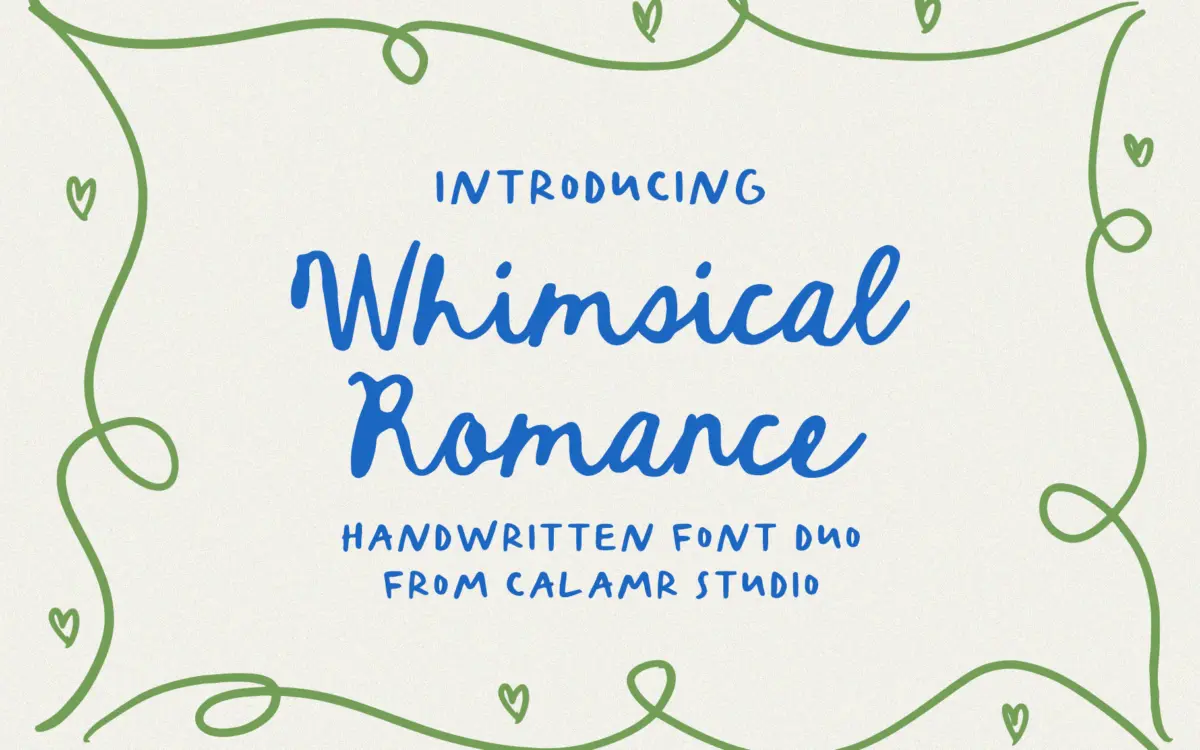
Whimsical Romance is built as a font duo, two related handwritten scripts meant to sit alongside each other on the same page rather than be used in isolation. The letterforms lean toward a loose, marker-and-pen quality rather than formal calligraphy: strokes vary in weight but not dramatically, and there’s a slight wobble to the baseline that reads as human rather than plotted. This puts it closer to a casual note than a bridal invitation suite drawn with a pointed pen.
The two weights in the duo appear to serve different jobs — one closer to a heading script with a bit more flourish, the other quieter and more suited to setting a line or two of supporting text. That division is useful in practice, since a single whimsical script asked to do everything from a monogram to a paragraph tends to fall apart at one end or the other.
Where the design earns its ‘whimsical’ tag is in the irregularity: letters don’t sit on a rigid baseline, and that’s clearly intentional rather than a flaw. It won’t suit anyone after a polished, symmetrical calligraphic look. It’s for the informal end of handmade.
Character set and features
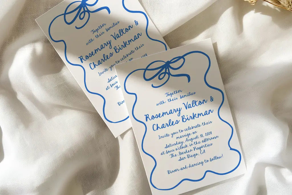
The set covers uppercase and lowercase basics, numerals, punctuation, and a handful of alternates and ligatures. That’s a workable foundation for short-form text — names, dates, single words — but it’s not a deep character set with swash variants for every letter or an extensive stylistic-set system. Anyone expecting to swap through dozens of contextual alternates will find the toolkit thinner than that.
The ligatures help smooth over the more awkward letter-pair collisions that handwritten scripts are prone to, and the alternates give some room to avoid repeating identical letterforms in a short phrase like a couple’s names. Beyond that, don’t expect much flexibility — this is a font built for a specific mood, not a flexible lettering system.
Because the character set is basic, language support beyond standard Latin characters should be checked before committing to a project with accented text; the brief doesn’t specify broader coverage, and scripts like this often stop short of full diacritic sets.
Use cases
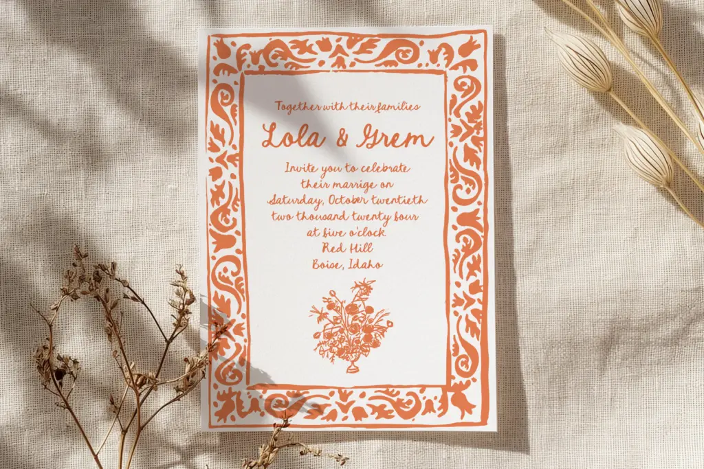
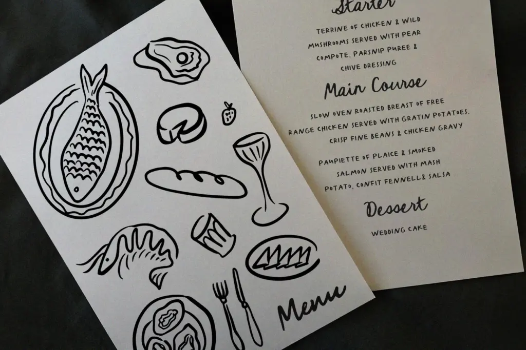
This pairing does its best work in short, curated pieces: a couple’s names on a save-the-date, a one-line quote on a menu card, a greeting on a social post. It’s suited to projects where the handwritten quality itself is the point — a wall print that wants to look personally lettered, an Instagram graphic that needs warmth rather than polish.
It’s less suited to anything requiring long-form setting. Handwritten scripts with this much stroke variation get tiring to read past a sentence or two, and the loose baseline that gives it charm at large display sizes becomes a legibility problem once you shrink it for body copy. Keep it to headlines, names, and short callouts, and pair it with a plain sans or serif for anything that needs to actually be read.
Branding use is possible but narrow — it fits businesses that want a handmade, approachable feel (a bakery, a florist, a small stationery brand) rather than anything aiming for precision or authority.
What we liked, and what we didn’t
Strengths
- Two complementary weights make heading-and-caption pairing straightforward
- Ligatures and alternates smooth over repeated letters in short phrases
- Loose, informal baseline gives it genuine handmade character rather than a polished calligraphic template look
Trade-offs
- Basic character set limits it to short-form text and simple layouts
- Irregular baseline that works at display size becomes harder to read once scaled down for body copy
Whimsical Romance is a competent, informal handwritten duo suited to short wedding-stationery text and casual social graphics. It doesn't have the depth of character set or refinement to carry longer text or formal branding, but for what it's built for — names, dates, short quotes — it does the job without fuss.
Verdict

Tmfonts reviews typefaces in depth — every font is tested in real branding, editorial and screen layouts before a word gets written. 555+ fonts reviewed and counting.