
Silk Serif: a high-contrast editorial serif for fashion and luxury branding
Design style
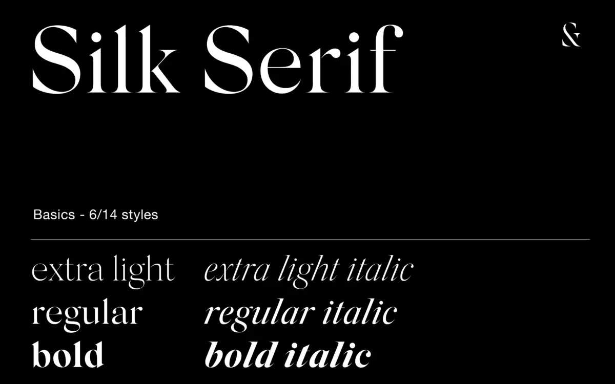
Silk Serif belongs to the current wave of high-contrast serifs built for fashion mastheads and premium packaging, but it has a couple of details that separate it from the pack. The most obvious is the disconnection between bowls and stems on letters like a, e, and g. The bowl sits close enough to the stem that at a glance the letter reads as joined, but look closer and there’s a gap — a thin sliver of white space that gives the letterforms a slightly open, breathing quality rather than the clenched look you get in stricter high-contrast designs.
The serifs are thin, pointy and heavily bracketed, which keeps them from looking fragile even as the strokes swing from hairline to substantial. Ball terminals show up on the right letters — the tails of a, the arm of r, the ear of g — and they’re restrained rather than decorative. Junctions throughout are bracketed too, which softens the transitions and keeps the whole family from feeling brittle. It’s a typeface with a clear point of view: refined, a little cool, built for spaces where contrast and negative space are doing rhetorical work.
Character set and features
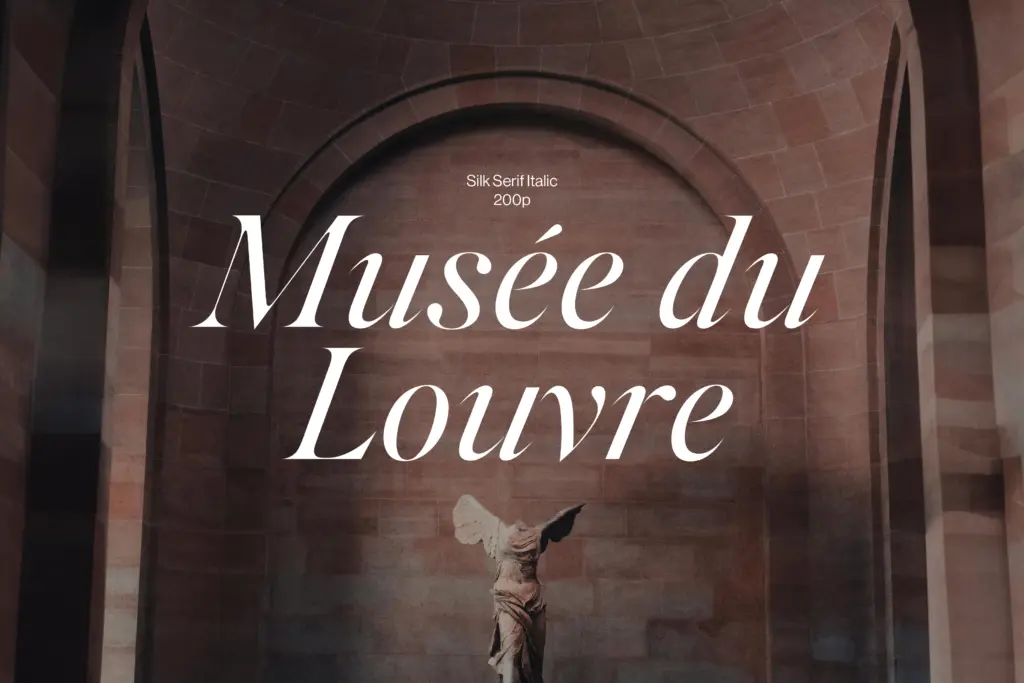
This particular package is the Basics tier of the Silk Serif family: six styles covering Extra Light, Regular and Bold, each with a matching true italic. That’s a deliberately narrow range compared to the full family, and it shows both the strength and the limit of the set. The three weights are spaced far enough apart to be genuinely useful — Extra Light is properly delicate, thin enough to disappear at small sizes, while Bold has real presence for headlines and logotypes. There’s no middle-weight step between Regular and Bold, so anyone wanting a Medium or Semibold for body copy in a longer editorial layout will find a gap.
The italics aren’t slanted romans; they’re drawn with their own rhythm, tighter apertures and a more cursive lean in letters like a and f, which is worth noting since a lot of
Verdict

Tmfonts reviews typefaces in depth — every font is tested in real branding, editorial and screen layouts before a word gets written. 555+ fonts reviewed and counting.