
Granada: an uppercase-only editorial serif for headlines and titling
Design style
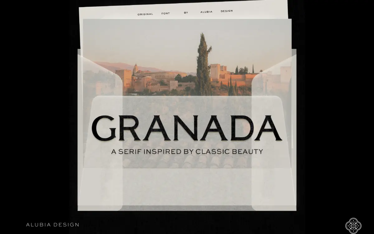
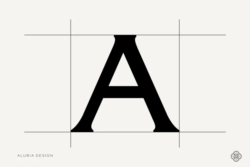
Granada is a high-contrast serif built for the top of a page rather than the body of one. The thick-thin transitions are pronounced but not exaggerated into a fashion-serif caricature; the modulation sits closer to a Didone-influenced editorial style than a wedding-stationery one. Hairline serifs meet the stems with a crispness that reads as confident on screen and would need care in print to avoid ink spread. The rhythm the seller mentions is real: letters like M, N and W carry enough width variation that a headline set in Granada doesn’t fall into a monotonous block, which is the usual failure mode of all-caps display serifs.
There’s a restraint here that keeps it from tipping into pastiche. It doesn’t lean on swashes or ornamental flourishes to signal luxury — the luxury, such as it is, comes from the contrast and the generous cap-height proportions. That’s a sensible choice for a typeface meant to sit above copy rather than compete with it.
Character set and features
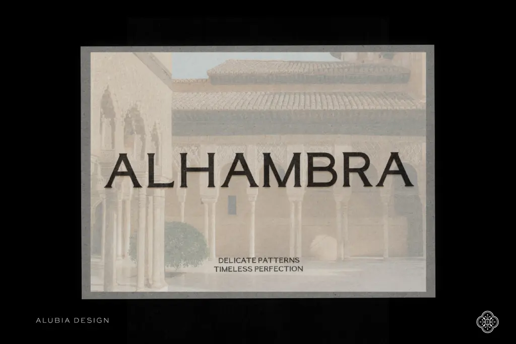
This is the part of the review where the limitations need stating plainly: Granada ships as uppercase and regular only. No lowercase, no bold, no italic. That’s not unusual for a display titling face, but it does mean you’re buying a single register of one weight, and the entire personality of the typeface has to be carried by capital letters alone. The set includes multilingual characters, numbers and punctuation, so it’s not a bare English-only alphabet — you can set headlines in several European languages without hunting for missing accents — but the absence of a lowercase means Granada can never function as a genuine text companion to itself. Anywhere you’d normally drop to sentence case for a subhead or a pull-quote, you’re either forced back into full caps or reaching for a different typeface entirely.
The numerals and punctuation appear to have been drawn with the same contrast logic as the caps, which keeps a set price or a dateline from looking like an afterthought bolted onto a titling face — a common problem with caps-only serifs where numerals default to something generic.
Use cases
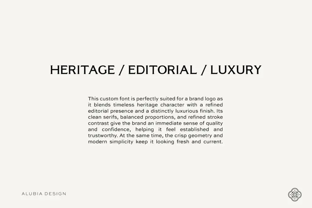
Granada’s obvious home is exactly where the name suggests: editorial mastheads, magazine cover lines, section headers, and the kind of pull-quote treatment where three or four words need to carry visual weight on a page otherwise set in a plain text face. It also works as a logotype candidate for brands chasing a heritage-meets-refined register — the kind of contrast that reads as considered rather than trendy. Packaging and label work in the same vein would suit it too, particularly where the brand name is short enough that all-caps setting doesn’t get unwieldy.
Where it won’t help is anywhere you need a lowercase register, an italic for emphasis, or a bold weight for hierarchy within the same family. Long headlines, subheads, and body copy will all need a separate typeface, so Granada is best treated as one voice in a pairing rather than a self-sufficient system. Buyers should go in expecting a titling accent, not a full working family.
What we liked, and what we didn’t
Strengths
- Strong, controlled contrast gives headlines real presence without tipping into pastiche
- Multilingual character support and punctuation extend beyond a bare English caps set
- Well-drawn numerals matched to the contrast logic rather than left generic
Trade-offs
- No lowercase means it can never carry body copy or casual subheads on its own
- Single regular weight with no bold or italic limits internal hierarchy options
Granada is a well-drawn contrast serif for headline and titling work, with a genuine sense of rhythm across its capitals. The catch is that it's caps-only, one weight, no italic — a single strong voice rather than a working family, so plan on pairing it with a text face for anything beyond short-form editorial use.
Verdict

Tmfonts reviews typefaces in depth — every font is tested in real branding, editorial and screen layouts before a word gets written. 555+ fonts reviewed and counting.