
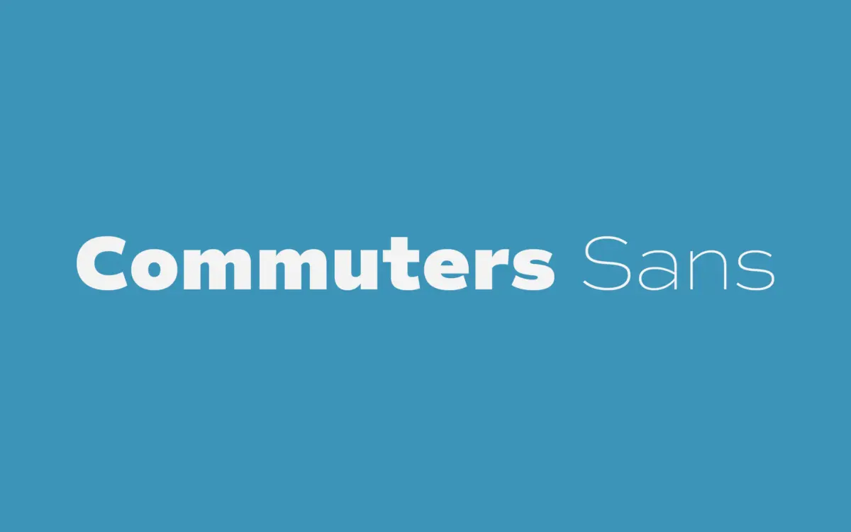
Commuters Sans: an eight-weight workhorse sans for editorial and everyday branding
Design style
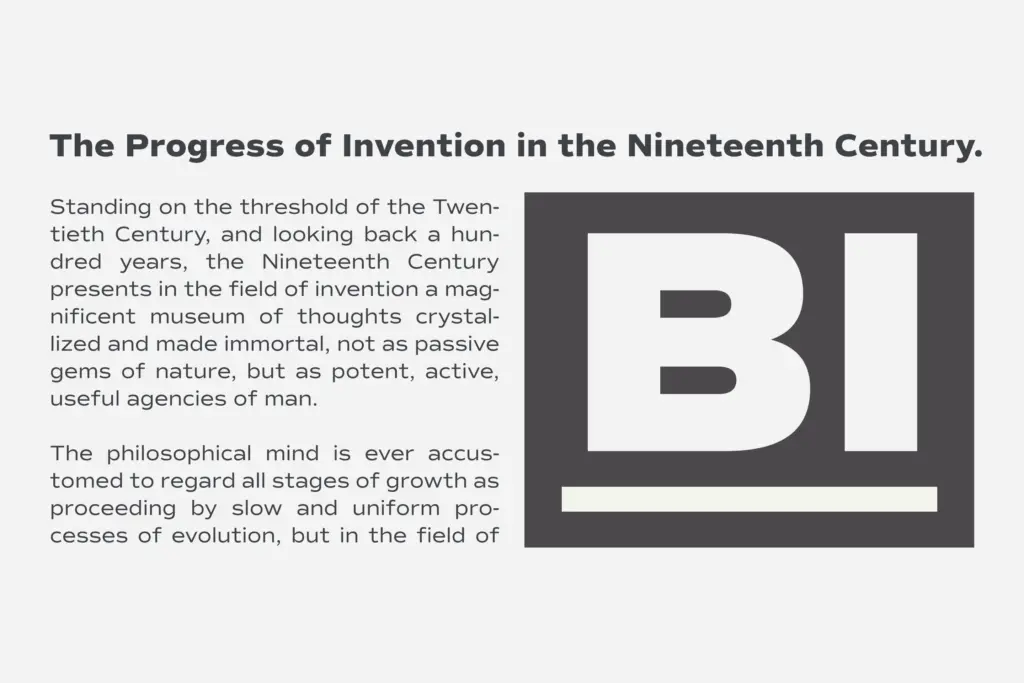
Commuters Sans sits in the geometric-humanist middle ground that a lot of contemporary sans families now occupy, but it doesn’t try to hide its debt to that territory. The proportions are slightly wider than you’d expect from a strict grotesque, which gives the lowercase a relaxed, unhurried rhythm rather than the clipped efficiency of something built for dense tabular work. Terminals are cut simply, apertures are open enough to keep counters from clogging at small sizes, and the overall skeleton reads as classic construction with modern trimming rather than a nostalgic revival or a hard geometric exercise.
What it doesn’t do is announce a strong personality. There’s no single letter here — no unusual ‘a’, no idiosyncratic ‘g’ — that would make you recognise the face in a lineup. That’s a deliberate trade for a typeface built to be used daily across a range of jobs, but designers looking for a sans with a distinct voice of its own will find Commuters Sans reticent rather than reserved.
Character set and features
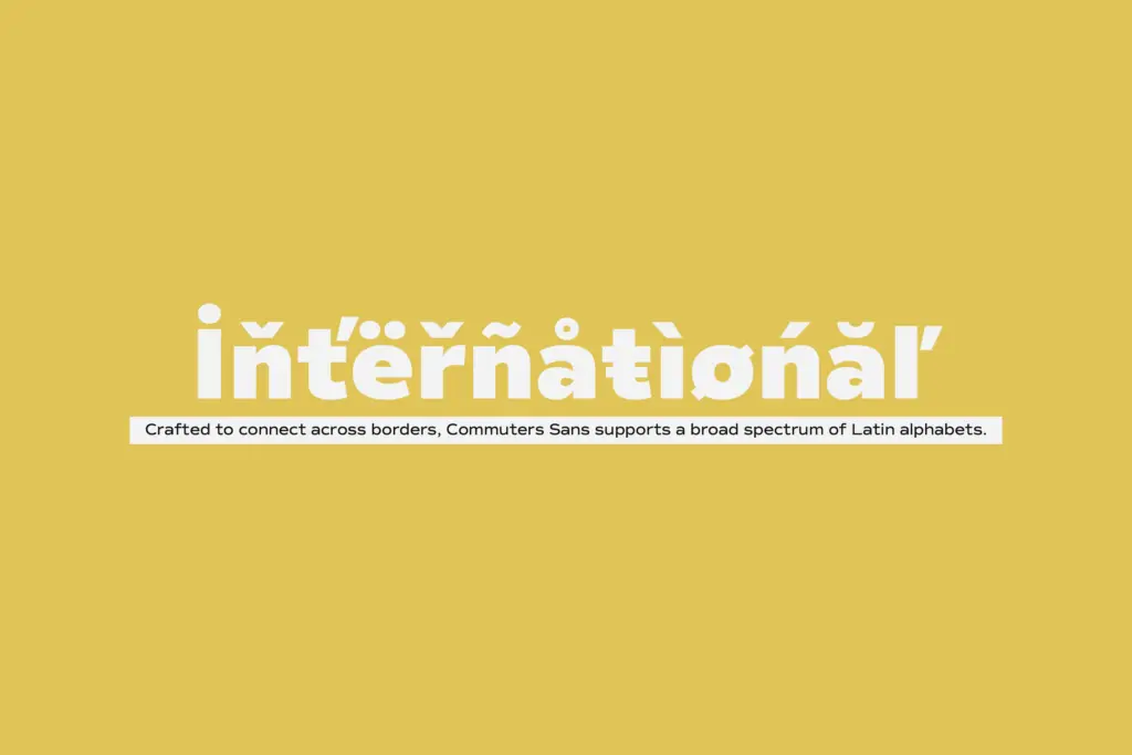
Eight weights with matching italics is a genuinely useful range, wide enough to build a hierarchy inside a single family without reaching for a second typeface. The claimed support across most Latin-based languages suggests the family was drawn with multilingual editorial and branding work in mind, which matters if you’re setting body copy that needs diacritics to sit comfortably rather than look bolted on. The italics, from what’s described, are matching rather than a true cursive construction — expect a slanted companion built for contrast and emphasis rather than a distinct secondary voice.
Nothing in the brief points to unusual OpenType features, alternate characters, or ligature sets beyond the standard family mechanics. This is a font built to do the basic job of type — set text, hold hierarchy, scale from caption to headline — rather than to supply a box of ornamental extras.
Use cases
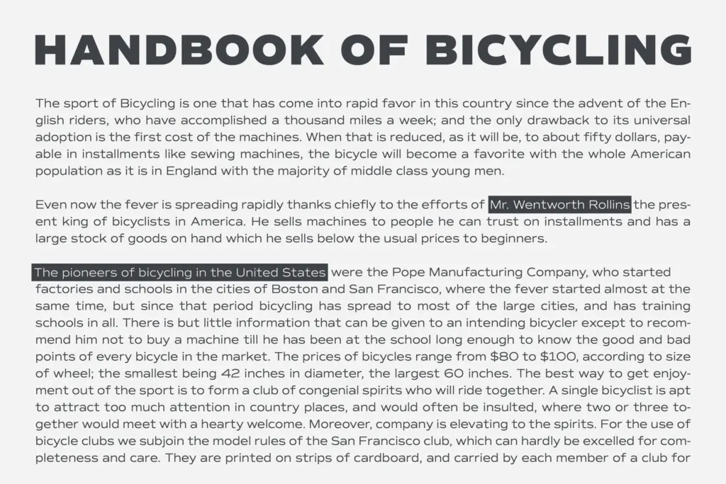
The stated use case, editorial and branding, tracks with what the letterforms suggest. At body text sizes the open counters and even rhythm should hold up in long-form reading, particularly with the lighter weights. In all caps, the slightly wide proportions give short lines — mastheads, logotypes, kickers — a steady, confident set without feeling cramped.
Eight weights make it a reasonable single-family solution for a brand system: light or regular for body copy, medium for subheads, bold or black for headlines and cover lines, with the italics reserved for emphasis or captions. It’s less suited to jobs that need a sans with real character — a poster headline that has to carry a project on typographic personality alone will find Commuters Sans too even-tempered. But for the everyday work the name promises — annual reports, editorial layouts, brand identities that need a dependable text-and-display pairing without a second typeface — it’s a sensible, well-built choice.
What we liked, and what we didn’t
Strengths
- Eight weights with matching italics give real hierarchy range within one family.
- Slightly wide proportions and open apertures keep it legible at body text sizes.
- Works comfortably in both all-caps titling and mixed-case long-form setting.
Trade-offs
- The letterforms are competent but neutral, with no distinctive character to anchor a brand identity.
- Matching italics appear to be slanted rather than a genuinely redrawn cursive companion.
Commuters Sans is a dependable, well-constructed sans built for daily editorial and branding work rather than for making a statement. It handles body text and titling competently across eight weights, but it won't be the typeface that gives a project a distinct voice.
Verdict

Tmfonts reviews typefaces in depth — every font is tested in real branding, editorial and screen layouts before a word gets written. 555+ fonts reviewed and counting.