
Storica: A Roman-Inspired Serif Family for Branding and Editorial Work
Design style
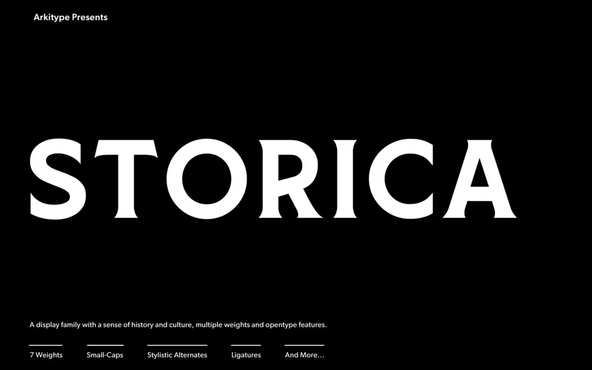
Storica draws on classical Roman letterforms, but it isn’t a strict revival. The serifs are sharp and slightly flared, giving each letter a carved, inscriptional quality without tipping into pastiche. Where it gets more interesting is in the range: seven weights span from a fine, almost hairline serif to a heavy weight with enough mass to anchor a cover or a bottle label. The two rough and hand-style variants of the heaviest weight are the real point of departure from a typical Roman revival. They introduce ink traps, uneven edges and slightly irregular strokes that read as worn stone or hand-cut signage, which gives the family a way to move from formal to weathered without switching typefaces entirely.
The core letterforms hold a consistent structure across weights, which matters more than it sounds. A lot of serif families lose their identity as they get heavier, the serifs blob out and the contrast collapses. Storica keeps its spur-like serif shape and axis intact from the lightest to the heaviest cut, so the family reads as one design rather than several unrelated ones bolted together.
Character set and features
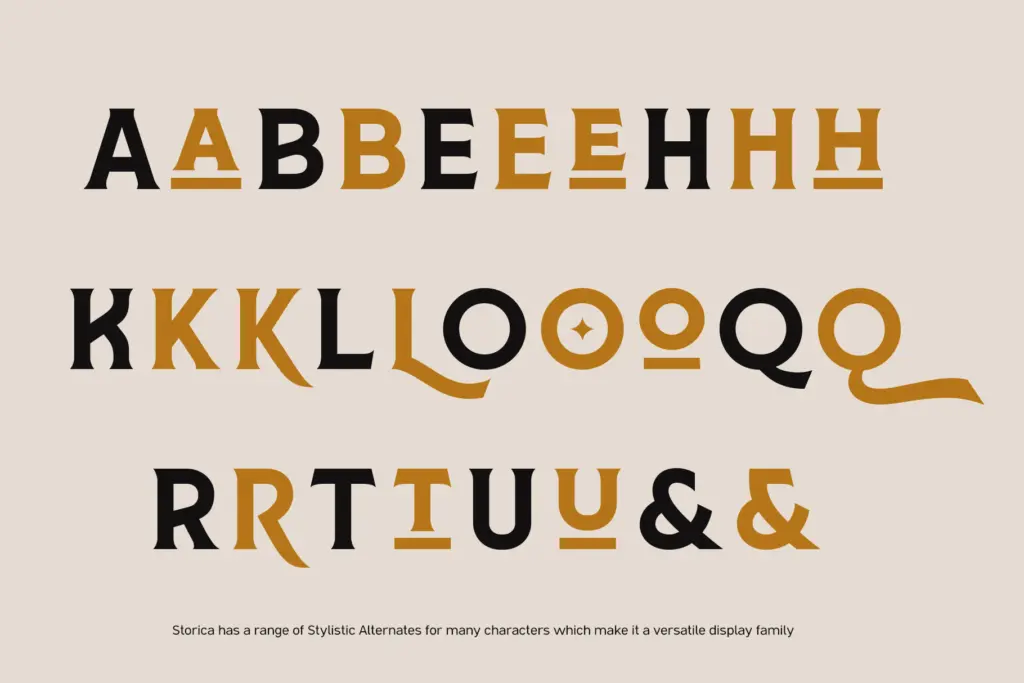
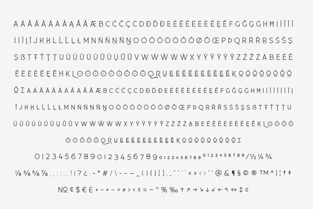
The OpenType feature set is generous: stylistic alternates, ligatures, small caps and old-style figures are all present, which gives a designer real room to vary a single word or headline without reaching for a second font. The alternates in particular are useful for logotypes, where a single swapped letterform can be the difference between generic and distinctive. Old-style figures are a welcome inclusion for anyone setting body copy or captions alongside the display sizes, since lining numerals tend to fight with a classical serif’s texture.
Language support is described as wide-ranging, which is worth noting if a project needs diacritics or non-English character coverage, though the exact scope should be checked against the specimen for a given job. As a display face first, Storica is built to be read in short bursts, headlines, wordmarks, cover type, rather than as a paragraph-setting text face, and the lighter weights show their serif detail best at larger sizes.
Use cases
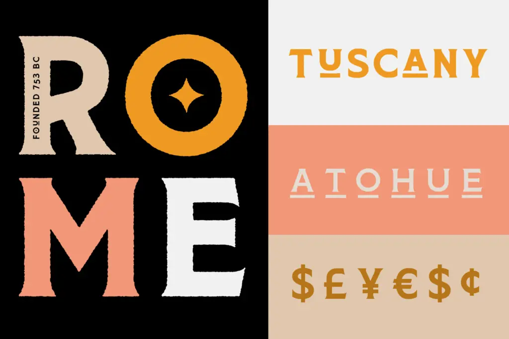
Storica’s natural home is branding work that wants some historical weight without going full antique: beer and spirits labels, packaging, and logotypes where the classical serif reads as credibility rather than nostalgia. The rough and hand versions extend that into craft and small-batch branding, where a slightly imperfect mark suggests something made rather than manufactured. On editorial covers and posters, the range of weights gives a designer enough contrast to build a hierarchy within a single family, a heavy weight for the title, a lighter cut for a subtitle or byline.
It is less suited to long-form text setting or interfaces, where its serif detail and display proportions would slow reading rather than help it. Used within its intended register, headlines, marks, short display copy, it does the job it was built for competently and with more range than most single-purpose display serifs offer.
What we liked, and what we didn’t
Strengths
- Consistent serif structure and axis held across all seven weights
- Rough and hand-style variants add a genuinely different texture, not just a filter effect
- Generous OpenType set with alternates, ligatures, small caps and old-style figures
Trade-offs
- Not built for body text or long-form reading, display use only
- Lighter weights need larger sizes to show their serif detail properly
Storica is a well-built classical display serif that earns its range through consistent structure across seven weights plus rough and hand variants. It's strongest in branding and packaging work where a carved, historical feel is wanted, and less useful for anything that needs to be read at length.
Verdict

Tmfonts reviews typefaces in depth — every font is tested in real branding, editorial and screen layouts before a word gets written. 555+ fonts reviewed and counting.