
Apostrophe: a distressed vintage serif for labels and rustic branding
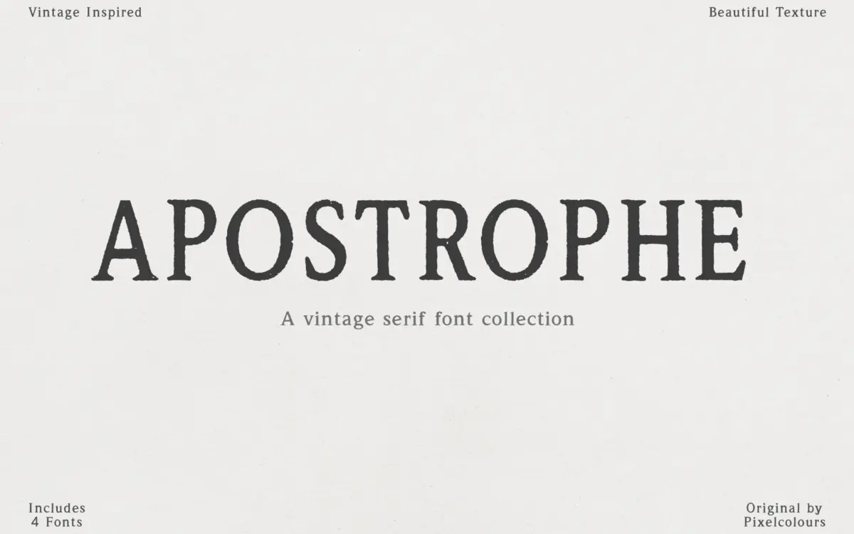
Design style
Apostrophe belongs to the well-worn genre of distressed serifs built to look like they came off a letterpress that’s seen better decades. The letters carry rough edges, broken strokes, and slightly worn terminals rather than crisp geometric contrast. It reads as antique-print pastiche: uneven ink coverage, a bit of wobble in the stems, and enough texture to suggest age rather than a clean revival of an old face. It’s not trying to be historically accurate to any particular period of printing — it’s a mood font, aiming for a general sense of nostalgia rather than the specific rigour of a Caslon or Clarendon reissue.
The texture is baked into the outlines rather than applied as a separate layer, which means it prints and scales as one clean vector object, no bitmap grain to worry about. That’s a practical advantage over some distressed fonts that rely on raster textures.
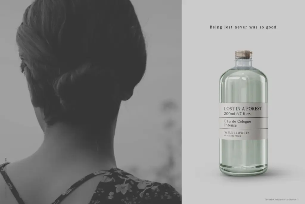
Character set and features
The family is built around four related styles: Regular, Spaced, Caps, and Caps Spaced. Regular and Spaced share the same letterforms with different tracking, useful for fitting body text or short labels without redrawing anything. Caps is the more distinctive piece — a separate, bolder, taller capital alphabet with its own uppercase and lowercase forms designed to be swapped in and mixed for a hand-set, non-uniform look. That’s a sensible approach for a vintage-label font: real antique typesetting rarely used a single consistent face, and having alternate caps built in saves the buyer from hunting for a second font to fake that effect.
Letters vary slightly in size and slant by design, which is the whole point of the

What we liked, and what we didn’t
Strengths
- Placeholder
Trade-offs
- Placeholder
Apostrophe delivers a convincing distressed vintage look for short-run branding and label work. It's not a workhorse text face, and the irregularity that gives it charm will fight legibility if you push it beyond headlines, badges, and short lines.", "tags":["vintage font","display font","retro font","branding design","font family","vintage style","serif font"],"category":"Serif","pros":["Built-in alternate capitals give a genuinely hand-set, non-uniform look without extra work.","Distressed texture is drawn into the outlines, so it stays sharp at any print size.","Spaced variants make it easy to reuse the same letterforms for both tight logotypes and looser text."],"cons":["The irregular baseline and worn strokes make it tiring to read in anything longer than a few words.","The look is a genre exercise rather than a distinct point of view, so it will sit close to many similar vintage serifs on the market."]}“`
Verdict

Tmfonts reviews typefaces in depth — every font is tested in real branding, editorial and screen layouts before a word gets written. 555+ fonts reviewed and counting.