
NT Seawave: a high-contrast serif for fashion and luxury branding
Design style
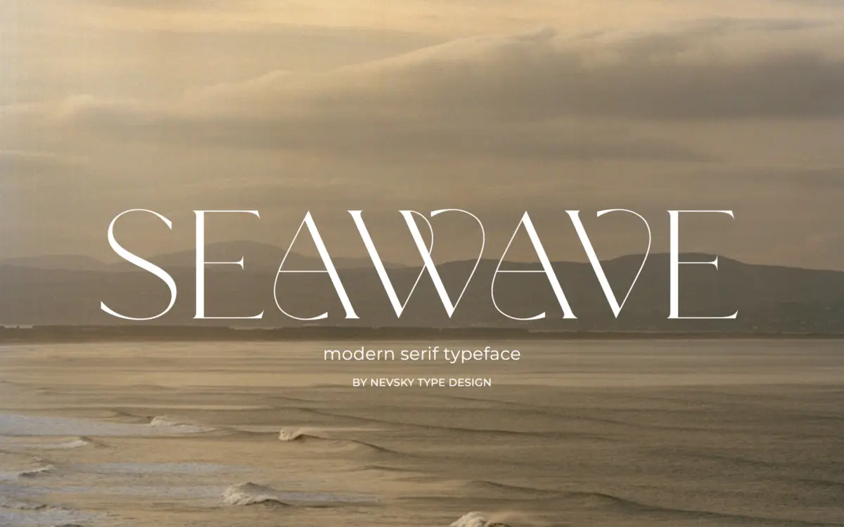
NT Seawave belongs to the family of high-contrast serifs that trace back to Didone models but push the contrast further toward the decorative end of the spectrum. The vertical stress is severe, thin strokes are hairline-thin, and the thick strokes are correspondingly heavy, which gives the letterforms a glossy, engraved quality rather than a workhorse text feel. Serifs are flat and unbracketed, meeting the stems at sharp angles, and the overall proportions lean tall and narrow. This is a display serif dressed up as a text serif, and it reads that way the moment you set more than a headline’s worth of copy.
The drawing is confident. Curves in the bowls of the ‘a’, ‘e’ and ‘g’ are even and the contrast transitions are handled cleanly, without the wobble that cheaper high-contrast fonts often show at the point where thin meets thick. There’s a fashion-editorial sensibility running through the whole set: it wants to sit next to a perfume bottle or a runway image, not next to a paragraph of body text.
Character set and features
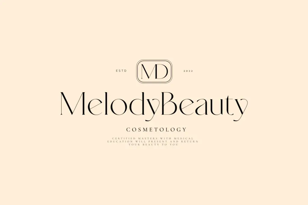
The seller states support for over 200 Latin-based languages, which suggests a broad diacritic set built out for international branding work rather than a narrow Western European character set. That’s a genuine practical advantage if your client list spans multiple markets, though buyers doing heavy multilingual work should still check specific accent combinations before committing, since broad claims don’t always cover every edge case cleanly. Numerals and punctuation follow the same high-contrast treatment as the lowercase, so figures in a price list or invitation will carry the same jewellery-like thinness as the letters around them, for better or worse depending on the size they’re set at.
There’s no indication of a script companion or a family of weights beyond the core cut, so this reads as a single-style release rather than a system with light, bold and italic options to lean on for hierarchy. Anyone wanting to build a full identity system from NT Seawave alone will need to do the weight and size work themselves, likely by pairing it with a plainer sans or slab for supporting text.
Use cases
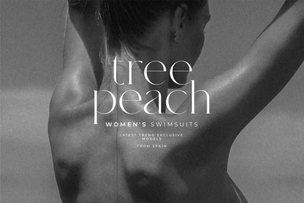
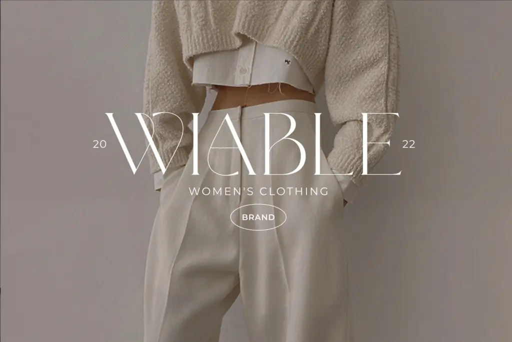
NT Seawave is built for headlines, logotypes, and packaging where a single line or short phrase needs to carry a lot of visual weight. Fashion branding, cosmetics packaging, wedding invitations, and magazine mastheads are the obvious fits — anywhere the brief calls for a luxury cue and the copy is short enough that the hairlines don’t disappear. At small sizes on screen, those thin strokes will vanish or flicker under anti-aliasing, so this is not a font for body copy, UI text, or anything that needs to survive a mobile viewport at 14px.
Used as intended — large, tracked out slightly, on a clean background with enough contrast between paper or screen and ink — it does the job it was drawn for. Treat it as a headline instrument, pair it with a quieter workhorse for the supporting text, and it will earn its place in a luxury identity kit.
What we liked, and what we didn’t
Strengths
- Sharp, evenly controlled contrast transitions that hold up at large display sizes
- Broad Latin diacritic support suited to international branding work
- Clear point of view suited to fashion, cosmetics and luxury packaging
Trade-offs
- Extreme stroke contrast makes it unreliable at small or body-copy sizes
- No visible weight range or family system to build hierarchy on its own
NT Seawave is a well-drawn high-contrast serif that does one job — luxury headlines and logotypes — very well, and almost nothing else. It's a strong pick for fashion and packaging work but needs a companion typeface for anything below display size.
Verdict

Tmfonts reviews typefaces in depth — every font is tested in real branding, editorial and screen layouts before a word gets written. 555+ fonts reviewed and counting.