
Northlake: a rounded rustic serif with ligatures for warm, worn branding
Design style
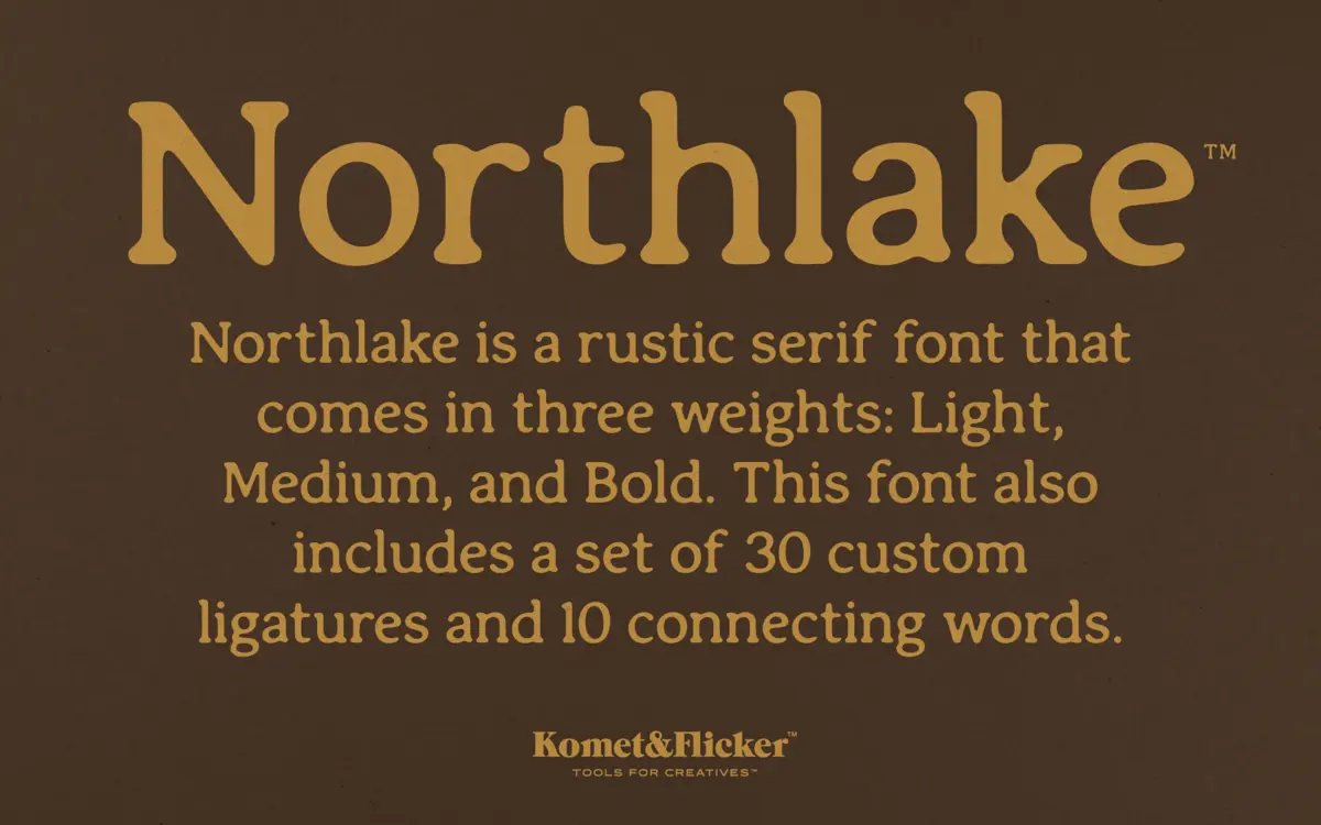
Northlake is a serif built for warmth rather than precision. Its edges are softened and rounded rather than sharp, and the serifs themselves have a stubby, slightly irregular quality that reads as hand-cut rather than drafted. This is the rustic-craft category doing what it does best: nothing here looks machined. Stroke contrast is moderate and consistent, so the face doesn’t lean into the high-contrast drama of a display serif — it settles instead into a sturdy, workmanlike rhythm. Three weights are included, Light, Medium and Bold, which gives the family a reasonable spread without pretending to be a full text system.
The overall feel sits closer to a hand-lettered sign than a printed book. Curves bulge slightly at their thickest points, terminals are rounded off rather than squared, and the whole lowercase has a slightly bouncy baseline feel when set in a headline. It’s a font with a specific mood — farmhouse, small-batch, artisanal — and it commits to that mood rather than hedging toward neutrality.
Character set and features
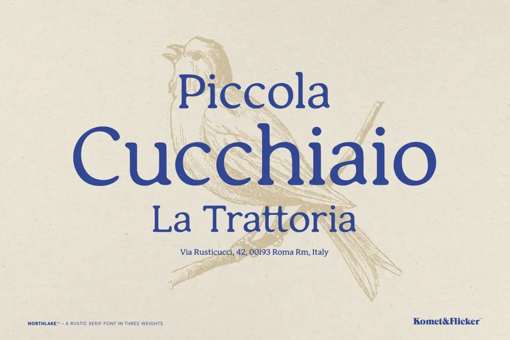
The standout functional element is the ligature set: thirty custom ligatures plus ten common connecting words such as “and,” “the” and “with.” These aren’t decorative flourishes bolted on afterward — they’re built to let letter pairs and short words merge into a single continuous stroke, which is exactly what a rustic script-adjacent serif needs to avoid looking like separate letters glued together. Used well, they give headline-length text a handwritten continuity that the base letterforms alone wouldn’t achieve.
That said, ligatures of this kind require some manual attention. You’ll want an OpenType-aware layout tool and a willingness to swap glyphs by hand when the automatic substitution doesn’t land the way you expect, especially with the connecting-word set, which only covers a handful of common words and won’t extend gracefully to arbitrary text. Treat it as a toolkit for short, curated phrases rather than a start-to-finish text feature.
Use cases
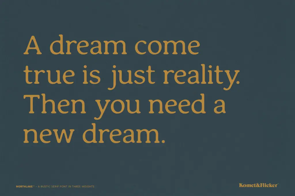
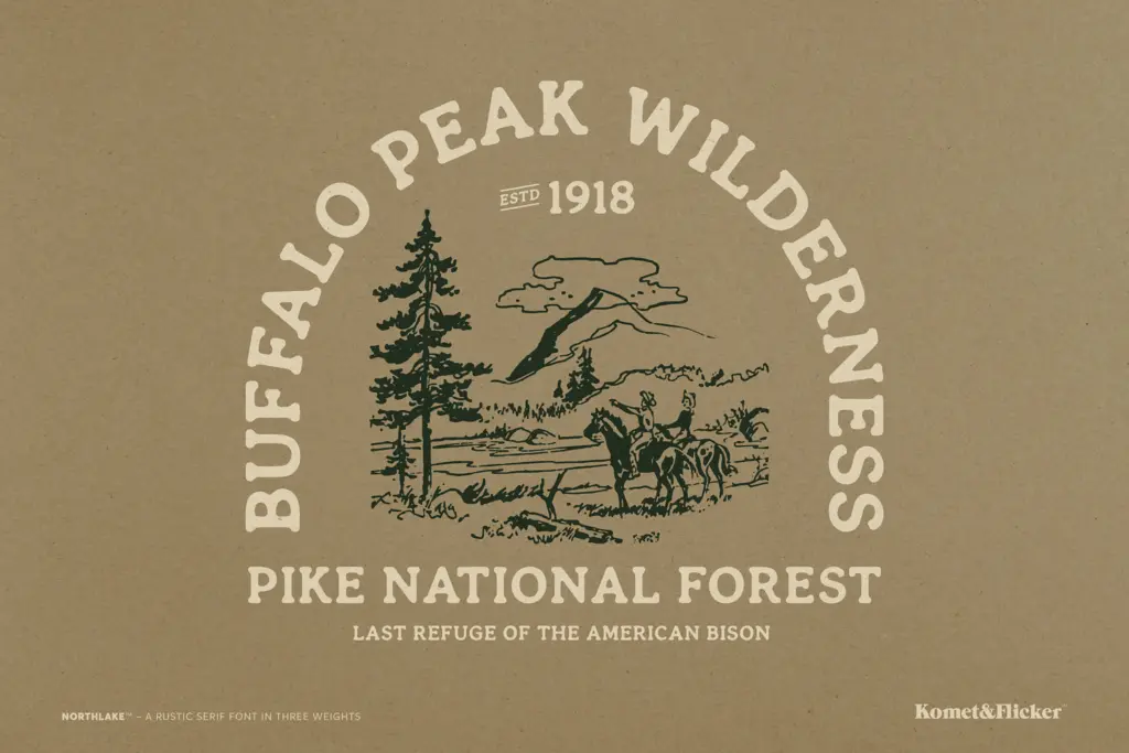
Northlake is happiest in short bursts: logotypes, packaging headers, signage, menu headers, and the kind of branding work that wants to suggest heritage, craft or the outdoors without going full antique. The rounded serifs and connecting ligatures make it a natural fit for food and drink labelling, farm-to-table branding, outdoor gear, and small-batch product packaging — anywhere the brief calls for
What we liked, and what we didn’t
Strengths
- The rounded serifs and soft terminals give it a consistent, believable handmade feel across all three weights.
- Thirty custom ligatures plus ten connecting-word glyphs add genuine continuity to short phrases rather than just decoration.
- Three weights (Light, Medium, Bold) give enough range for a simple headline hierarchy without overcomplicating the family.
Trade-offs
- Legibility softens at small sizes because the rounded, bouncy forms lose crispness below headline scale.
- The ligature and connecting-word set covers only common cases, so longer or unusual text needs manual glyph substitution.
Northlake does one thing well: it makes short, branded text feel handmade and warm. It's not built for long-form reading and the ligature system asks for some manual setup, but for headline and packaging work in the rustic-craft space it delivers real character.
Verdict

Tmfonts reviews typefaces in depth — every font is tested in real branding, editorial and screen layouts before a word gets written. 555+ fonts reviewed and counting.