
Tomato Pasta Font Free Download
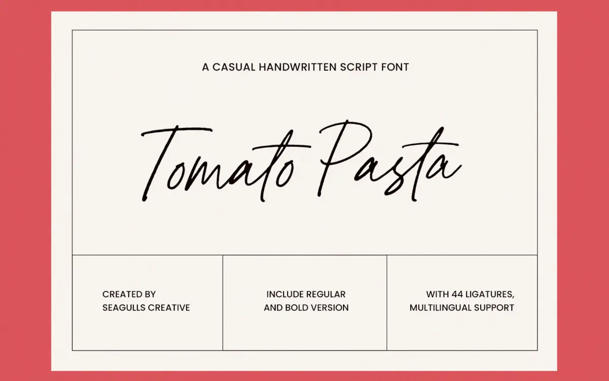
Is Tomato Pasta free to download?
Tomato Pasta is a commercial font sold on Creative Market, so the full version needs a paid license. Get it from the official listing: Tomato Pasta font download.
Need something free? These handwritten fonts from Google Fonts are free for personal and commercial use:
Design style
Tomato Pasta is a loose, marker-style handwritten script, the kind meant to look like it was dashed off with a brush pen in one sitting. The letters lean slightly, baselines bounce a little from character to character, and the strokes keep a fairly even weight rather than chasing heavy contrast. That evenness is what gives it its casual, unforced feel — nothing here is trying to look formal or engraved.
Where it departs from the generic brush-script crowd is in its informality: joins are loose rather than continuous, so it reads more as confident handwriting than as a calligraphic performance. The Regular and Bold weights don’t change the personality much, just the stroke thickness, which keeps the font’s voice consistent whether you need a whisper or a shout.
It’s a font with a clear, limited ambition. It isn’t trying to be an elegant wedding script or a historicist revival. It’s closer to the quick, friendly note scrawled on a packaging label or a social graphic, and it does that one thing reasonably well.
Character set and features
The set covers letters, numbers, punctuation and a run of ligatures, along with symbols you’d expect in a commercial script. The ligatures are worth testing before you commit to a layout — in handwritten fonts like this they’re often what separates a believable word from a string of disconnected glyphs, smoothing over awkward letter combinations that would otherwise look mechanical.
Multilingual support is included, which widens its reach beyond basic Latin text, though as with any handwritten font you’ll want to check specific accented characters in your own language before relying on it for body copy.
The two weights are a practical inclusion rather than a dramatic range. Don’t expect a condensed, italic, or display-only cut here — this is a single script idea executed at two intensities, not a full family built for complex hierarchy.
Use cases
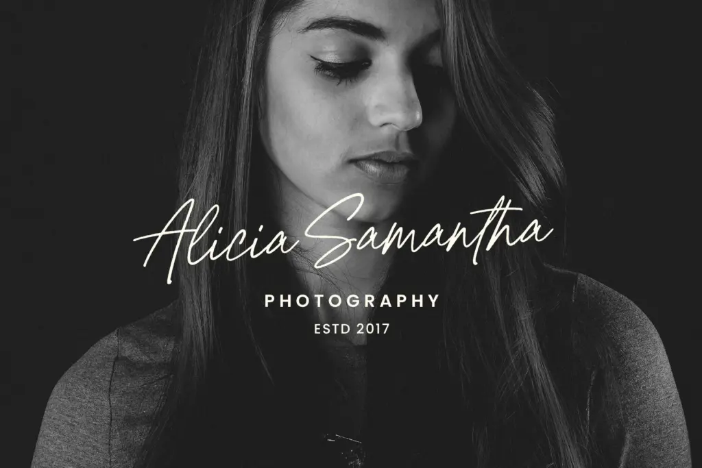
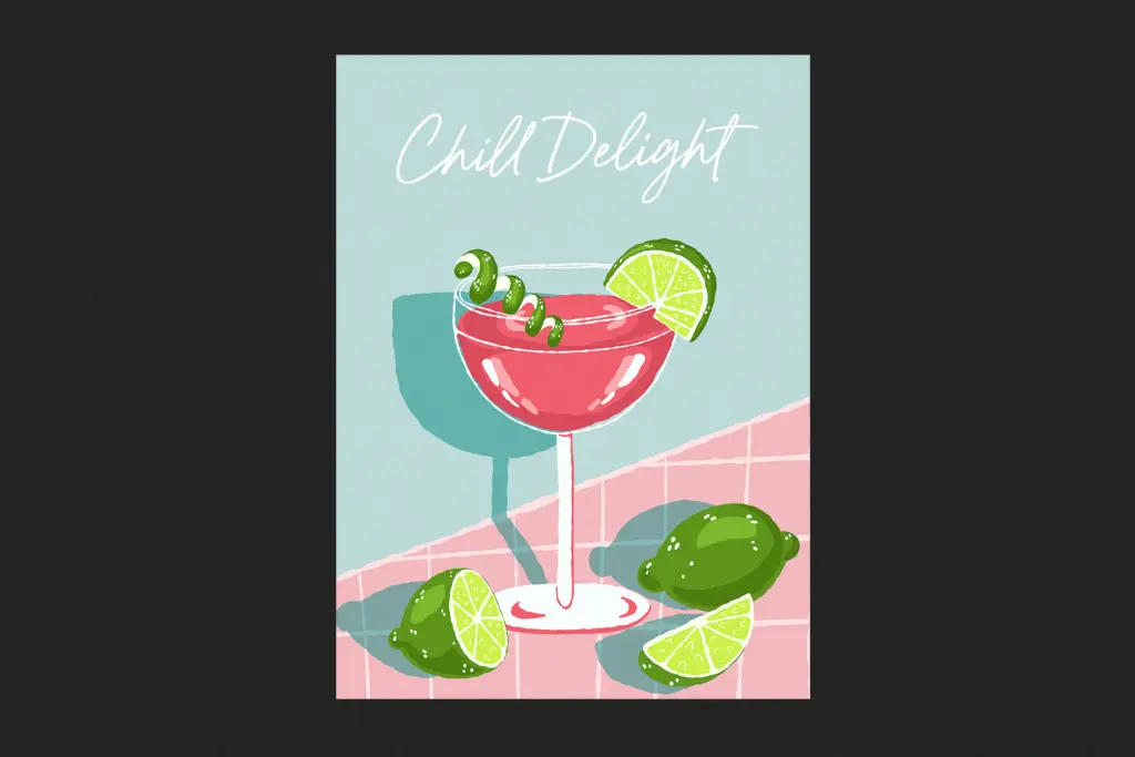
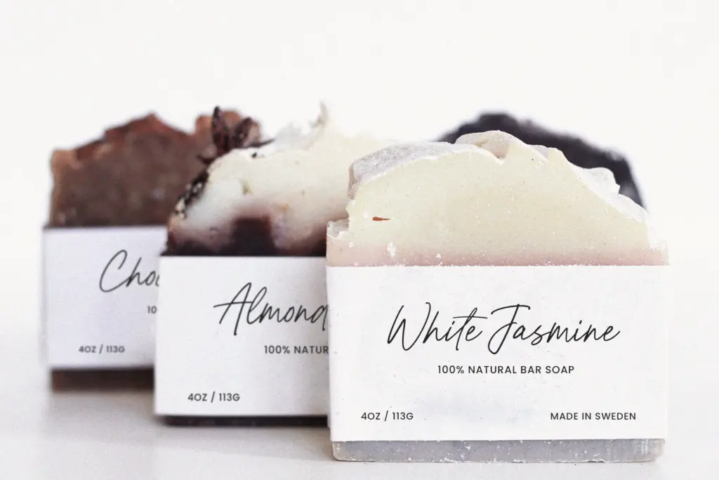
This font sits most comfortably in short bursts: a logotype, a product label, a quote card for social media, a line of copy on packaging. Anywhere you want the appearance of a human hand without the fuss of true hand-lettering, it does the job efficiently.
It’s less suited to long passages. Handwritten scripts like this tire the eye quickly at paragraph length, and the irregular baseline that reads as charming in a headline becomes a legibility headache across several lines. Keep it to short phrases, names, or single words and it holds up; push it into body text and it starts to work against you.
For wedding stationery or anything requiring real elegance, it’s worth being honest that Tomato Pasta’s casual tone isn’t the right register — it reads as friendly rather than formal, a note on a coffee cup rather than an engraved invitation. But for branding, packaging, and quick social content, where the brief calls for warmth and informality rather than polish, it does a straightforward, dependable job.
What we liked, and what we didn’t
Strengths
- Even stroke weight keeps the casual tone consistent across both weights
- Ligatures help smooth over awkward letter joins in short words
- Multilingual support extends its use beyond basic Latin text
Trade-offs
- Bouncing baseline becomes fatiguing and illegible at paragraph length
- Only two weights with no structural variation limits layout flexibility
Tomato Pasta does one job competently: a casual, hand-drawn voice for short branding and social copy. It isn't versatile enough for formal invitations or long-form text, but within its lane it's a reliable, unpretentious script.

Tmfonts writes independent reviews of typefaces: what each font does well, where it falls short, what it suits, and where it is sold.