
Prosecco and Baguette Font Free Download
Is Prosecco and Baguette free to download?
Prosecco and Baguette is a commercial font sold on Creative Market, so the full version needs a paid license. Get it from the official listing: Prosecco and Baguette font download.
Need something free? These handwritten fonts from Google Fonts are free for personal and commercial use:
Design style
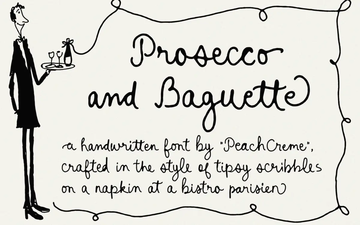
Prosecco and Baguette reads as exactly what it claims to be: a casual scribble rather than a formal calligraphic script. The strokes are uneven in weight, the baseline wanders slightly, and the letters lean into an unpolished, handheld quality rather than the smooth, continuous-pen look of most commercial scripts. Where a lot of handwritten fonts try to disguise their construction, this one leaves the seams visible on purpose — you can see the pen lifts, the slightly rushed connections, the places where a stroke thins out because the hand pressed less hard. That’s the point of it.
It sits closer to the “anti-bride” end of the script spectrum than the elegant end. There’s no attempt at refinement here, and that’s a deliberate stylistic choice rather than a shortcoming. If you’re after a script that looks considered and formal, this isn’t it. If you want something that looks like a note scrawled on a napkin at a wine bar, it does that convincingly.
Character set and features
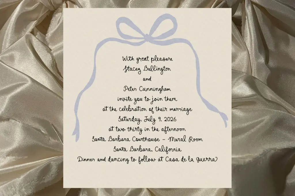
The headline feature is the ligature set — 168 of them, built to vary how letters connect so that repeated words don’t look stamped out of the same mould. Alongside that, every lowercase letter has beginning and ending alternates, each with its own swash, so the start and finish of a word can shift in character even within a single line of text. This is the kind of groundwork that takes real patience to draw, and it shows: words set with OpenType features active look genuinely varied rather than recycled.
The trade-off is that none of this works without a layout application that supports OpenType ligatures and contextual alternates. Drop the font into something that doesn’t read those features and you’ll get a far flatter, more repetitive result than the specimen images promise. Designers working in Illustrator, InDesign or Photoshop with the right panels open will get the full effect; anyone pasting text into a basic web builder or office app may not.
There’s no mention of extended language support or a variable axis, so treat this as a single-weight script built for Latin-alphabet setting, best approached with the expectation that most of its character comes from manual glyph substitution rather than automatic smartness.
Use cases
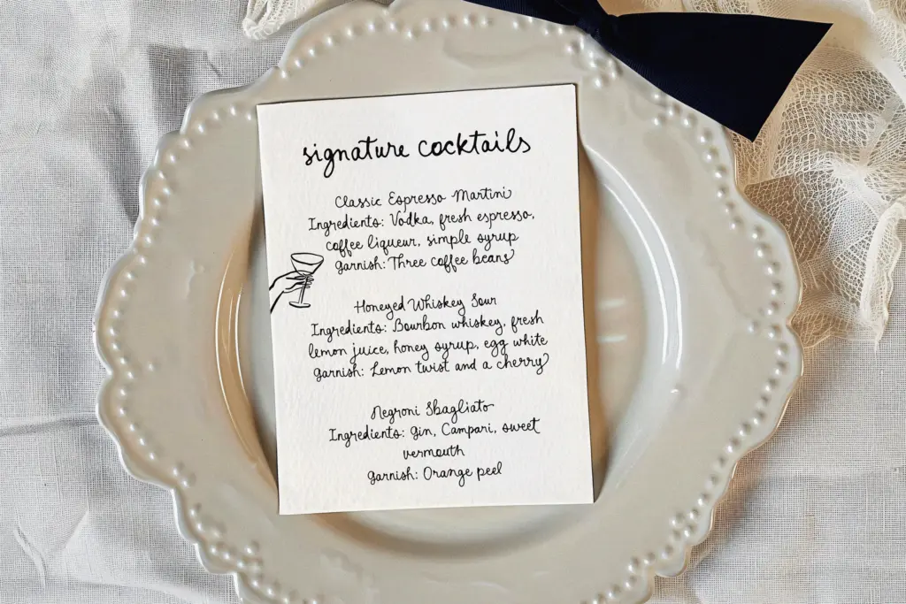
This is a short-text font — a word or two, a name, a logotype, a line on a label. The scribbled irregularity that makes it charming at display size would become fatiguing and hard to track across a paragraph, so it isn’t a candidate for body copy or long-form editorial work. Think packaging for something small-batch and informal, a wine or food label that wants to look handwritten rather than designed, a logo for a casual café or bakery, or a greeting card that’s going for warmth over polish.
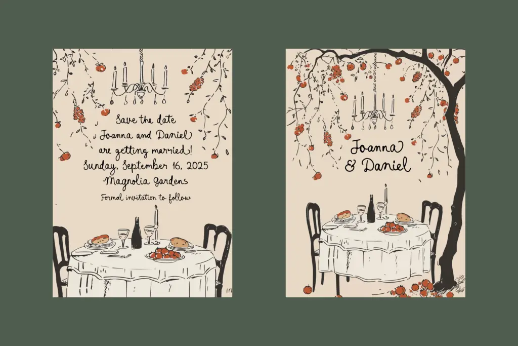
It also suits the growing market for wedding stationery that deliberately avoids looking like wedding stationery — save-the-dates and invitations for couples who want informality over elegance. Pair it with a plain, quiet sans or serif for any supporting text, since this script needs calm surroundings to read as intentional rather than messy.
What we liked, and what we didn’t
Strengths
- 168 ligatures and per-letter swash alternates give real variation across repeated words
- The deliberately uneven, scribbled quality reads as honestly informal rather than falsely tidy
- Well suited to anti-bride wedding stationery and casual food or drink packaging
Trade-offs
- Needs an application with full OpenType support to look as varied as intended
- Not legible or comfortable for anything beyond a word or short phrase
Prosecco and Baguette commits fully to an unpolished, scribbled handwritten look, and the ligature and alternate system is genuinely deep. It's a short-text, display-only tool that depends on OpenType support to show its best side, so it rewards designers who know how to activate it and frustrates those who don't.

Tmfonts writes independent reviews of typefaces: what each font does well, where it falls short, what it suits, and where it is sold.