
Miss Noteworthy Font Free Download
Is Miss Noteworthy free to download?
Miss Noteworthy is a commercial font sold on Creative Market, so the full version needs a paid license. Get it from the official listing: Miss Noteworthy font download.
Need something free? These script fonts from Google Fonts are free for personal and commercial use:
Design style
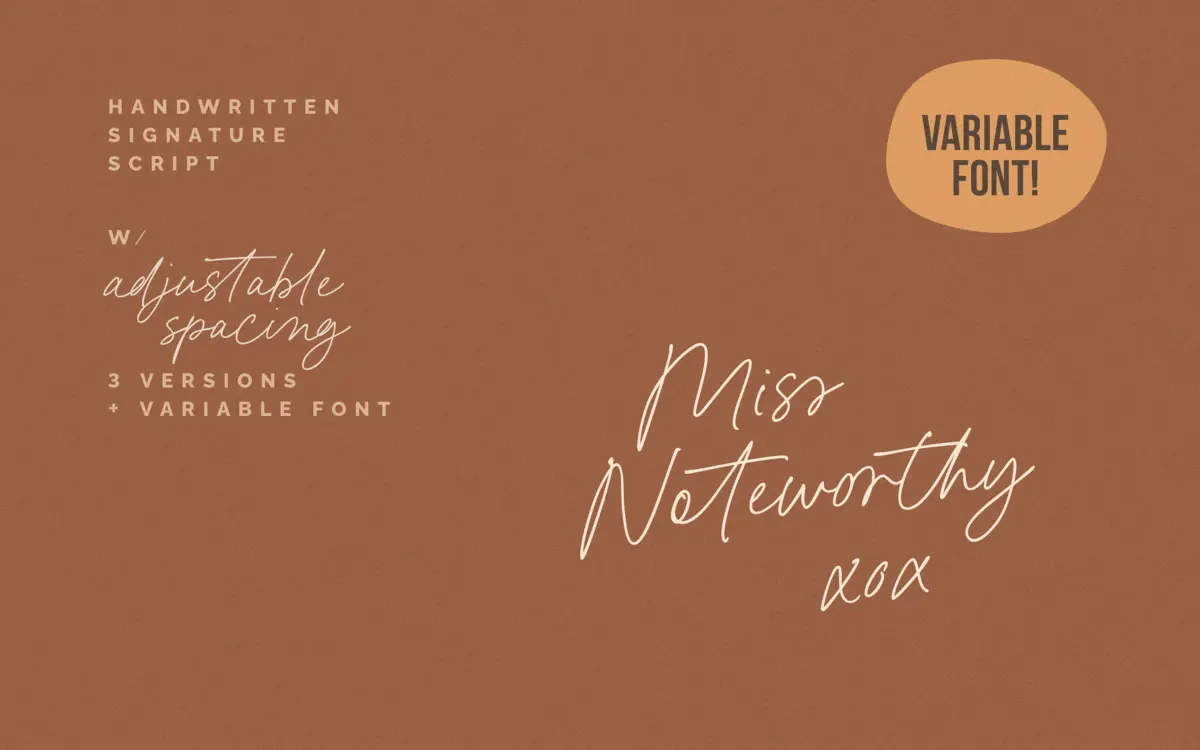
Miss Noteworthy sits in the luxe signature-script category: a single-weight, connected cursive with a light touch and a slight forward lean. The strokes are thin and consistent, closer to a fine pen than a brush, which gives it that glossy, cosmetics-label look rather than the looser feel of a felt-tip diary hand. Letters join continuously, as signature scripts do, and the baseline wanders just enough to read as handwritten rather than mechanically repeated. It’s a style built for restraint — this isn’t a font with flourishes competing for attention, it’s one that’s meant to sit quietly under a logotype or beside a product name and look expensive doing it.
Character set and features
The headline feature here is the variable axis controlling tracking. Rather than just stretching letterforms apart, the design keeps connecting strokes meeting their neighbours correctly across the whole range from Dense to Loose, which is a genuinely useful piece of engineering for a connected script — most scripts break at the joins the moment you touch tracking. In apps without variable font support, three static instances cover the same ground reasonably well, and those come PUA-encoded so the 145 ligatures are reachable without an OpenType-savvy layout engine. That ligature count matters more in a script than in a text face: it’s what keeps repeated letter pairs from looking stamped out, and 145 is enough to get meaningful variation through common combinations without the font needing constant manual swapping. Language coverage is broad, running through most of the Latin-script European languages, so there’s little risk of hitting unsupported accented characters in European-market work. A handful of extra decorative characters round out the set for flourish-hunters, though they read as a bonus rather than the main event.

Use cases
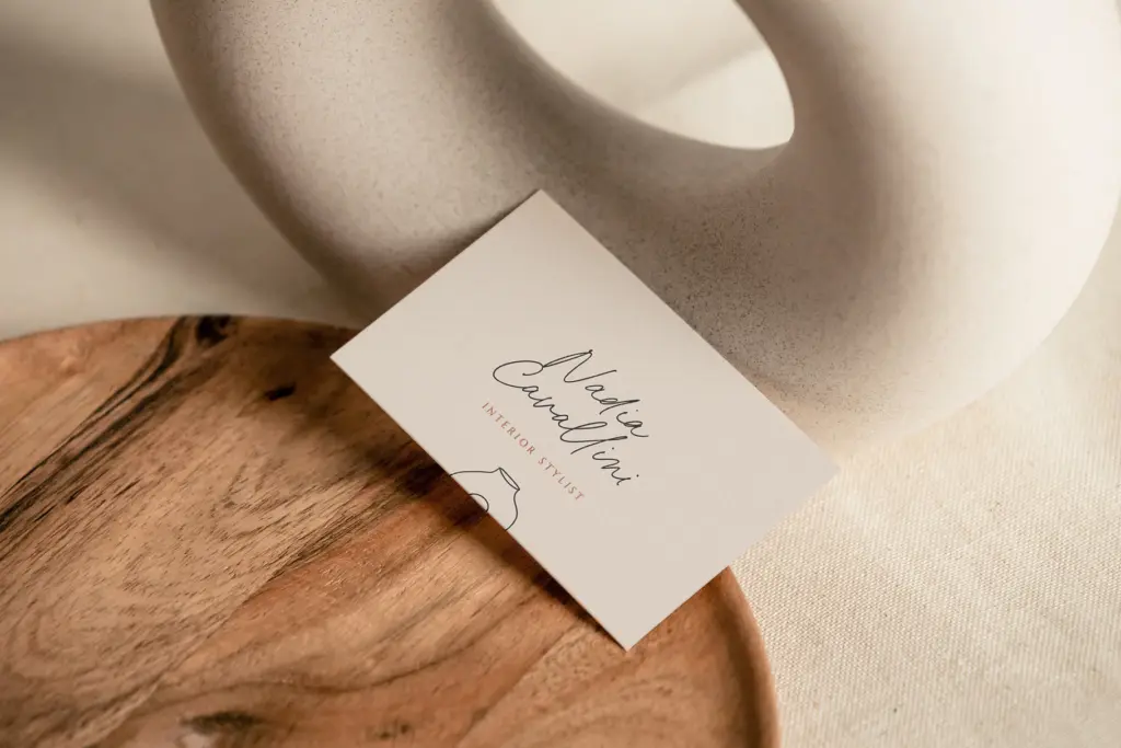
This is a font for moments, not paragraphs. It’s drawn for logotypes, signature-style wordmarks, packaging accents, invitation lettering and the kind of social graphic that needs one elegant line of script over a product photo. The variable tracking is the feature that actually changes how you’d use it day to day: tightening a word to fit a narrow label, or loosening a short phrase to fill a wide banner, without the usual script-font problem of strokes drifting apart or overlapping. At small sizes the fine strokes thin out and can lose crispness on screen or in low-resolution print, so this wants generous sizing rather than being squeezed into a caption. It also isn’t built for continuous reading — connected scripts rarely are — so keep it to short lines, names, and single words doing a styling job rather than carrying a paragraph of copy. Anyone building a beauty, fashion, or boutique food brand that wants a handwritten signature feel without the font falling apart when tracking gets adjusted will find this does that one job cleanly.

What we liked, and what we didn’t
Strengths
- Variable tracking axis keeps connected strokes meeting correctly across the whole spacing range
- 145 ligatures give repeated letter combinations real variation instead of looking stamped
- Broad European language support makes it usable across many Latin-script markets
Trade-offs
- Fine strokes lose crispness at small sizes or low resolution
- Not suited to continuous text — short lines and single words only
Miss Noteworthy is a well-made signature script whose variable tracking axis solves a real problem scripts usually have when you adjust spacing. It's best treated as a short-line, logo-and-label font rather than anything meant to carry body text, and its fine strokes want size to stay crisp.

Tmfonts writes independent reviews of typefaces: what each font does well, where it falls short, what it suits, and where it is sold.