
Carefree Font Free Download
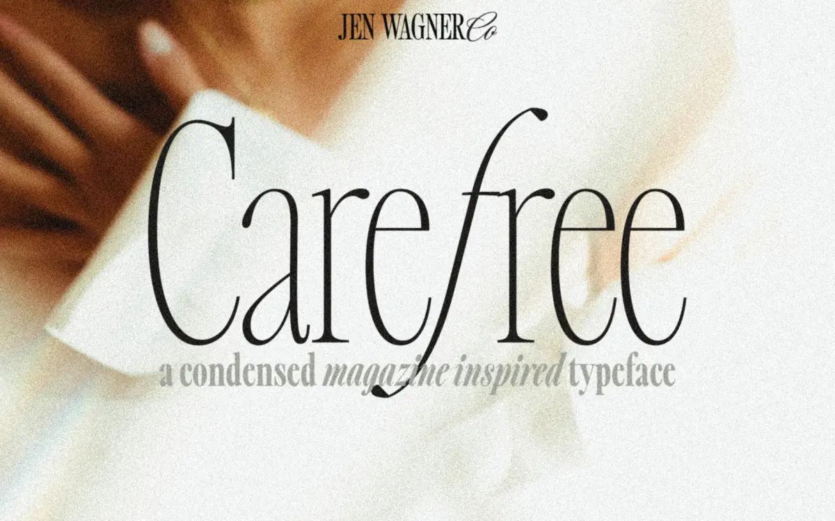
Is Carefree free to download?
Carefree is a commercial font sold on Creative Market, so the full version needs a paid license. Get it from the official listing: Carefree font download.
Need something free? These serif fonts from Google Fonts are free for personal and commercial use:
Design style
Carefree is a condensed serif built around sharp, angled italics, with the family expanded out to eight weights in roman and matching italics. The condensing is the first thing you notice: letters sit narrow and upright, which gives the family a tight vertical rhythm that reads as confident rather than cramped. Contrast is high across the whole range, from the hairline weight where strokes nearly disappear to the bold where the thicks turn almost slab-like against the thins. That swing in contrast is what gives the family its personality, but it’s also what limits where it can work.
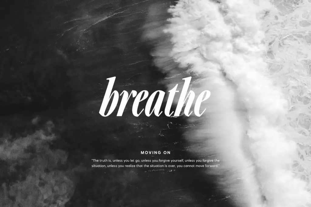
The italics are the more interesting half of this family. They lean hard, with serifs that sharpen into small spurs rather than curling into brackets, giving them a slightly brittle, cut-paper look. Mixed with the upright roman weights, the italics add a feminine, editorial flourish without tipping into script territory. It’s a font designed to be combined with itself — regular against italic, light against bold — more than to be used as a single static style.
Character set and features
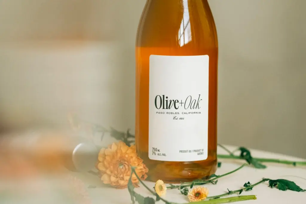
Across the sixteen fonts you get the expected range of weights from hairline to bold, each with a companion italic, plus alternate characters for some letters. The spacing has been set generously by default, intended for clean reading at display sizes rather than the tight, overlapping look associated with trendy all-caps lockups. If you want that tighter aesthetic — the kind used in a lot of branding mockups — you’ll need to dial the tracking down yourself; the font doesn’t arrive pre-set for it. That’s a reasonable choice on the designer’s part, but worth knowing before you start setting type and wondering why it looks looser than reference images you’ve seen.
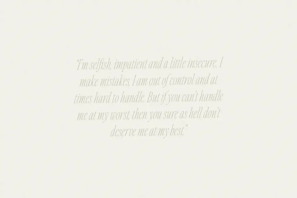
High contrast strokes mean the hairline and light weights lose integrity fast once you shrink them. Thin serifs and fine stems that look delicate at 80pt start to vibrate or drop out entirely in a paragraph at body-copy size. This isn’t a flaw so much as a boundary: the family is built for headlines, not running text, and the letterforms make no attempt to pretend otherwise.
Use cases
This is a headline and branding tool first. Logotypes benefit from the range of weights — pairing a bold roman wordmark with a lighter italic tagline, for instance, gives a logo two registers without introducing a second typeface. Editorial headers, pull quotes, and callouts also suit it well, especially where the quote is short enough that the condensed width and high contrast can be appreciated rather than fought against.
It’s less suited to anything that needs sustained reading: body paragraphs, long captions, dense packaging copy. The contrast and narrow set that make it striking as a headline will work against legibility once you’re past a sentence or two. Treat it as the display layer of a layout, sitting above a plainer workhorse typeface for the actual reading, and it does its job well.
What we liked, and what we didn’t
Strengths
- The angled, spurred italics give the family a distinct personality that plain condensed serifs usually lack.
- Eight weights per style make mixing regular and italic, light and bold within one logo or header genuinely workable.
- Default spacing is set for clarity, so it reads cleanly straight out of the box without manual fixing.
Trade-offs
- High contrast strokes thin out badly at small sizes, ruling out body text entirely.
- Achieving the tighter, trendy all-caps look seen in marketing images requires manual tracking adjustments, not a default setting.
Carefree is a sharply drawn condensed serif with a genuinely distinctive italic, well suited to headlines, logotypes, and short display quotes. It loses composure at small sizes and in long-form text, so it needs a quieter partner to do the actual reading. Best thought of as a display accent rather than a do-everything family.

Tmfonts writes independent reviews of typefaces: what each font does well, where it falls short, what it suits, and where it is sold.