
Cervo Neue Font Free Download
Is Cervo Neue free to download?
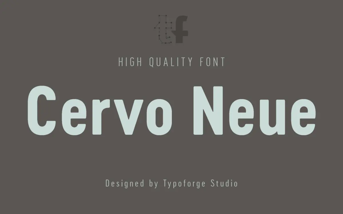
Cervo Neue is a commercial font sold on Creative Market, so the full version needs a paid license. Get it from the official listing: Cervo Neue font download.
Need something free? These sans serif fonts from Google Fonts are free for personal and commercial use:
Design style
Cervo Neue draws from an unlikely source: a Polish lifestyle monthly published between 1960 and 1973. That lineage shows up not as pastiche but as attitude — the letterforms carry a mid-century editorial confidence, with a slightly condensed stance and terminals that feel cut rather than drawn. It’s not a revival in the strict sense; it reads as a contemporary sans that has absorbed the posture of old masthead lettering without copying any single letter directly.
The grotesque variant included in the family loosens up the geometry further, trading some of the main style’s character for a plainer, more neutral register. Having both in one package gives you a way to dial character up or down depending on the job, which is a sensible way to extend a display face into something more flexible.
Character set and features
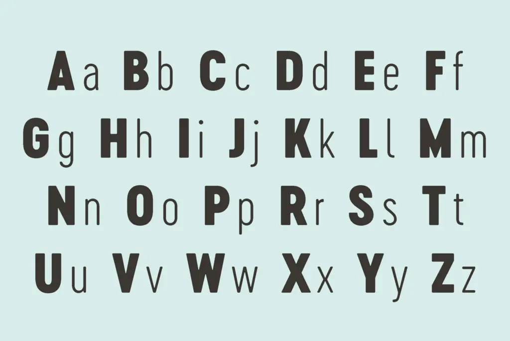
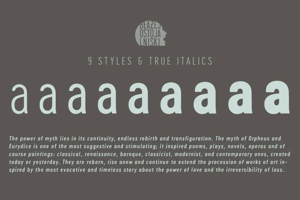
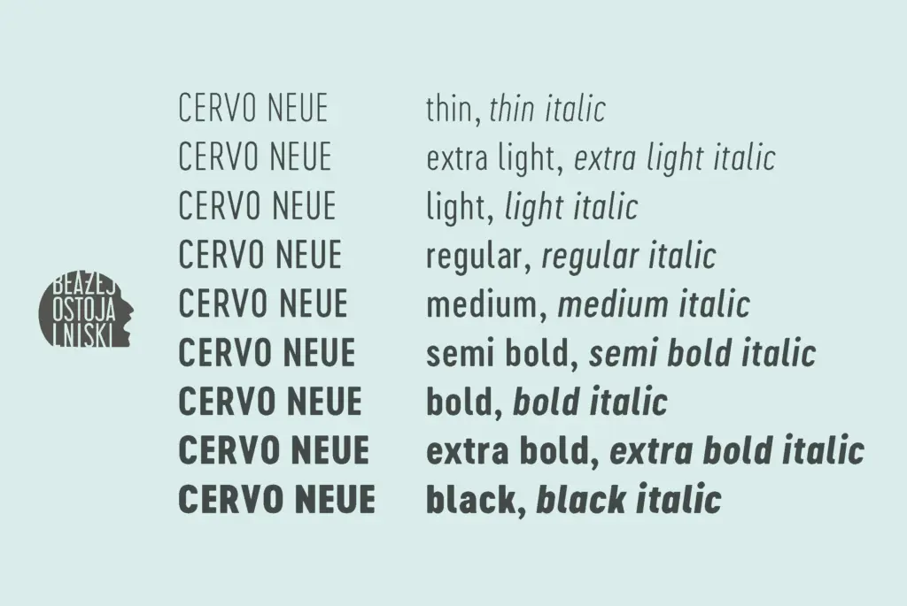
Eighteen variants is a substantial spread for what started life as a display idea, and the weight range — running up through Semi Bold, Bold, Extra Bold and Black in this revised edition — is where the family does its best work. At the heavier end, counters stay open and the condensed proportions hold their shape instead of clotting, which is the usual failure point for compressed sans faces pushed to Black.
This version also raises the accent marks, which previously sat too close to the caps, and enlarges the punctuation — a small fix but one that matters at headline sizes, where a cramped comma or a swallowed acute reads as a mistake rather than a style choice. Old-style numerals are new to this release too, giving the family a quieter option for running text or tabular contexts where lining figures would feel too assertive.
What the brief doesn’t tell us is the extent of language coverage or whether OpenType features go beyond the numeral sets, so treat anything beyond what’s described here as unconfirmed.
Use cases
This is a headline tool first. The condensed width and the weight range make it suited to posters, magazine covers, and any packaging or branding work that needs a few words to carry real presence in a narrow space. The editorial inspiration is worth taking seriously as a cue: it suits mastheads, section headers, and cover lines more naturally than it suits a logotype that needs to sit quietly for years.
At body text sizes it’s not the right tool — the condensed proportions and display-weight construction aren’t built for long reading, and the family doesn’t present itself as a text face. Where it earns its keep is in short bursts: a product name on packaging, a title card, a pull quote set large. The grotesque variant is the one to reach for if a project needs the family’s bones without quite so much period flavour.
What we liked, and what we didn’t
Strengths
- Heavy weights keep open counters instead of clotting, unusual for a condensed face pushed to Black
- Eighteen variants including a separate grotesque give real flexibility between characterful and neutral
- Corrected accent height and enlarged punctuation fix real legibility issues at display size
Trade-offs
- Condensed proportions and display construction rule it out for body copy
- Language support and deeper OpenType features aren't specified, so multilingual or feature-heavy projects need checking first
Cervo Neue is a confident condensed display sans with a genuine point of view, especially at its heavier weights. It's not built for body text and won't try to be, but for headlines, covers and packaging it has real presence.

Tmfonts writes independent reviews of typefaces: what each font does well, where it falls short, what it suits, and where it is sold.