
Simple Serenity Serif & Script Font Free Download
Is Simple Serenity Serif & Script free to download?
Simple Serenity Serif & Script is a commercial font sold on Creative Market, so the full version needs a paid license. Get it from the official listing: Simple Serenity Serif & Script font download.
Need something free? These script fonts from Google Fonts are free for personal and commercial use:
Design style
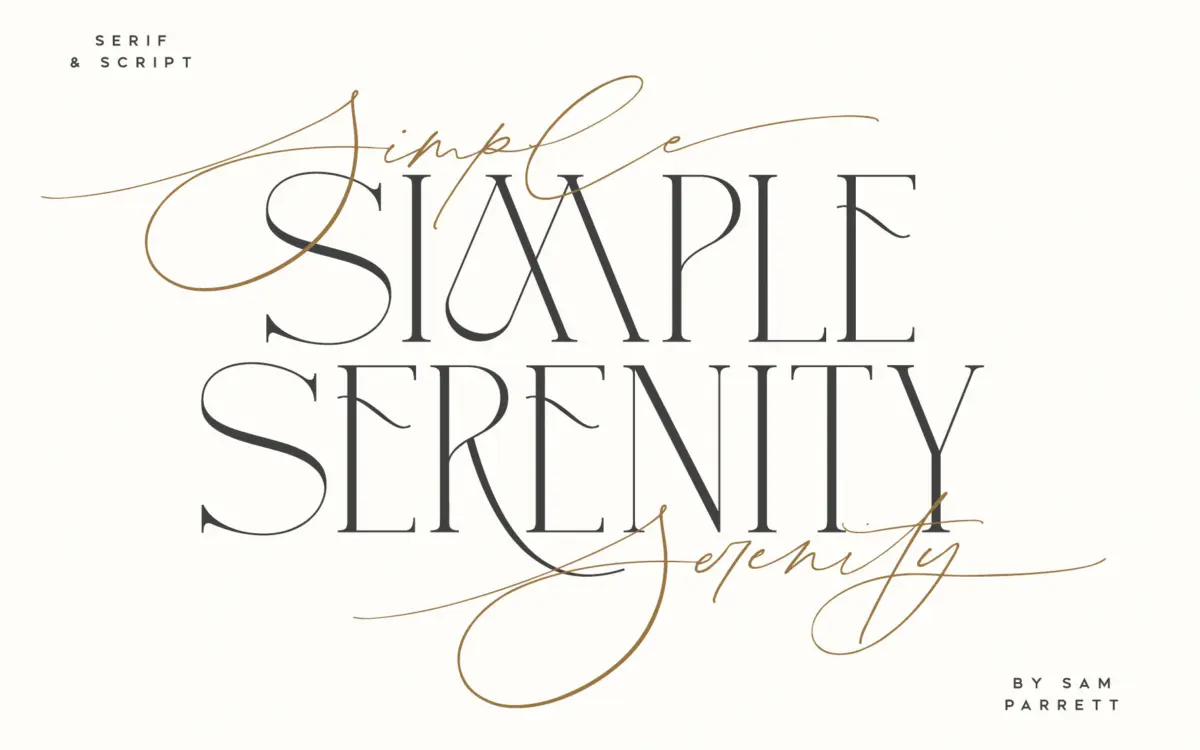
Simple Serenity is a two-part set: a fine, hand-drawn script and an uppercase-only serif built to sit alongside it. The script is light in weight, with a low-contrast stroke that stays consistent rather than swelling and thinning dramatically — the effect is closer to a confident ballpoint hand than a pointed-pen calligraphy script. Letters connect with a gentle slant and the baseline has just enough variation to avoid looking mechanical.
The serif half reads as a companion rather than a standalone text face, since it’s capitals only. Its forms are narrow, with small, understated serifs and open counters. It has none of the eccentricity you sometimes see in ‘modern classic’ serif revivals — no exaggerated contrast, no flared terminals. That restraint is the point: it’s designed to frame the script, not compete with it.
Character set and features
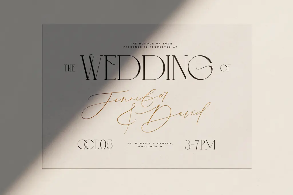
The script carries the more developed feature set of the two. Fifty ligatures handle common letter pairings so joins don’t collide or look pasted together, and there are nine alternate letterforms (d, k, f, g, h, i, j, t, y) with extra flourish for anyone wanting a bit more flair on key letters. Beginning and end swashes are available on every lowercase letter, which is a generous allowance — it means a word can start and finish with a flourish even if the middle stays plain, useful for monograms or short-word lockups like names or single words on invitations.
The serif is simpler by comparison: fourteen ligatures and ten stylistic alternates across Q, A, M, E, R, K, U, F, H and W. Since it’s capitals-only, it functions best as a companion for titles, initials or short labels rather than as a workhorse text face — there’s no lowercase to fall back on for body copy. Both fonts rely on OpenType features for ligatures and alternates, so they need software that supports Standard Ligatures and Stylistic Alternates, or a glyphs panel, to access the full character set. Anyone pasting text into a program without that support will only see the default glyphs, missing most of what the design actually offers.
Use cases
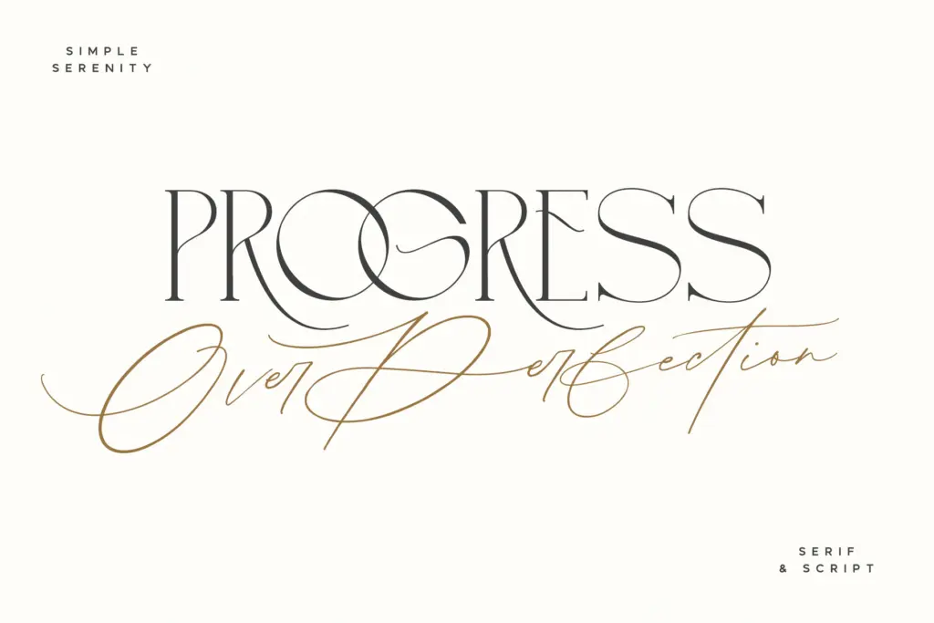
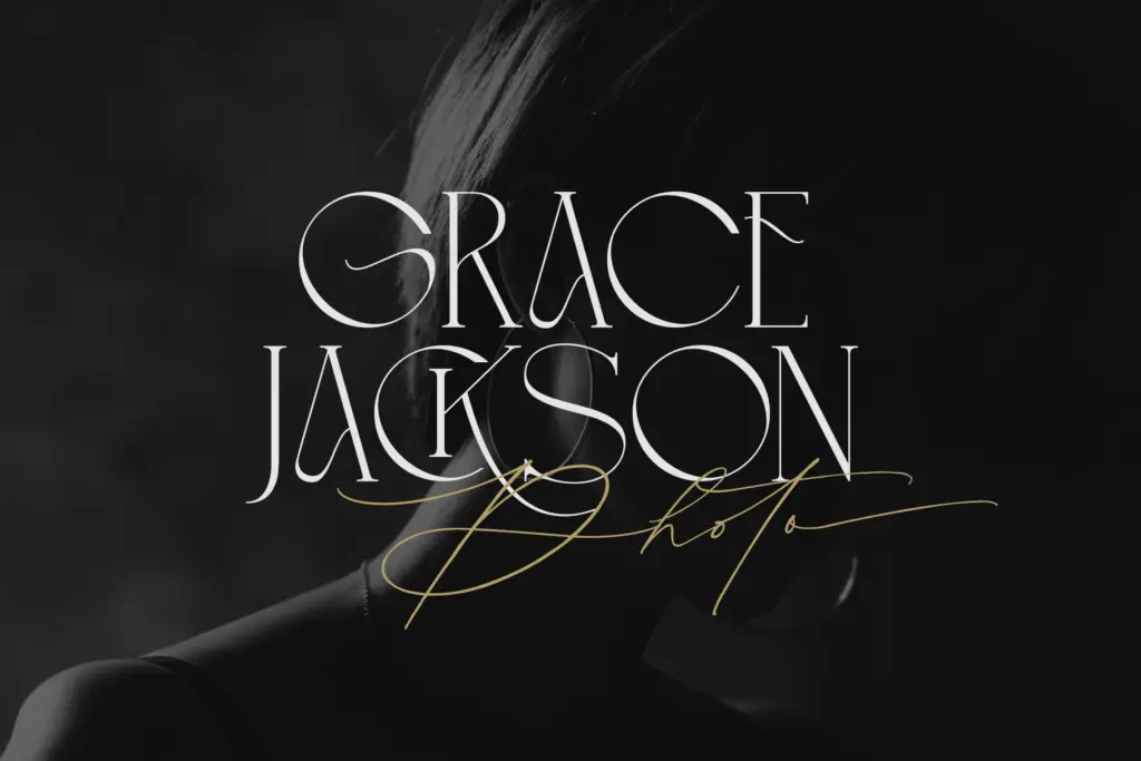
This pairing is built for short-form, decorative work rather than long-form reading. Wedding stationery is the obvious fit — names, dates,
What we liked, and what we didn’t
Strengths
- Fifty script ligatures and full beginning/end swashes give genuine flexibility for short-word compositions
- The restrained serif avoids over-designed quirks, making it an easy frame for the script
- Alternate letterforms on both fonts add variation without requiring extra typefaces
Trade-offs
- The serif is uppercase-only, so it can't function as a body-text partner on its own
- Full character set depends on OpenType feature support, meaning basic text tools will only show default glyphs
Simple Serenity does one job well: short, decorative pairings for invitations, titles and monograms. The script's swash and ligature set is genuinely generous, but the serif's capitals-only scope and the pair's reliance on OpenType features limit how far it stretches beyond that narrow lane.

Tmfonts writes independent reviews of typefaces: what each font does well, where it falls short, what it suits, and where it is sold.