
Wellsville Font Duo Free Download
Is Wellsville Font Duo free to download?
Wellsville Font Duo is a commercial font sold on Creative Market, so the full version needs a paid license. Get it from the official listing: Wellsville Font Duo download.
Need something free? These script fonts from Google Fonts are free for personal and commercial use:
Design style
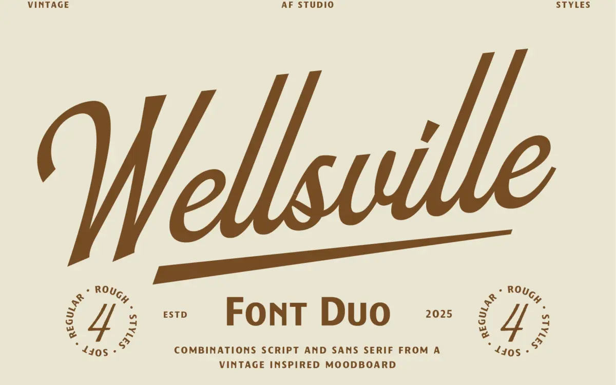
Wellsville leans into the same well-worn territory as most retro Americana releases: a connected script set beside a bold, condensed-leaning sans. The script has a relaxed slant and soft, rounded joins rather than the whiplash flourish of a formal wedding script — it reads more like signage lettering than calligraphy, which suits its stated purpose. The companion sans is chunky and upright, with squared terminals that give it the weight to anchor a logo lockup underneath the lighter script strokes.
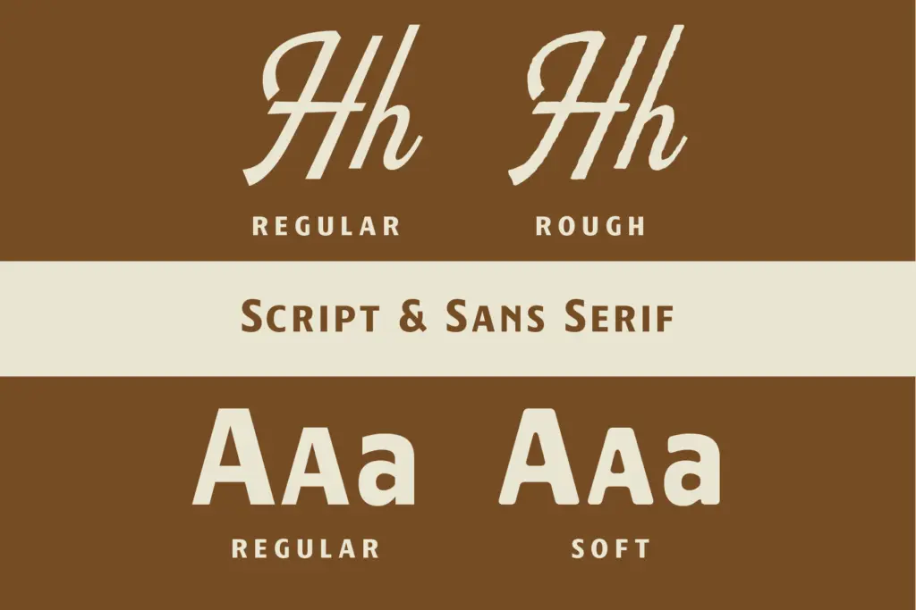
The pairing includes a rough variant of the script and a soft variant of the sans, which is really where the design decisions live. The rough version adds broken edges and ink traps that suggest a worn letterpress plate; the soft sans rounds its corners just enough to feel friendlier without losing its block-letter sturdiness. Neither textured version is subtle — they’re meant to be noticed at poster size, not read in a paragraph. There’s nothing especially novel in the construction of either face, but the drawing is even and the two styles share enough DNA in stroke weight and proportion that they sit together without a fight.
Character set and features
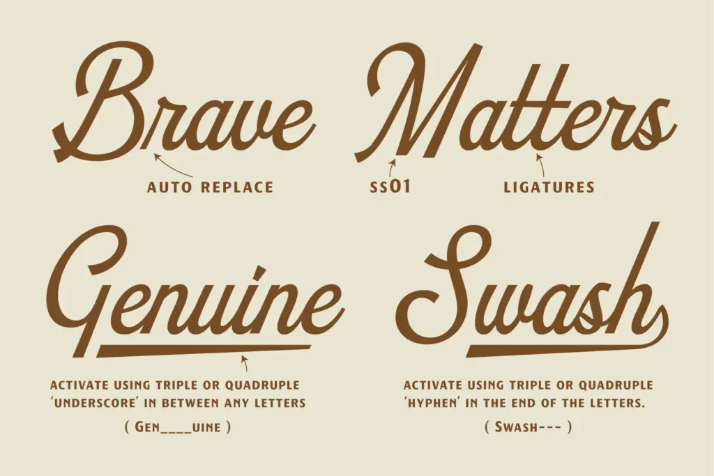
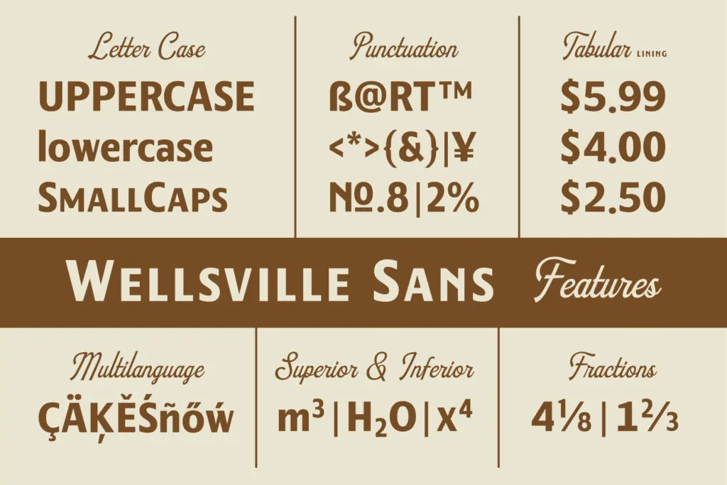
As a duo built for badges and lockups, the practical value is in how the two families interlock rather than in any single glyph. The script has enough swing in its lowercase to avoid looking mechanical, though it’s restrained compared to scripts built for invitations — there’s no dramatic entry stroke or looping ascender to speak of. The sans is the more useful workhorse of the two: it’s legible at small sizes in a way the script simply isn’t, and it can carry supporting text (taglines, addresses, ingredient lists) while the script handles the headline word.
The included vector badges are worth noting separately from the typefaces themselves. These are pre-built compositions — frames, banners, ribbon shapes — rather than font features, and they’re useful mainly as a starting template for a logo rather than a long-term asset, since anyone using the same badge pack will end up with a similar-looking mark.
Use cases
This is a duo built for a narrow job: short-word branding where a vintage American feel is the whole point. Café signage, bakery logos, packaging for small-batch goods, craft beer labels, nostalgic poster headlines — Wellsville does that work without much adjustment. The rough and soft variants give you two levels of polish from one purchase, so a brand can look a bit more raw or a bit more clean depending on which version gets used.
It is not a font for long-form text. The script will tire the eye in anything beyond a few words, and the sans, while sturdier, is still cut for display use rather than body copy. Anyone expecting a multi-purpose editorial system, or a script with genuine calligraphic range, should look elsewhere — this is a logo-and-badge tool first.
What we liked, and what we didn’t
Strengths
- The script and sans share consistent stroke weight, so they lock together cleanly in badge layouts.
- Rough and soft variants give two finish levels from one set of files without redrawing anything.
- The sans is legible enough at small sizes to carry supporting text under the script headline.
Trade-offs
- The script lacks the flourish or contrast range that formal script fonts offer, limiting it to casual use.
- Neither style is suited to body text, so the duo only covers headline and badge work.
Wellsville does one job well: short, punchy vintage branding where a soft script sits over a sturdy sans. It doesn't try to be a flexible text system, and it shouldn't be judged as one — within its lane of logos, badges, and packaging it's a dependable, well-matched pair.

Tmfonts writes independent reviews of typefaces: what each font does well, where it falls short, what it suits, and where it is sold.