
Dirty Luxe Font Free Download
Is Dirty Luxe free to download?
Dirty Luxe is a commercial font sold on Creative Market, so the full version needs a paid license. Get it from the official listing: Dirty Luxe font download.
Need something free? These script fonts from Google Fonts are free for personal and commercial use:
Design style
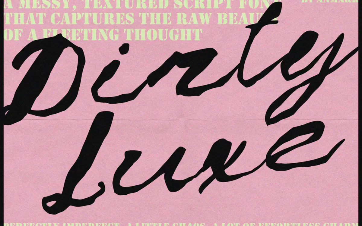
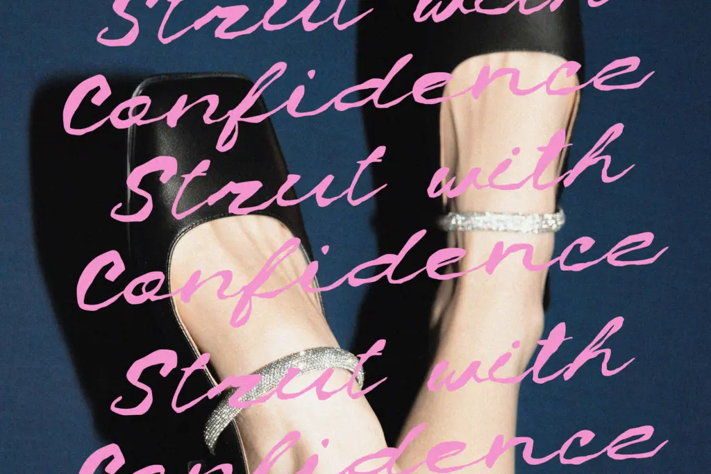
Dirty Luxe sits in the current wave of deliberately rough scripts, where the pitch is imperfection rather than polish. The strokes look like they were laid down with a dry brush or a leaking pen — edges fray, ink pools at the ends of some letters, and the baseline wanders more than a formal script would allow. The slant is loose rather than mechanical, and the letters connect with a kind of hurried confidence rather than the smooth joins of calligraphic scripts.
What keeps it from reading as pure chaos is a consistent stroke logic underneath: entry and exit strokes are placed with intent, and the weight distribution follows a recognisable brush-pen rhythm even when the outlines get splattery. It’s not trying to be legible calligraphy. It’s trying to look like a signature scrawled on a mirror in eyeliner, and on that brief it does the job. The tone is urban and a little sardonic rather than romantic — closer to streetwear graphics than wedding stationery, despite what some of the marketing around fonts like this tends to suggest.
Character set and features
Each glyph — uppercase, lowercase, and the numerals — ships with an alternate, so there’s a built-in way to break up repeated letters within a word or across a layout. That’s the main functional feature here, and it matters: scripts this textured get monotonous fast if every ‘a’ or ‘s’ looks identical, so having a second option per character is genuinely useful for anyone hand-setting a wordmark or a short line of display type.
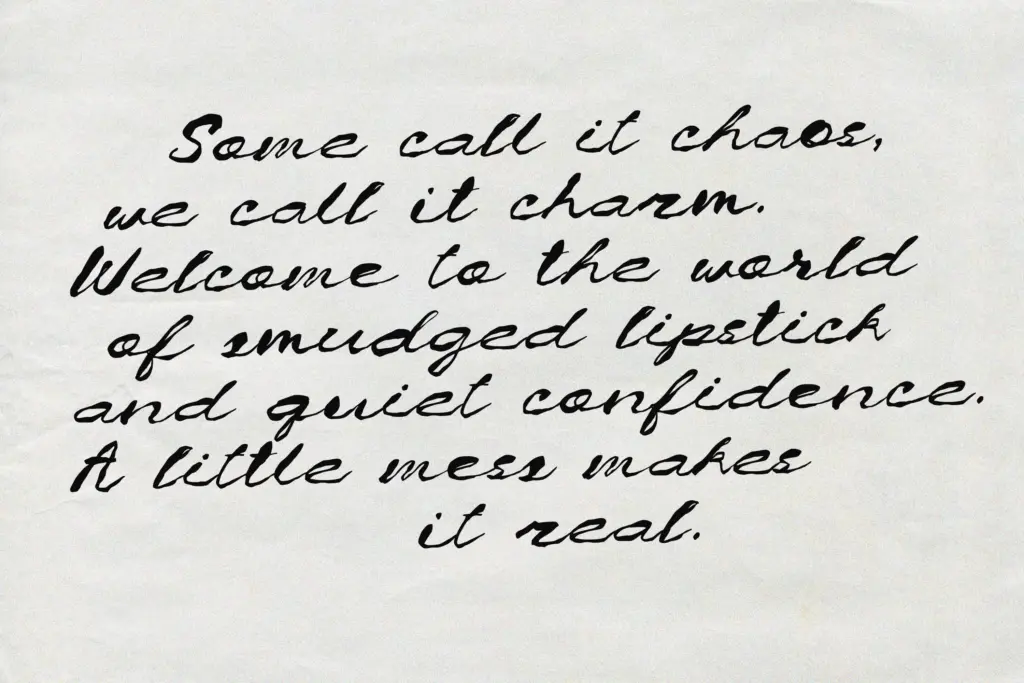
Don’t expect this to behave like a text face. The messiness that makes it distinctive also makes dense paragraphs of it hard to read — ink splatters and uneven baselines are fine at word scale, exhausting at sentence scale. This is a headline and lockup font, built for short bursts: a name, a tagline, a single word on a label. Treat it that way and the texture reads as intentional; push it further and it starts looking like a glitch.
Use cases
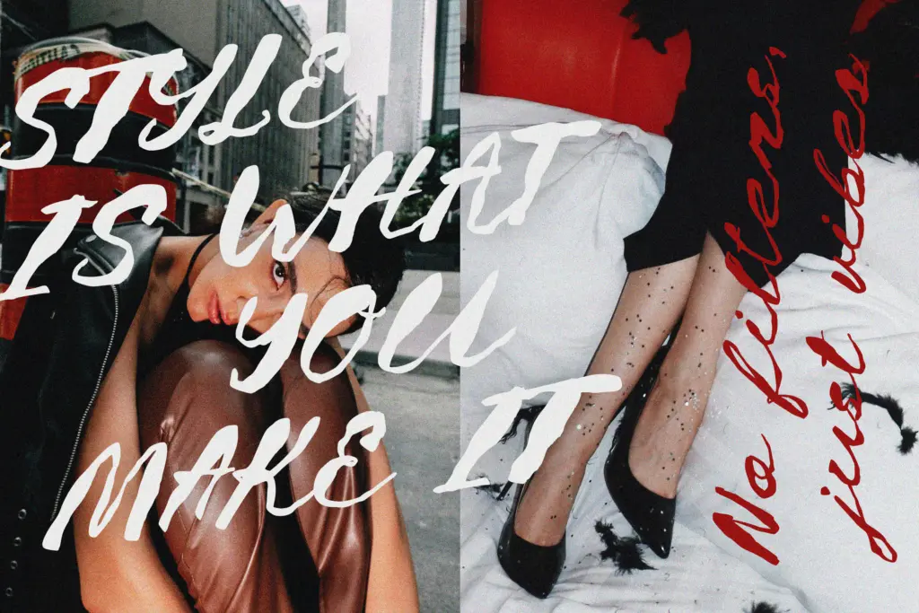
The obvious lane is fashion and beauty branding — perfume labels, streetwear drops, editorial pull-quotes, the kind of logotype that wants to look handwritten but also a bit dangerous. It also works for social posts and quote graphics where a short phrase needs attitude rather than clarity, and for packaging accents where one inked word does more work than a paragraph of copy. It’s less suited to anything that needs to feel formal or trustworthy — invitations, legal documents, or long-form editorial text will fight the font’s whole reason for existing.
Pair it sparingly: because the letterforms are already loud, the rest of the layout benefits from staying quiet — a plain sans for body copy, generous white space, and restraint on colour. Used as a single accent word, Dirty Luxe can carry a design. Used everywhere at once, it tends to cancel itself out.
What we liked, and what we didn’t
Strengths
- Alternates for every uppercase, lowercase and numeral help break up repetition in short words
- Consistent stroke rhythm underneath the mess keeps it from feeling random
- Strong fit for fashion and beauty branding where a bit of attitude is the point
Trade-offs
- Legibility drops fast below display size or across more than a few words
- Narrow tonal range makes it a poor fit for anything formal, elegant or quiet
Dirty Luxe delivers a convincing, splattery brush-script look with enough alternates to avoid obvious repetition. It's a specialist font for short, loud headline moments in fashion and beauty branding, not a general-purpose script, and it will frustrate anyone who tries to set it small or long.

Tmfonts writes independent reviews of typefaces: what each font does well, where it falls short, what it suits, and where it is sold.