
NEUKULTUR: A Compressed All-Caps Display Font for Tight Headlines
Design style
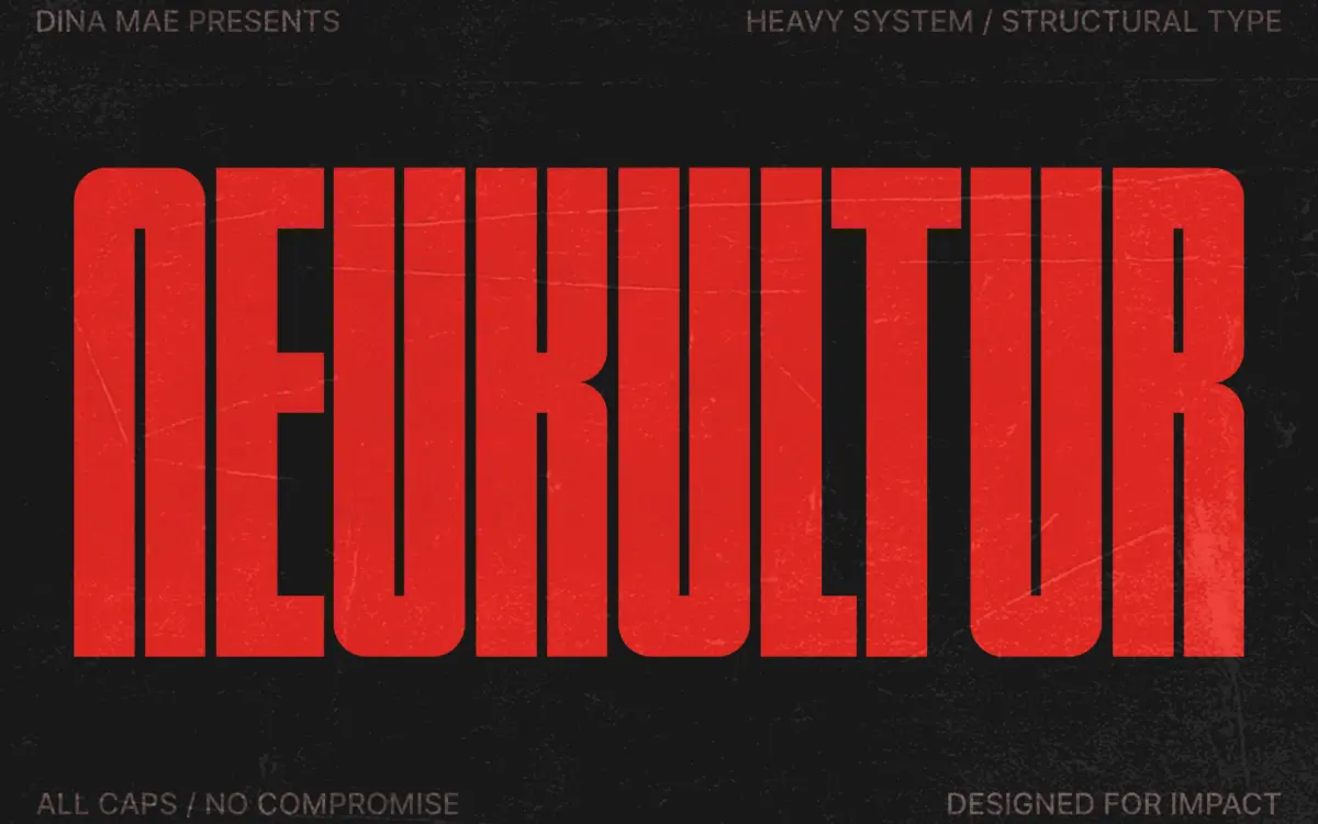
NEUKULTUR is a bold, compressed, all-caps display face built for situations where horizontal space is scarce and the message still needs to land hard. The letterforms are narrow and vertically driven, with tight sidebearings that push the type into a dense block rather than a loose line. There’s a clear brutalist and archival-print influence here: squared-off terminals, minimal curvature, and a general refusal to soften anything for the sake of prettiness. It reads as a working typeface rather than a decorative one — the kind of design you’d expect on a stencil, a shipping label, or a stripped-down zine cover.
The compression is the whole point, and it’s handled with some discipline. Strokes stay a consistent weight across the character set, so the face doesn’t wobble between thick and thin at odd points the way some hastily compressed display fonts do. Counters are kept open enough that letters like O, D, and B don’t collapse into ink blobs even at tight tracking, though they’re not spacious by any stretch. This is not a face designed to whisper. It’s designed to fill a column, a strip, a label — and it does that job with intent.
Character set and features
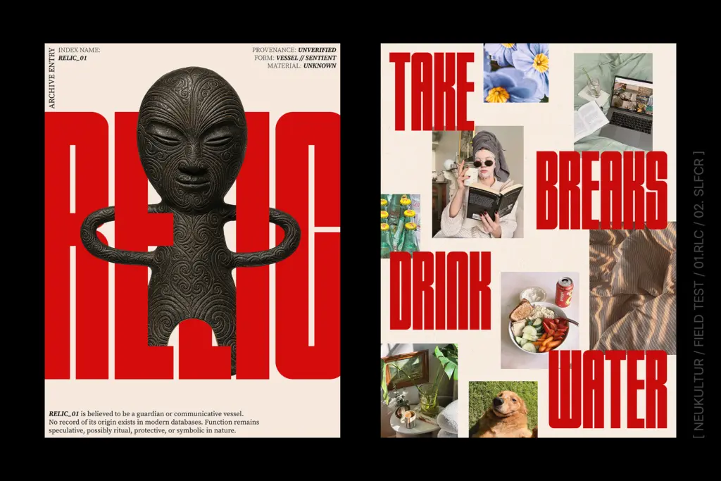
As an all-caps display font, NEUKULTUR doesn’t try to do everything. There’s no lowercase to speak of, which immediately tells you this is a headline tool, not a text face. Numerals follow the same compressed, squared logic as the letters, which keeps things consistent when the font is used for labels, pricing, or dates. Punctuation is present but minimal — enough to construct a poster line or a tag, not enough to set a paragraph.
Don’t expect ligatures, alternates, or a stylistic set system here; the brief and feel of the font suggest a single, focused cut rather than an expanded family with multiple weights. That’s a real limitation if you need range within one project — there’s no lighter companion to shift into for secondary text, and no easy way to soften the tone if the brutalist edge feels too aggressive for a particular brand. What you get is one register, executed with conviction.
Use cases
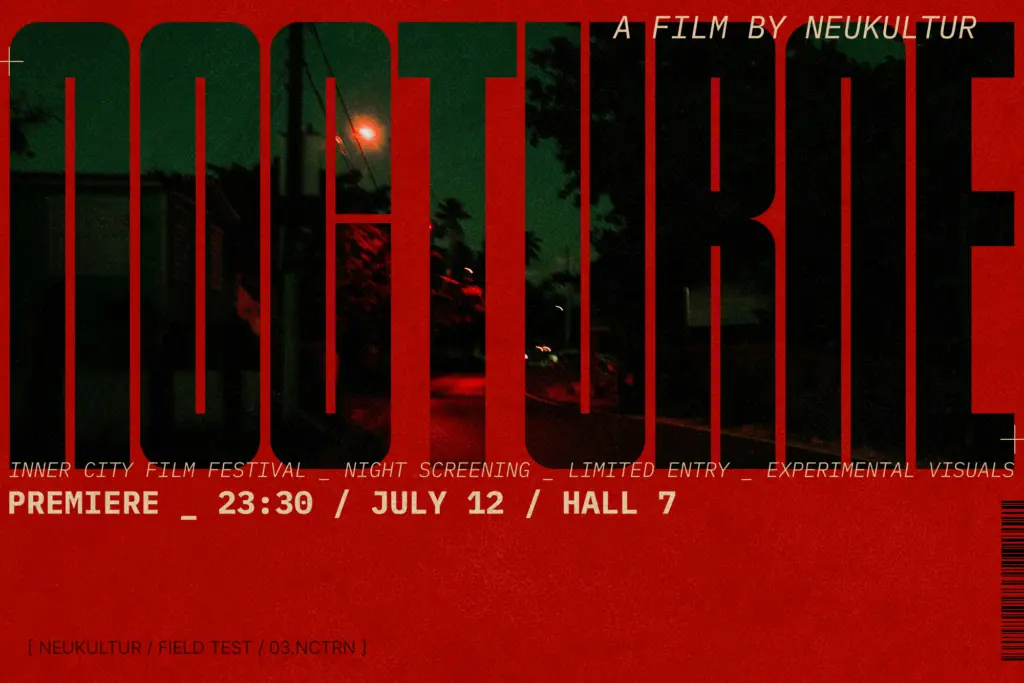
NEUKULTUR is built for headlines and short bursts of text, not paragraphs. Posters, apparel graphics, packaging labels, and editorial mastheads are the natural home for it — anywhere a designer needs a few words to carry visual weight in a tight column or banner. It suits fashion and music promo work particularly well, where a stripped-down, industrial tone reads as intentional rather than unfinished. Architecture and studio branding projects that want a no-nonsense, structural feel would also find use for it, especially in logotypes or wordmarks where the compression itself becomes part of the identity.
It’s less suited to anything requiring warmth, approachability, or long-form reading — this isn’t a face for body copy, captions, or UI text, and forcing it into those roles will fight against everything it’s built to do. Used at the scale and length it’s designed for, though, it does its job cleanly: loud without shouting, as intended.

What we liked, and what we didn’t
Strengths
- Consistent stroke weight keeps the compression from looking uneven
- Counters stay open enough to avoid clogging even at tight tracking
- Strong fit for brutalist, industrial, and archival-inspired branding work
Trade-offs
- All-caps only, with no lowercase for mixed-case headlines
- Single weight and style with no expanded family to shift tone or hierarchy
NEUKULTUR does one job well: loud, compressed headline type for posters, labels, and brand marks with an industrial edge. It's not built for range, and anyone needing lowercase, multiple weights, or body text options will hit its limits fast. As a single-purpose display tool, it's confidently drawn and consistent.
Verdict

Tmfonts reviews typefaces in depth — every font is tested in real branding, editorial and screen layouts before a word gets written. 555+ fonts reviewed and counting.