
PS Badge Monogram Bold: a keyboard shortcut for two-letter emblems
Design style
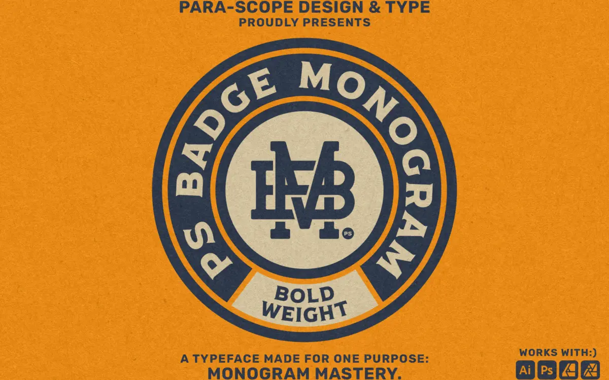
PS Badge Monogram Bold belongs to a small, useful genre: typefaces built not to set words but to generate combined letter marks. The bold weight leans into thick, slab-serif strokes with squared-off feet, the kind of letterform you’d expect on a barrel stamp or a varsity patch. Strokes are heavy and evenly weighted, which is the point — a monogram needs to read as a single solid shape from a distance, not as two thin letters politely sharing space.
The slab treatment gives it a stamped, industrial feel rather than anything delicate. There’s no contrast to speak of between thick and thin strokes, which keeps the whole thing legible when letters overlap or interlock, but it also means the font has one register. This is a badge face, not a text face, and it doesn’t pretend otherwise.
Character set and features
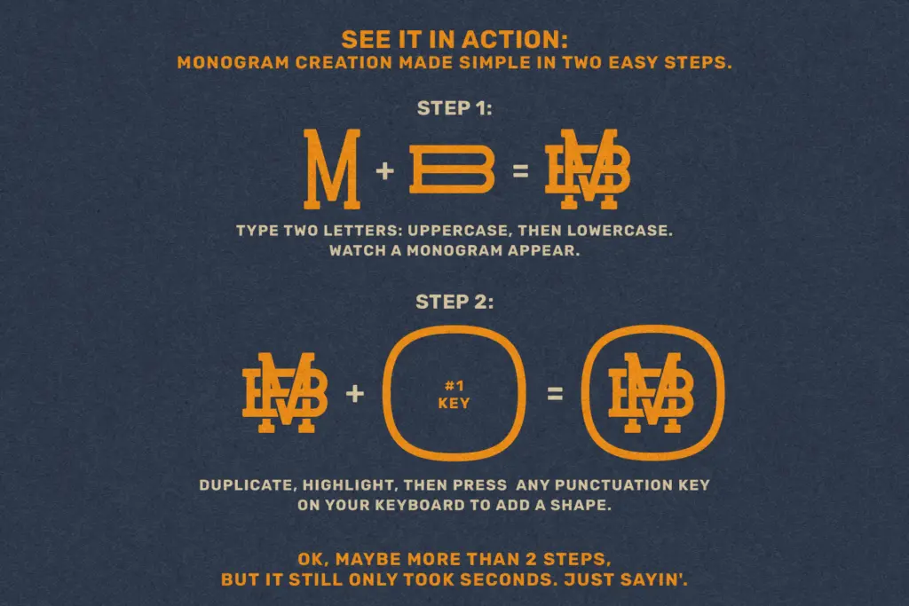
The mechanism here matters more than any individual letterform: rather than drawing 26 letters, the font is built as a library of pre-combined two-letter pairs, accessed by typing the two initials in sequence. That’s what the seller means by storing monograms on your system instead of as image files — you’re not typing a font so much as querying a lookup table of ligature-style combinations.
Two versions are included: a Solid style, where the letters are fused into one continuous badge shape, and a Gapped style, where a thin channel separates the strokes so the two letters stay visually distinct even while interlocking. That’s a genuinely practical pair — Solid reads better at small sizes or as an embroidered patch, Gapped keeps more of the individual letterforms visible for anyone who wants their initials to still look like initials.
What you don’t get, by design, is a full working alphabet in the conventional sense. This isn’t a typeface for setting a headline or a paragraph. If your two initials happen to be included and the combination has been drawn well, you get a clean, ready-made mark. If you need three letters, lowercase, or a combination the font simply hasn’t anticipated, you’re out of luck — the whole system lives or dies on how thorough that combination library is.
Use cases
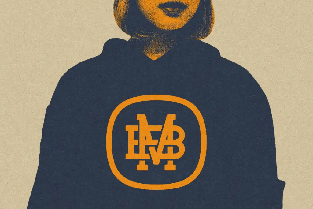
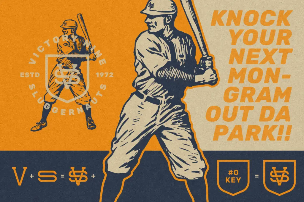
This is squarely a logo and merch tool: monograms for wedding stationery, apparel prints, product stamps, packaging badges, or personalized gifts where two initials need to look considered rather than slapped together in a graphics editor. Designers producing this kind of work repeatedly — a stationer doing custom wedding suites, a print shop doing personalized merch — will get the most out of it, since the whole appeal is speed: type two letters, get a finished mark, convert to outlines, done.
It’s less useful as a general branding tool for anyone whose mark needs more than two characters, and it has no role outside of monogram work — there’s no lowercase alphabet to fall back on for body copy or supporting text. Pair it with a separate text face for any surrounding typography; this one only does the initials.
What we liked, and what we didn’t
Strengths
- Solid and Gapped versions cover both fused-badge and distinct-letter looks
- Heavy slab strokes stay legible at small sizes like patches and stamps
- Typing initials directly is genuinely faster than assembling monograms by hand
Trade-offs
- Limited to two-letter combinations, so three-initial or lowercase needs aren't covered
- No accompanying alphabet, meaning it can't help with any surrounding text in a design
PS Badge Monogram Bold does one job — turning two initials into a stamped, slab-serif badge — and does it efficiently. It's not a typeface in the usual sense, so judge it as a tool: useful often, but narrow by design.
Verdict

Tmfonts reviews typefaces in depth — every font is tested in real branding, editorial and screen layouts before a word gets written. 555+ fonts reviewed and counting.