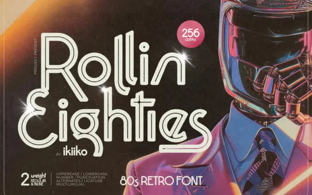
Rollin Eighties: a neon-drenched display sans for retrowave branding
Design style Rollin Eighties is a display sans built squarely on 1980s signage cues: angular terminals, exaggerated diagonal cuts, and…
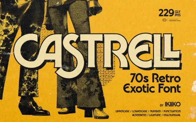
Design style Castrell sits in that overworked-but-still-fun lane of 70s revival lettering, the kind of face built to look like…
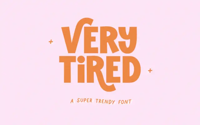
Design style Very Tired is a blocky, all-caps sans with a deliberately worn, retro feel. The core letterforms are thick…
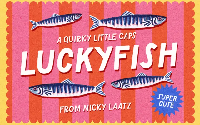
Design style Lucky Fish is an all-caps display sans built for noise, not nuance. The letterforms are chunky and slightly…
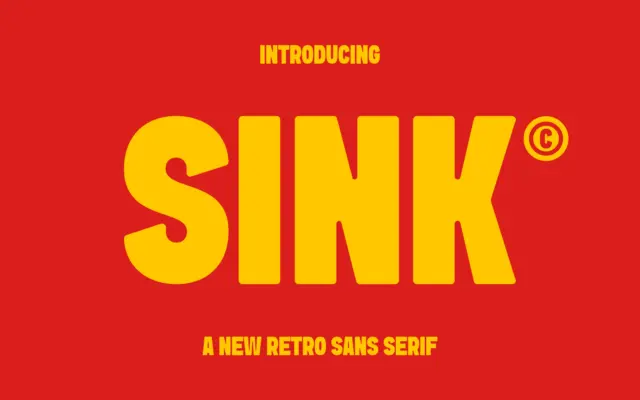
Design style Sink sits in that familiar territory of heavyweight retro sans faces: thick strokes, low contrast, and a general…
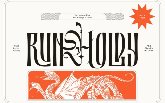
Design style Runholdy sits at the crossing of two traditions that don’t usually meet. The bones are blackletter — broken,…
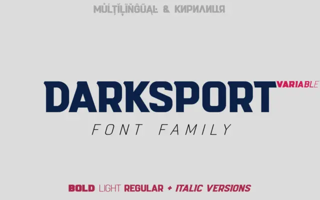
Design style Darksport is a condensed-leaning sans built with athletic branding in mind, and it shows in the details. The…
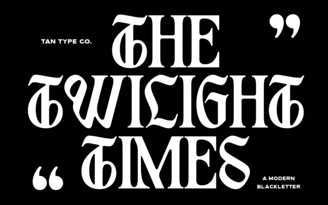
Design style TAN – Twilight takes the bones of blackletter and files down most of the ornament. The double-story structures,…
Design style Fluffy Morning is a bubble sans in the strict sense: every stroke has been inflated until the letters…