
Sink Font Free Download
Is Sink free to download?
Sink is a commercial font sold on Creative Market, so the full version needs a paid license. Get it from the official listing: Sink font download.
Need something free? These sans serif fonts from Google Fonts are free for personal and commercial use:
Design style
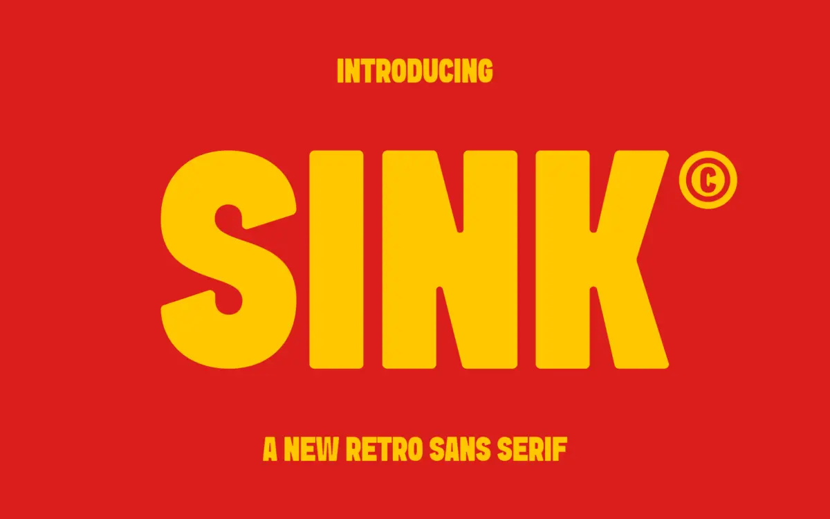
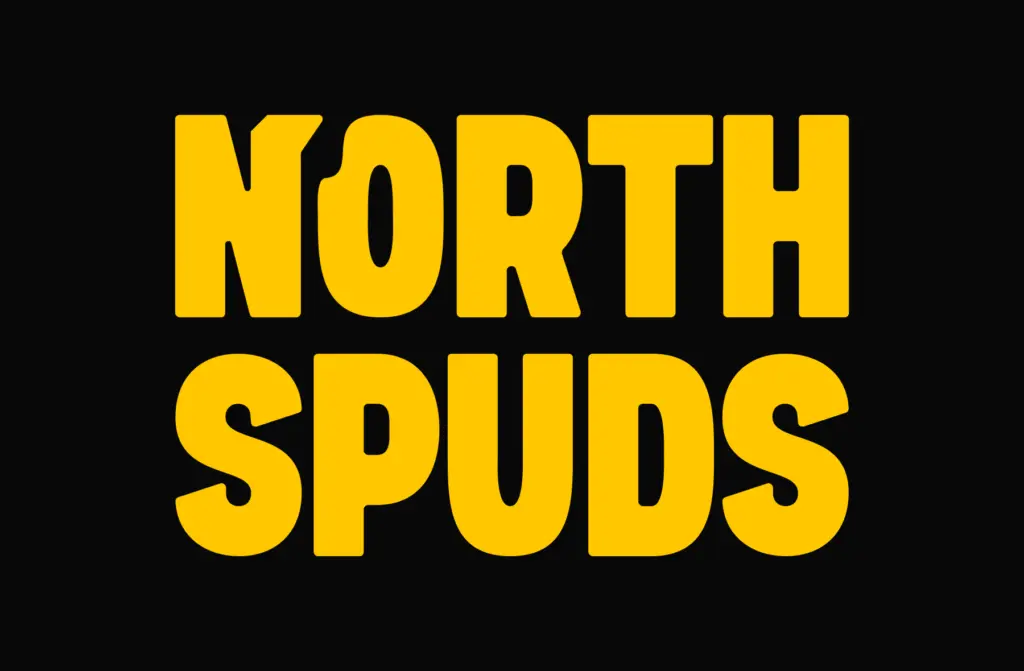
Sink sits in that familiar territory of heavyweight retro sans faces: thick strokes, low contrast, and a general refusal to whisper. What separates it from a plain grotesque at this weight is the treatment of the corners. Instead of sharp right angles, Sink rounds its terminals just enough to take the edge off without turning soft or bubbly. The result reads as confident rather than aggressive, which is a harder balance to hit than it sounds when you’re working with this much ink per letter.
The letterforms lean into a vintage sensibility without going full pastiche. There’s no faux distressing, no exaggerated ball terminals, no attempt to look hand-carved. It’s a more restrained kind of retro — the sort that shows up on mid-century packaging and old signage where boldness was the whole point and decoration was kept to a minimum. That restraint is what gives Sink some staying power; it won’t date as quickly as a font that leans harder on nostalgia cues.
Character set and features
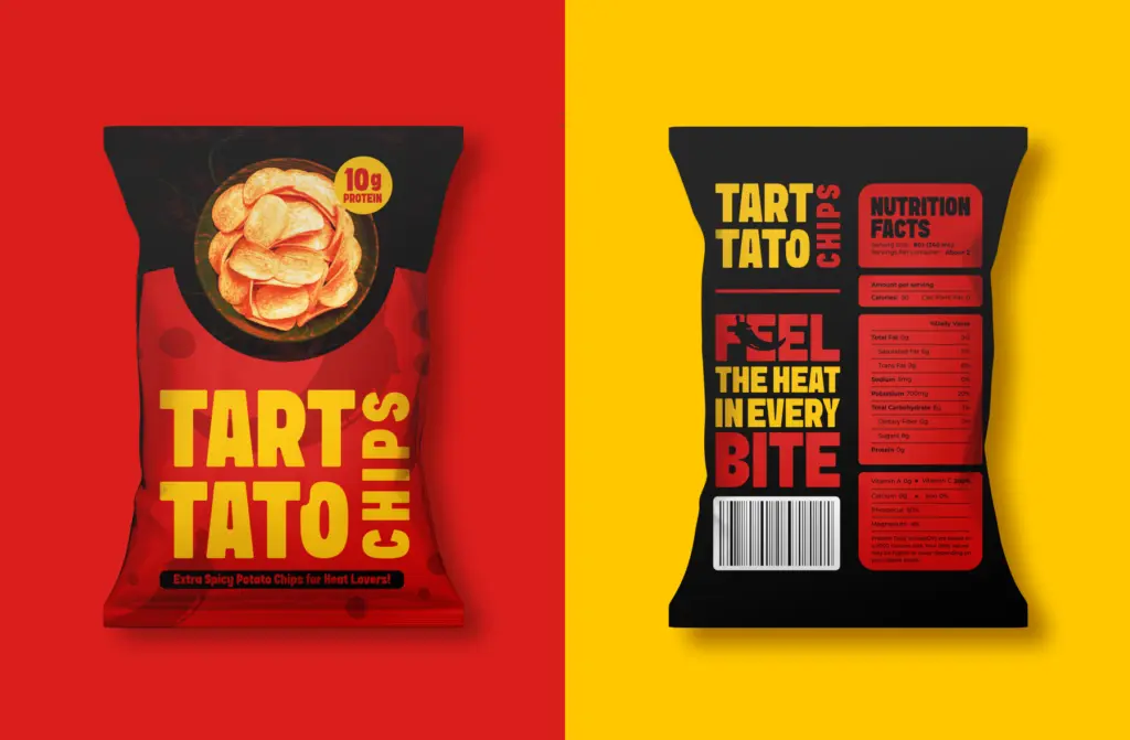
As a single-weight bold sans, Sink is built to do one job rather than flex across a range of registers. The letters are wide and square-set, with apertures open enough that shapes like C, S, and G don’t clog up even at this stroke weight. Numerals follow the same heavy, rounded logic as the lowercase, so tabular figures on packaging or pricing won’t feel like an afterthought.
Spacing is generous, which is necessary given the weight — tighter tracking would cause the counters to close in and the rhythm to collapse. That generosity means Sink needs room to breathe; cramming it into a narrow column or a tight logo lockup will fight its natural proportions. Punctuation and basic symbols are present and drawn with the same rounded corner treatment, so a stray ampersand or exclamation mark won’t stick out as an obviously different hand.
Use cases
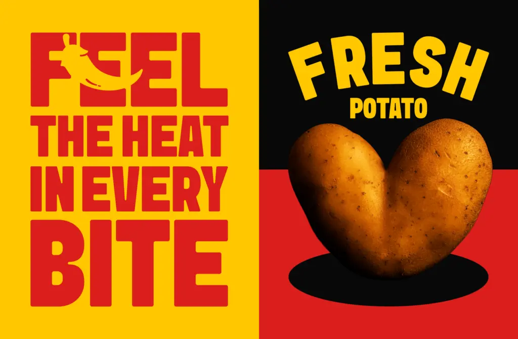
Sink is a titling font first and a text font never. At display sizes — headlines, cover lines, packaging fronts, shop signage — the weight and the rounded corners do real work, giving copy a stamped, permanent feel without tipping into heaviness for its own sake. It’s well suited to food and beverage packaging, retro-leaning branding, and logotypes that need to hold up small on a shelf or a can.
It is not a font for paragraphs. Set it below display size and the strokes start to merge, the counters shrink, and the softness that reads as charm at large sizes just reads as mush at small ones. Pair it with a plain, quiet body text and let Sink do the shouting only where shouting is warranted — a masthead, a wordmark, a headline, not a caption.
What we liked, and what we didn’t
Strengths
- Rounded corners soften the weight without losing confidence
- Wide, generous spacing keeps counters open at heavy stroke widths
- Restrained retro styling avoids dating itself with obvious decoration
Trade-offs
- No weight range means no built-in hierarchy for headline-to-subhead work
- Falls apart below display size, so it needs a separate text companion
Sink is a well-drawn, single-purpose bold sans with a restrained retro feel that avoids obvious nostalgia clichés. It does one job — big, confident titling — very well, but it isn't built to flex into text sizes or quieter contexts. Buy it for a wordmark or a package front, not for a full brand system.

Tmfonts writes independent reviews of typefaces: what each font does well, where it falls short, what it suits, and where it is sold.