
Summertime Stories Font Free Download
Is Summertime Stories free to download?
Summertime Stories is a commercial font sold on Creative Market, so the full version needs a paid license. Get it from the official listing: Summertime Stories font download.
Need something free? These script fonts from Google Fonts are free for personal and commercial use:
Design style
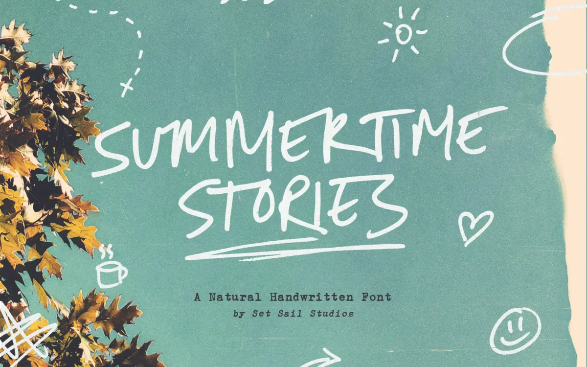
Summertime Stories is an all-caps script drawn with a real pen, and it shows. The strokes wobble slightly at the joins, the pressure isn’t perfectly even, and the letters lean forward at a casual, unhurried angle. It reads as handwriting rather than a font pretending to be handwriting, which is the whole point of the genre and the thing most scripts in this category fail to pull off.
Because every letter is a capital, the rhythm is different from a lowercase-driven script. There’s no ascender-descender bounce to carry the eye; instead the texture comes from stroke width, connecting flourishes and the intentional roughness of the linework. It sits closer to a marker-pen note than a formal invitation script, and that rustic, slightly scratchy quality is the font’s clearest point of view.
Character set and features
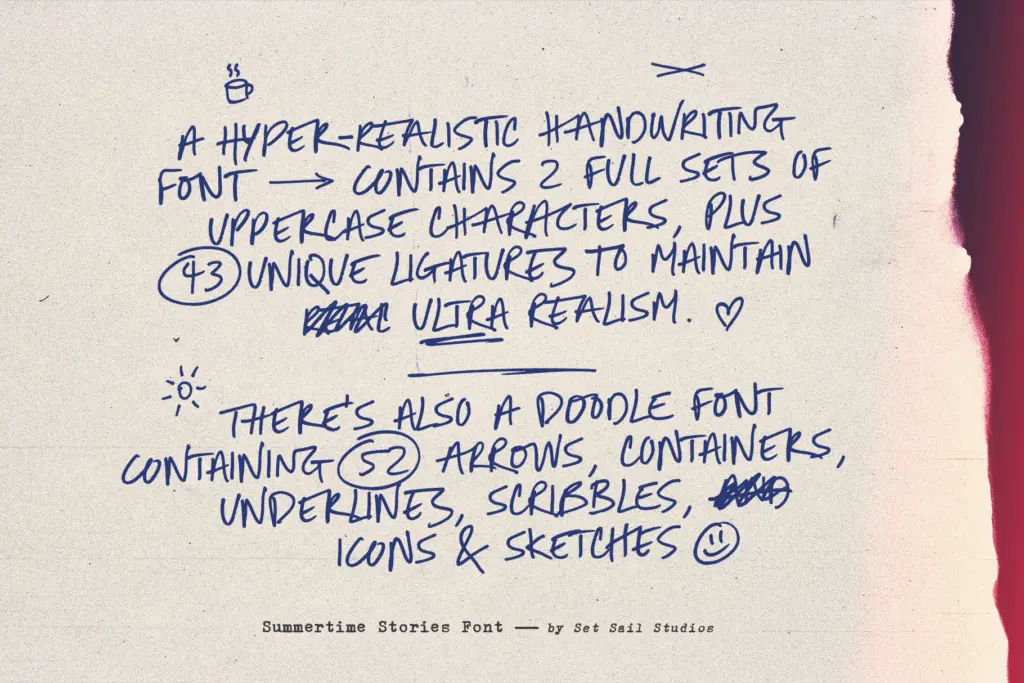
The practical work here is in the alternates and ligatures. Each letter has an alternate form, and the font includes 43 ligatures built specifically to join double-letter combinations in ways that mimic a continuous pen stroke. This matters more than it sounds like it should — repeated letters are where handwriting scripts usually break down, either repeating the identical glyph twice (a dead giveaway) or connecting badly. Here the ligatures exist precisely to avoid that, provided the software and layout support OpenType features, since none of this happens automatically in every app.
The separate Doodles font is the other half of the package: 52 arrows, scribbles, underlines, containers and small sketch icons designed to sit alongside the script rather than as a standalone typeface. Used sparingly, these give the composition somewhere for the eye to land besides the lettering itself — a circled word, an arrow pointing to a headline, a scribble underline instead of a straight rule. They’re a genuine extension of the concept rather than a bundled filler product.
Language support is broad, covering most major Western and Central European languages, so accented characters aren’t an afterthought.
Use cases
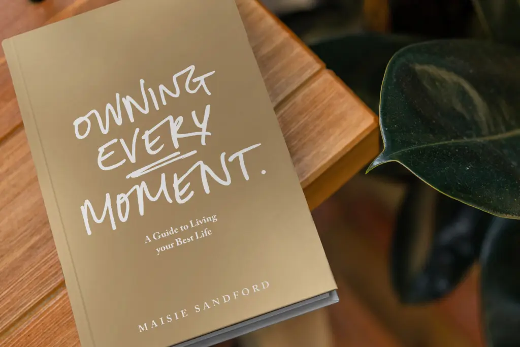
This is a font for work that wants to feel personal and slightly imperfect on purpose: greeting cards, market and craft packaging, blog headers, social graphics, quote cards, and short branding moments where a handmade signature note is the goal. The all-caps structure makes it awkward for long-form text — there’s no lowercase to fall back on, so anything beyond a phrase or two starts to feel shouty and tires the eye. It works best as a headline, a name, a short caption, or a hand-lettered accent next to a plain sans body font.
Because the roughness is baked into the drawing, it doesn’t suit projects that need to look polished, corporate or precise — the deliberate imperfection is a feature here, not a bug, but it rules the font out of luxury or formal contexts, wedding stationery aside where the rustic tone is arguably the intent. For casual, warm, human-scale branding it does the job it was built for, provided the OpenType features are actually switched on.

What we liked, and what we didn’t
Strengths
- 43 custom ligatures genuinely solve the double-letter repetition problem common in script fonts
- The bundled Doodles set of arrows and scribbles extends the concept rather than padding it out
- Broad European language support makes it usable well beyond English-language projects
Trade-offs
- All-caps-only structure makes it unsuitable for anything beyond short phrases or headlines
- The rough, casual drawing style rules out formal or polished branding contexts
Summertime Stories delivers a genuinely handmade-feeling uppercase script, with ligatures that solve the repeated-letter problem most casual scripts stumble on. It's built for short, warm, personal messaging rather than body text, and the all-caps-only structure limits how far it can stretch. Worth having for craft, social and casual branding work, less so for anything that needs a formal or extended read.

Tmfonts writes independent reviews of typefaces: what each font does well, where it falls short, what it suits, and where it is sold.