
The Regals Font Free Download
Is The Regals free to download?
The Regals is a commercial font sold on Creative Market, so the full version needs a paid license. Get it from the official listing: The Regals font download.
Need something free? These serif fonts from Google Fonts are free for personal and commercial use:
Design style
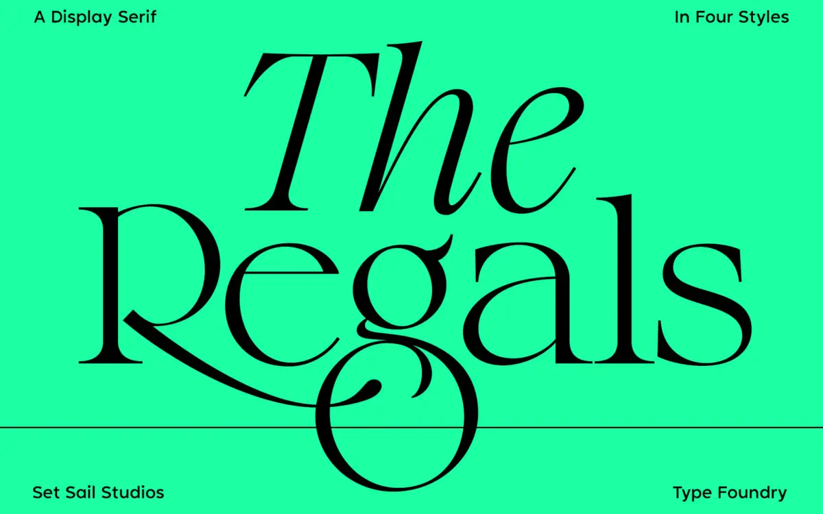
The Regals sits in transitional serif territory: moderate stroke contrast, a vertical stress, and bracketed serifs that lean crisp rather than antique. It reads as a display-first cut of a classic structure, drawn with cleaner terminals and tighter curves than you’d find in a text-oriented transitional. The bowls are a touch narrower than you’d expect at first glance, which gives the letters a slightly formal, upright posture rather than a relaxed one. It’s not trying to be a workhorse book face; it’s built to hold a headline or a short line of type and look composed doing it.
The italic is where the personality shows. It has a proper calligraphic slant with some flourish in the entry strokes, distinct from the upright rather than just a slanted clone of it, and it pairs with the alternates to push into genuinely decorative territory when you want that.
Character set and features
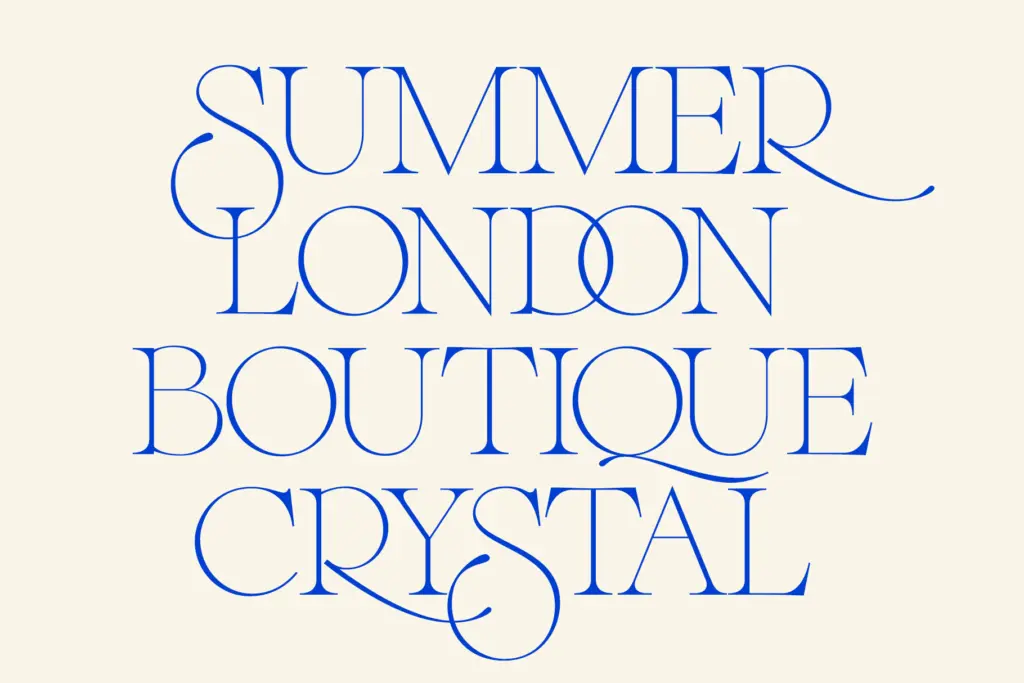
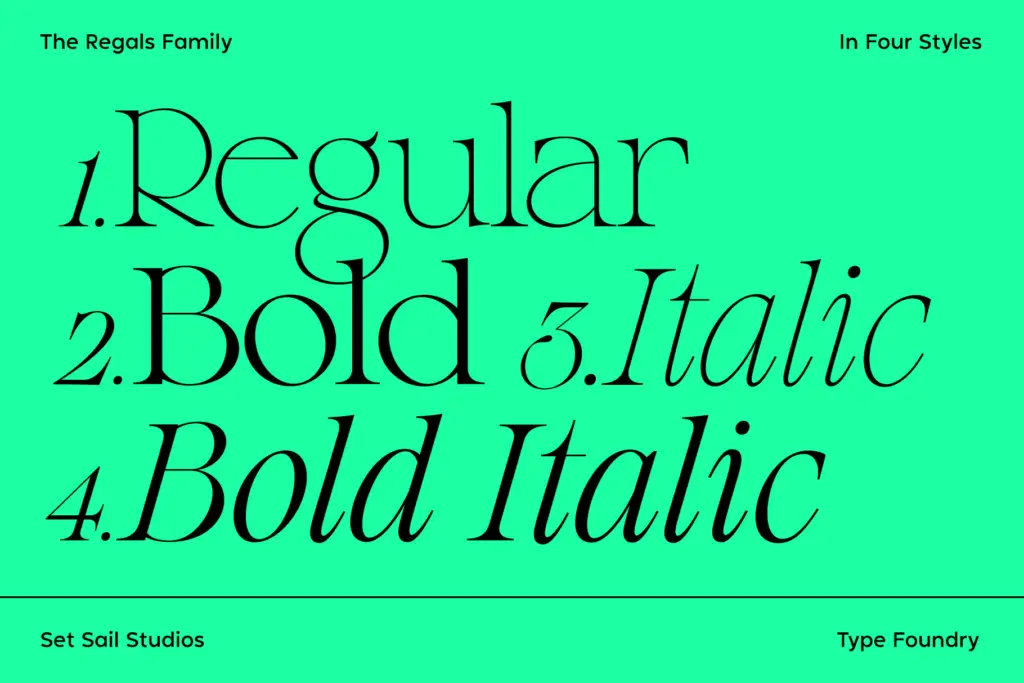
The family ships as four styles — Regular, Bold, Italic, Bold Italic — which is a sensible, unfussy range for a display serif rather than an attempt to be a full-blown system. The more interesting part is the extras: alternate letterforms for S, Q, R, g and t (accessible via Stylistic Alternates), and 36 ligatures that fire automatically once Standard Ligatures is switched on. These aren’t subtle fi/fl fixes — they’re overlapping, ornate combinations meant to be seen, the kind of thing you’d use on a single word in a logotype rather than across a paragraph.
That’s worth flagging plainly: the ligature set is a feature for short-form typesetting, not body copy. Turn it on for a headline and it adds warmth and craft; turn it on for a paragraph and the overlapping strokes will fight each other and slow reading down. Designers need to apply it selectively, which means either manual glyph substitution or careful use in software that lets you toggle OpenType features per line. Language support covers a good spread of Western and Central European languages, so multilingual headline work is covered without extra sourcing.
Use cases
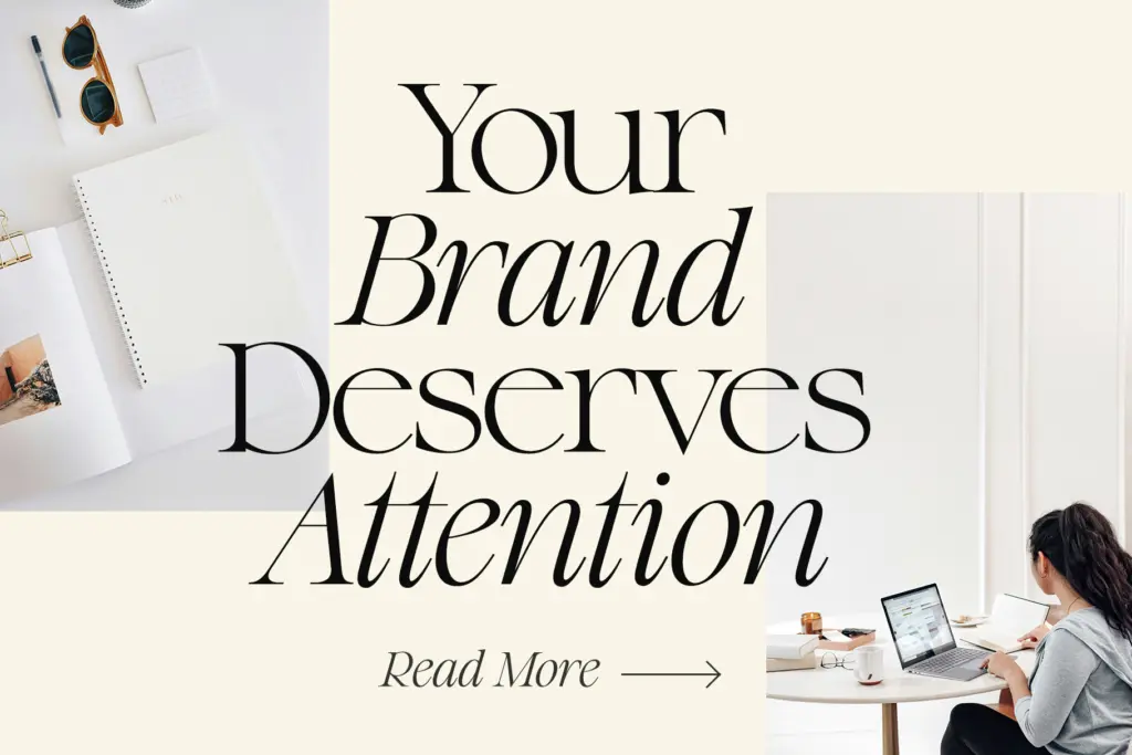
This is a font for the moments where type is doing branding work rather than communication at volume: logotypes, wordmarks, pull quotes, editorial mastheads, wedding stationery, packaging fronts. The alternates and ligatures are strongest when isolated — a single word set large, a monogram, a short tagline — where the eye has time to appreciate the overlap and swash rather than parse it as noise.
It’s less suited to anything that needs to run long: captions, body text, dense UI. The moderate contrast and vertical stress will hold up fine at smaller sizes in its plain form, but the whole reason to license this typeface is the ornamentation, and that ornamentation doesn’t scale down to paragraph use. Pair it with a quieter sans or a plainer serif for supporting text, and let The Regals do the one job — the headline, the mark, the opening line — it’s actually built for.
What we liked, and what we didn’t
Strengths
- 36 ligatures and five alternate letterforms give it genuine flourish for short-form typesetting
- The italic has real calligraphic character rather than a mechanically slanted upright
- Broad European language coverage makes it usable across multilingual branding work
Trade-offs
- Ligatures and alternates overlap heavily, which makes them unsuitable for anything beyond a word or short phrase
- Only four styles, so it can't carry a full text hierarchy without help from another typeface
The Regals is a well-drawn transitional serif that earns its keep through a genuinely decorative ligature and alternate set, best deployed on single words and short lines. It's not built for body text and shouldn't be asked to do that job. For logotypes, quotes and editorial headers it has real presence.

Tmfonts writes independent reviews of typefaces: what each font does well, where it falls short, what it suits, and where it is sold.