
The Faitline Romantic Script Font Free Download
Is The Faitline Romantic Script free to download?
The Faitline Romantic Script is a commercial font sold on Creative Market, so the full version needs a paid license. Get it from the official listing: The Faitline Romantic Script font download.
Need something free? These script fonts from Google Fonts are free for personal and commercial use:
Design style
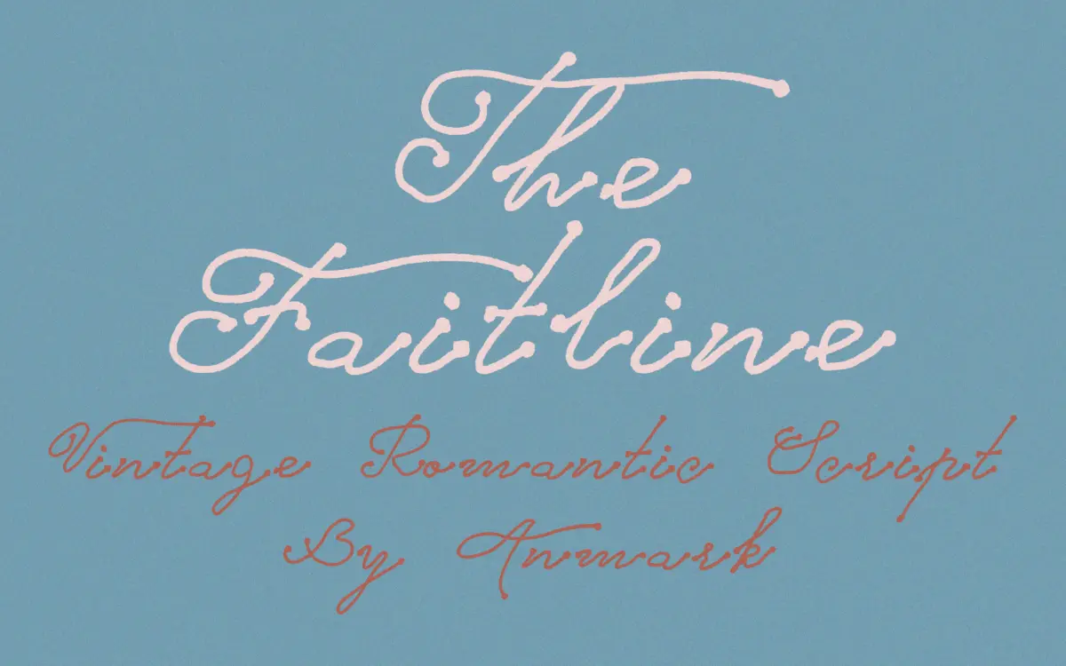
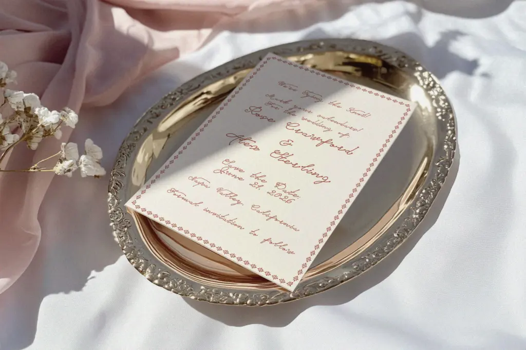
The Faitline sits in the crowded field of casual romantic scripts, and it plays that role without much fuss. The strokes are light, the letters lean forward at a gentle angle, and the connections between characters are loose rather than tightly joined — it reads more like fast, tidy handwriting than formal calligraphy. There’s none of the heavy contrast or ribboned flourish you get in bridal scripts built for foil stamping. Instead the weight stays fairly even throughout, with just enough thinning at the stroke ends to keep it from looking mechanical.
What gives it a bit of personality is the slight irregularity in the baseline and the way ascenders and descenders swing out with a small extra curl rather than stopping short. That keeps individual letters from feeling stamped out of a template. It’s not a technically ambitious script — you won’t find unusual stroke construction or an obvious signature move the way you do in scripts built around one distinctive letterform — but it does the basic job of looking handwritten and warm without straining for effect.
Character set and features
The lowercase carries the font’s identity; the connecting strokes are where the


Tmfonts writes independent reviews of typefaces: what each font does well, where it falls short, what it suits, and where it is sold.