
Figura Sans Font Free Download
Is Figura Sans free to download?
Figura Sans is a commercial font sold on Creative Market, so the full version needs a paid license. Get it from the official listing: Figura Sans font download.
Need something free? These sans serif fonts from Google Fonts are free for personal and commercial use:
Design style
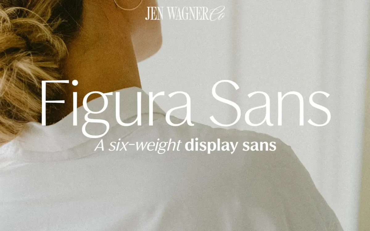
Figura Sans belongs to the current run of “quiet luxury” sans serifs that trade on restraint rather than character quirks. The skeleton is geometric-leaning but not rigidly so: circular counters on the o and e are slightly squeezed, giving the face a touch more warmth than a strict geometric sans would allow. Strokes are even in weight across the lighter cuts, with terminals cut straight rather than rounded, which keeps the overall impression clean and a little cool. There’s nothing showy here — no ink traps, no exaggerated apertures, no eccentric letterforms to build a brand story around. That’s the point. It reads as a background typeface designed to let a logotype or a product photograph do the talking.
Where the design earns its keep is in the italics. Rather than a simple oblique, the italics have a slight structural shift in the a and e that gives them a bit more personality than the uprights, which helps when you need contrast within a single family rather than reaching for a second typeface.
Character set and features
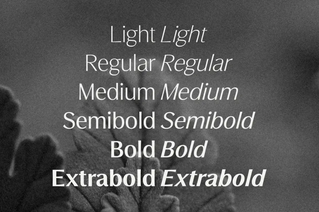
The family spans six weights — Light, Regular, Medium, Semibold, Bold, and Extrabold — each with a matching italic, for twelve fonts total. That’s a genuinely useful range for anyone building a full brand system: Light and Regular carry body copy and captions, Medium and Semibold handle subheads and pull quotes, and Bold through Extrabold cover headlines and wordmarks without needing to fake weight through software bolding.
The set covers standard numerals and punctuation along with foreign-language character support, so basic accented Latin text should render correctly. There’s no mention of stylistic alternates, ligatures, or a variable font axis, and nothing in the source material suggests small caps or extended numeral sets (fractions, superscripts). Treat this as a solid working sans rather than a feature-loaded one — the value is in the weight range, not in OpenType extras.
Use cases
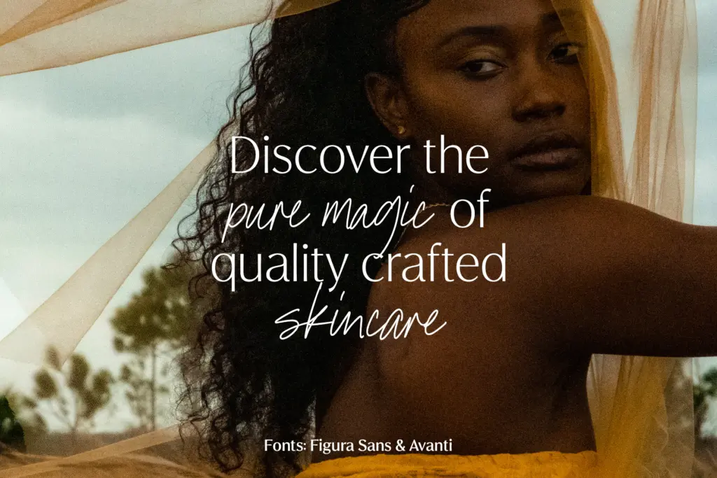
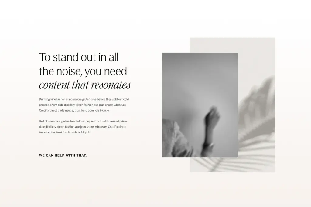
This is a font for brand systems more than for editorial layouts with long-form reading. The seller’s framing toward beauty and fashion branding, social media graphics, and quote cards is accurate to how the letterforms behave: the lighter weights look good large, spaced out, sitting next to product shots or on Instagram tiles, and the heavier weights make clean, confident wordmarks. Because the family runs a full six weights with italics, it also holds up as a standalone system for a small business that can’t commission a custom typeface — packaging, signage, a website’s whole type hierarchy can come from this one family without visible strain.
It’s less suited to dense body text at small sizes over long stretches; the even stroke weight and tight spacing in the middle weights start to feel a little flat in a paragraph of running copy, where a text-optimized sans would give more breathing room. For headlines, branding, and short-form social content, though, it does the job without drawing attention to itself, which for this kind of luxe positioning is exactly the brief.
What we liked, and what we didn’t
Strengths
- Six weights plus italics give a full hierarchy from one family
- Italics have enough structural shift to add real contrast, not just a slant
- Even, restrained forms work well for logotypes and product-adjacent branding
Trade-offs
- Middle weights feel flat in long paragraphs of body copy
- No stated OpenType extras like ligatures or alternates to add character
Figura Sans is a competent, restrained luxe sans with a genuinely useful six-weight range and matching italics, built for branding and social work rather than long-form reading. It doesn't take risks with its letterforms, which makes it dependable but not especially memorable on its own. Good choice for a full brand type system on a budget that can't stretch to a bespoke face.

Tmfonts writes independent reviews of typefaces: what each font does well, where it falls short, what it suits, and where it is sold.