
Friend Regular Font Free Download
Is Friend Regular free to download?
Friend Regular is a commercial font sold on Creative Market, so the full version needs a paid license. Get it from the official listing: Friend Regular font download.
Need something free? These serif fonts from Google Fonts are free for personal and commercial use:
Design style
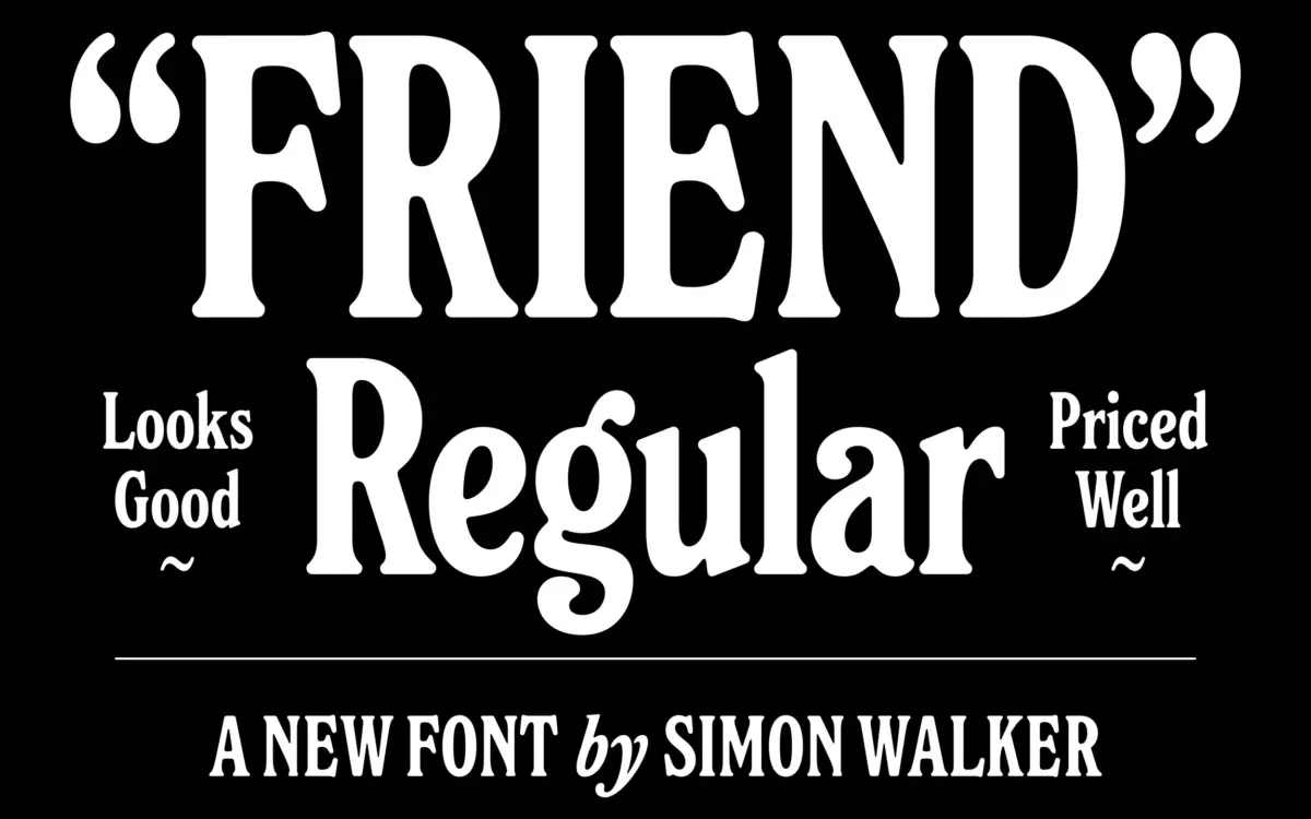
Friend is a rounded serif built on unusually tall proportions. The x-height sits high, the ascenders and descenders stretch further than you expect from a text serif, and the overall effect is a letterform that feels upright and a little formal, softened by rounded terminals and serifs that never come to a hard point. Where a lot of rounded serifs read as soft and casual, Friend keeps enough vertical tension to avoid tipping into whimsy. It reads as considered rather than decorative.
The serifs themselves are the detail worth studying. They are bracketed and blunt rather than bracketed and sharp, which gives the font a slightly worn, hand-finished quality without resorting to distressed textures or irregular baselines. Stroke contrast is moderate — enough to give the letters some rhythm on the page, not so much that it strains at small sizes. The italic leans into this further, loosening the joins and adding a bit more slope than you’d expect from a text-weight companion, which makes it useful as a genuine secondary voice rather than just a slanted duplicate.
Character set and features
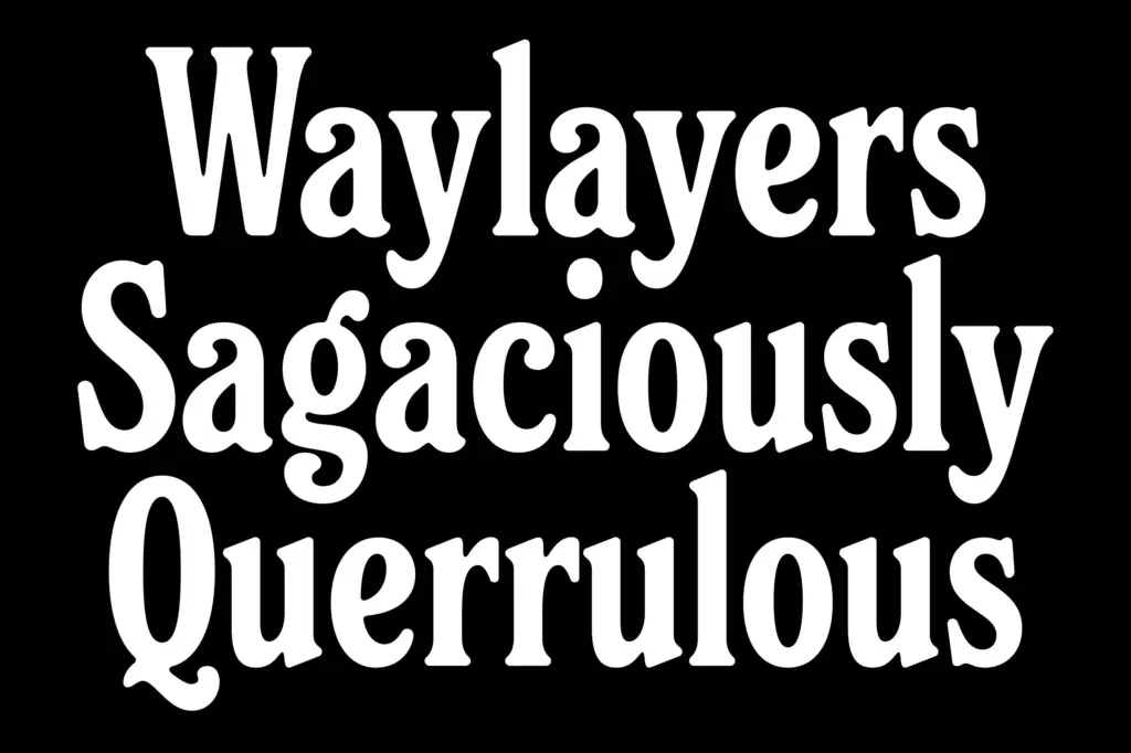
As a rounded serif with an italic companion, Friend covers the basics you need for a working family: a full set of caps, lowercase and figures, and the italic gives you a second register for emphasis, captions or pull quotes without switching families. The rounding is consistent across the character set — bowls, terminals and serif ends all share the same softened geometry, so the font holds together as a system rather than feeling like a few flourished letters bolted onto a standard skeleton.
What stands out is the height of the design. Ascenders in particular run tall, which affects line spacing more than usual — tighter leading will crowd ascenders into the line above, so this is a font that wants a bit of extra room to breathe. That’s a trade worth knowing before you drop it into a dense paragraph.

Use cases
Friend’s tallness and warmth suit headlines, short editorial copy, and branding work where you want something friendlier than a traditional serif but still credible — a masthead, a product name, a cover line. The italic makes it workable for pull quotes and captions alongside the roman, which is handy for editorial layouts that need a bit of contrast without a second typeface.
At body-text sizes it’s a mixed proposition. The rounded terminals and generous height make it readable, but that same tallness means you’ll need looser leading than a typical text serif to keep it comfortable over several paragraphs. It’s better suited to shorter blocks — intros, callouts, packaging copy — than to long-form reading. For logotypes, headers and any brand voice that wants approachable-but-not-cute, it’s a solid pick; for dense text setting, it needs care.

What we liked, and what we didn’t
Strengths
- Tall proportions and rounded serifs give it a distinctive, warm-but-credible character
- The italic is genuinely differentiated, not just a slant, making it useful for emphasis and captions
- Consistent rounding across the character set keeps the design coherent
Trade-offs
- Tall ascenders demand extra leading, which limits comfortable use in dense body text
- The rounded, blunt serif style is a strong flavour that won't suit every brand voice
Friend Regular is a distinctive rounded serif that trades some body-text comfort for a strong, friendly personality at display sizes. It's a good pick for branding and editorial headlines where you want warmth without cuteness, less so for long-form reading without generous leading.

Tmfonts writes independent reviews of typefaces: what each font does well, where it falls short, what it suits, and where it is sold.