
Rollin Eighties Font Free Download
Is Rollin Eighties free to download?
Rollin Eighties is a commercial font sold on Creative Market, so the full version needs a paid license. Get it from the official listing: Rollin Eighties font download.
Need something free? These sans serif fonts from Google Fonts are free for personal and commercial use:
Design style
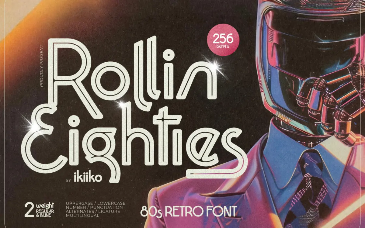
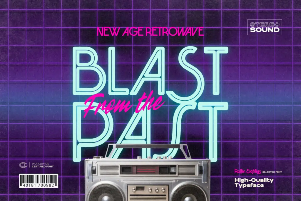
Rollin Eighties is a display sans built squarely on 1980s signage cues: angular terminals, exaggerated diagonal cuts, and a geometric skeleton that leans on sharp joins rather than soft curves. The letterforms sit wide and confident, with a vertical emphasis that recalls arcade cabinet logos and VHS title cards more than any contemporary grotesque. It comes in two styles, Regular and Inline, and the Inline is where the font earns its keep — the hollowed-out stroke reads as a lit tube rather than a gimmick, which is the whole point of a typeface chasing neon-sign nostalgia.
The drawing is consistent rather than virtuosic. Letters like K, R and the numerals carry the most personality, with angled spurs that feel deliberately cut rather than drawn. Rounder characters such as O and C are less distinctive, which is common in this genre — the retrowave vocabulary is built on straight lines, and curves tend to be the weak link. It is not a subtle font, and it isn’t trying to be. The design commits fully to one mood and executes it with reasonable discipline, without the wobble or inconsistency that sinks a lot of novelty display faces.
Character set and features
The set covers uppercase and lowercase, numerals and punctuation, with alternates and ligatures included for customising repeated letterforms — useful if you’re setting a short wordmark and want to break up visual repetition. Multilingual support is listed, which extends its reach beyond basic Latin layouts, though exactly how deep that support goes isn’t something to take on faith without testing your own language requirements. Files come in both TTF and OTF, so it drops into any standard design workflow without conversion headaches.
Lowercase is present but secondary to the font’s identity — this is a typeface built to be read in caps, at large sizes, from a distance. At small text sizes the sharp angles and tight apertures start to compete with each other, and the Inline style in particular loses definition once it drops below headline scale. This is not a book text face, and treating it as one will disappoint.
Use cases
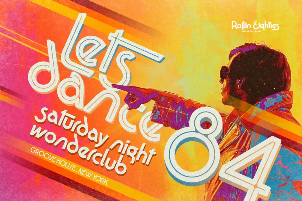
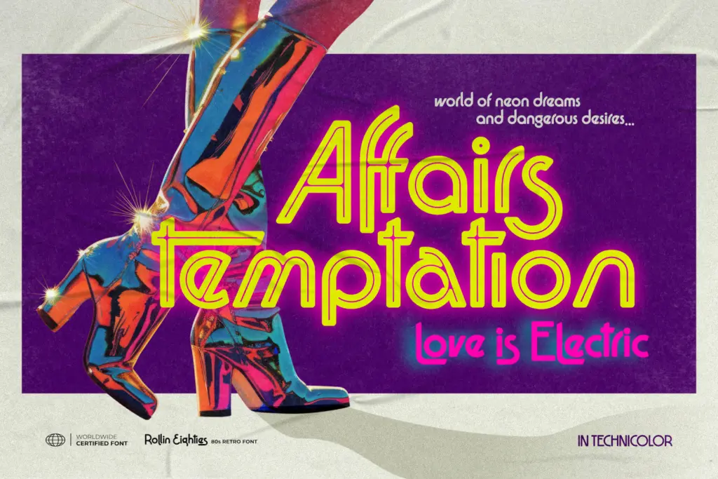
Rollin Eighties is squarely a headline and lockup font: movie titles, gig posters, club flyers, product packaging chasing a retrowave or synthwave mood, logo marks that want an instant decade signal. The Inline style works especially well over gradient or neon-glow backgrounds, which is clearly the environment it was designed for — drop it on a plain white background and some of its character drains away. Pair it with a plain, quiet body text elsewhere in the layout; this font should never be asked to carry paragraphs.
It also suits short branding moments — a single word or short lockup on a poster, a game title screen, a single-page flyer — rather than extended editorial layouts. Anyone building out a full 80s-themed identity system, from merch to social templates, will get consistent mileage out of it as the headline anchor, provided the rest of the system is built to let it stand out rather than compete with it.
What we liked, and what we didn’t
Strengths
- The Inline style convincingly mimics neon tube lettering without looking gimmicky
- Sharp, consistent angular construction gives it a clear, committed point of view
- Alternates and ligatures let you vary repeated letters in short wordmarks
Trade-offs
- Rounded letterforms are noticeably weaker than the angular ones, breaking consistency
- Legibility drops fast below headline sizes, especially in the Inline style
Rollin Eighties does one job well: it signals the 1980s instantly through sharp, confident display letterforms, especially in its Inline style. It's not built for small sizes or long-form text, but as a headline font for retrowave branding and poster work, it delivers exactly what it promises.

Tmfonts writes independent reviews of typefaces: what each font does well, where it falls short, what it suits, and where it is sold.