Sans Serif
3.7
Bazook: A Chunky Geometric Sans for 80s-Flavored Headlines
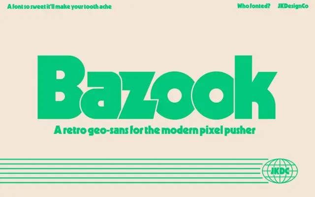
Design style Bazook is a single-weight geometric sans built heavy and stays that way through every letter. The geometry is…
 Tmfonts

Design style Bazook is a single-weight geometric sans built heavy and stays that way through every letter. The geometry is…
Tmfonts
Design style Maple is a heavy, blocky display face built for impact rather than nuance. The letterforms sit close to…
Tmfonts
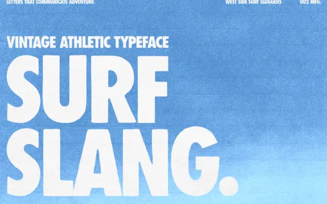
Design style Surf Slang is a heavyweight condensed sans built for shouting rather than reading. The letters are squeezed tight,…
Tmfonts
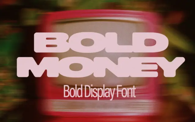
Design style Bold Money is a heavyweight all-caps display face built around a single conceit: the letters look like they’re…
Tmfonts
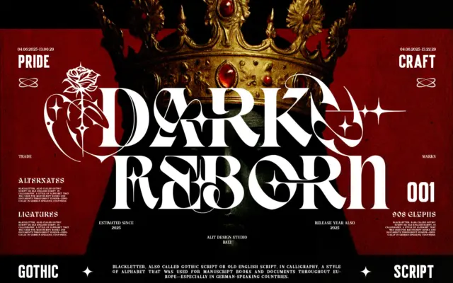
Design style Dark Reborn sits at the collision point of Blackletter and modern serif construction. Rather than the tight, angular…
Tmfonts
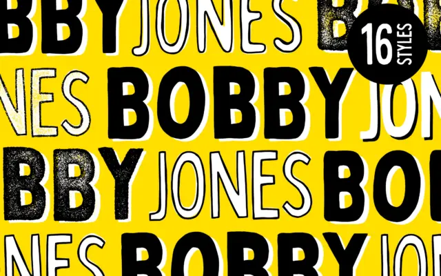
Design style Bobby Jones is a bold, handcrafted display sans built on the idea that imperfection is the point. The…
Tmfonts
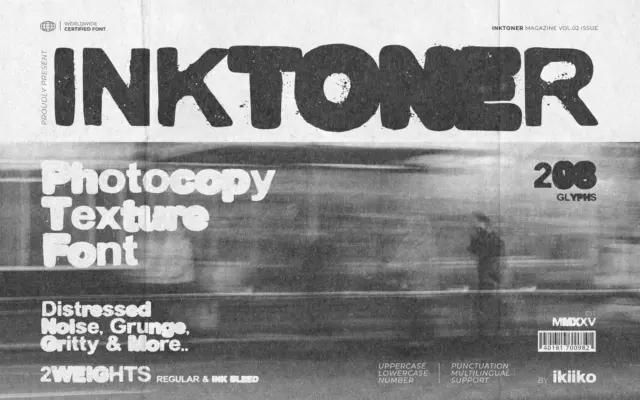
Design style Inktoner is a bold sans built around a single idea: what happens to type after it has been…
Tmfonts
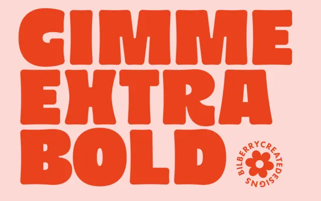
Design style Gimme Extra Bold leans hard into a 1980s revival mood — thick, rounded strokes, generous curves, and a…
Tmfonts
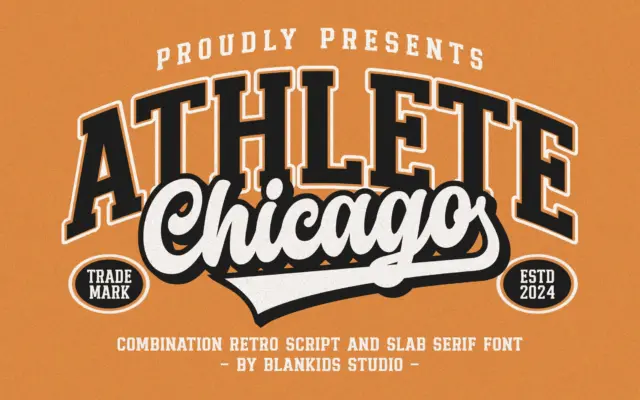
Design style Chicago Athlete pulls from collegiate athletic lettering: the block-letter jerseys, the stitched patches, the varsity jacket chest logo.…
Tmfonts