
Surf Slang Font Free Download
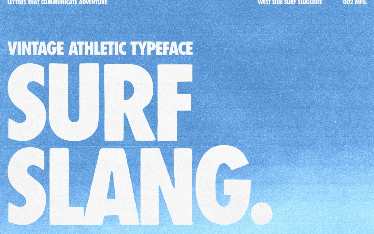
Is Surf Slang free to download?
Surf Slang is a commercial font sold on Creative Market, so the full version needs a paid license. Get it from the official listing: Surf Slang font download.
Need something free? These sans serif fonts from Google Fonts are free for personal and commercial use:
Design style
Surf Slang is a heavyweight condensed sans built for shouting rather than reading. The letters are squeezed tight, the strokes are thick, and the outlines carry a deliberate roughness — you can see where the drawing wasn’t smoothed out with a bezier tool afterward. That rough edge is the whole point. It signals hand-cut stencils, screen-printed tees, and surf-shop signage rather than anything produced on a plotter. The condensed width means the font packs a lot of visual weight into a small horizontal footprint, which is exactly what you want when a word needs to feel loud but the space is limited.
The bold-and-condensed pairing described here is a single stylistic direction rather than a range of weights, so don’t expect a light or regular cousin to soften things. This is a poster typeface, built to be big.
Character set and features
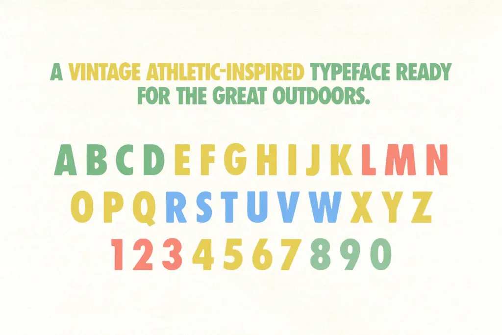
The letterforms lean into irregularity as a feature: terminals are cut at slightly inconsistent angles, curves aren’t perfectly symmetrical, and there’s a general sense of a hand behind the vector rather than a grid. That inconsistency is controlled enough that words still read cleanly at a glance — the skeleton underneath is disciplined even when the surface isn’t. Counters stay open despite the tight spacing, which keeps the bolder letters (the round ones especially) from clogging up at smaller display sizes.
Because this is a display face rather than a text face, there’s no pretense of extensive OpenType machinery here — no alternates system to speak of, no small caps, no elaborate ligature set. What you get is a confident, consistent set of capitals and companion lowercase built to do one job well: hit hard in a handful of words. That’s a reasonable trade for a typeface in this category, but buyers expecting a flexible workhorse family should recalibrate expectations before they commit a whole brand system to it.
Use cases
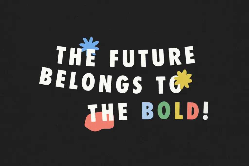
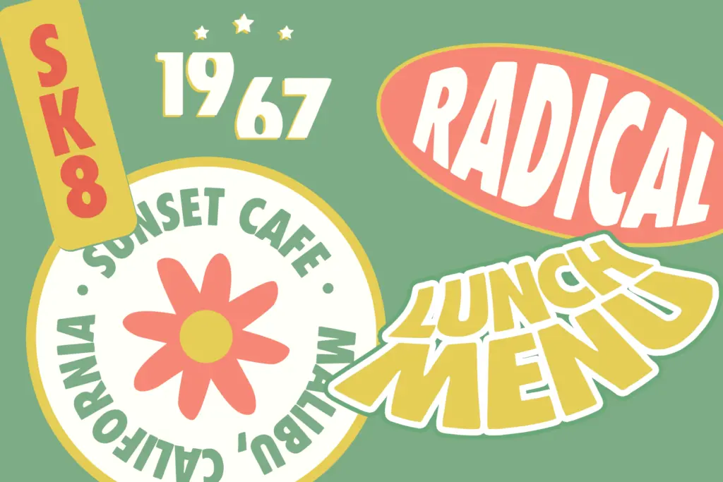
This is a logotype and lockup font first. Surf and skate branding is the obvious lane — the name isn’t subtle about that — but the same roughened, condensed boldness works for streetwear graphics, gig posters, zine covers, and any packaging that wants to read as handmade and unpolished rather than corporate. On apparel, the tight letterspacing and thick strokes hold up well under screen printing, where fine detail tends to blur or fill in.
Keep it to short words and headlines. At body-copy sizes the roughness and condensation work against comprehension — this isn’t a face for paragraphs, captions, or anything a reader has to sit with. Pair it with a plain, restrained sans or a simple serif for supporting text, and let Surf Slang carry the single word or short phrase that needs the attitude. Used that way — big, brief, and a little battered — it does exactly the job it was drawn for.
What we liked, and what we didn’t
Strengths
- Condensed width packs heavy visual weight into tight lockups and small print areas
- Rough, hand-cut edges give it an authentic screen-print feel without looking sloppy
- Open counters keep bold letterforms from clogging up at smaller display sizes
Trade-offs
- No lighter weights or alternate styles, so it can't flex across a full brand system on its own
- Roughened texture and tight spacing make it unsuitable for anything beyond short headline text
Surf Slang does one job with conviction: loud, condensed, hand-roughened display type for logos and apparel. It's not built for flexibility or for text, so treat it as a specialist tool rather than a brand-wide workhorse.

Tmfonts writes independent reviews of typefaces: what each font does well, where it falls short, what it suits, and where it is sold.