
Pasta and Wine Font Free Download
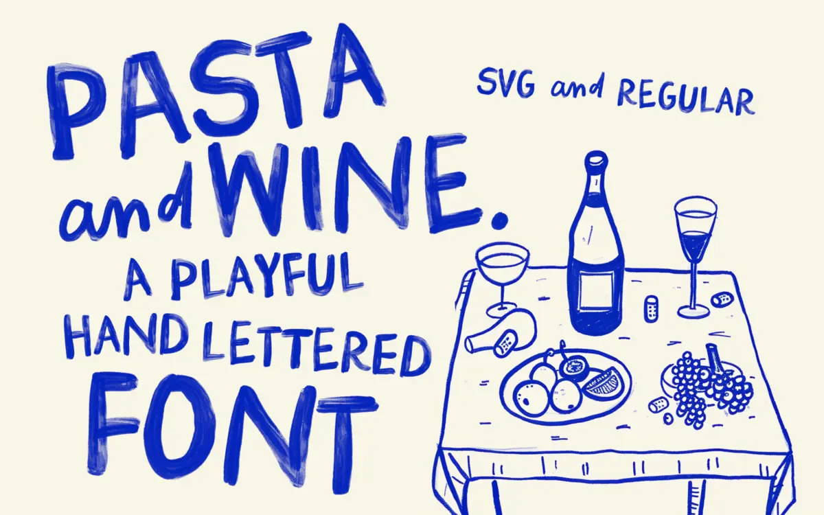
Is Pasta and Wine free to download?
Pasta and Wine is a commercial font sold on Creative Market, so the full version needs a paid license. Get it from the official listing: Pasta and Wine font download.
Need something free? These handwritten fonts from Google Fonts are free for personal and commercial use:
Design style
Pasta and Wine is a brush-painted display font that doesn’t pretend to be tidy. The strokes are thick, uneven at the edges and clearly built from an actual brush or marker rather than a vector pen tool smoothed into submission. Letters wobble slightly from one instance to the next thanks to the SVG colour-font build, so no two words look quite the same twice. That’s the whole point of it: it reads as handmade, a little chaotic, and unbothered by conventional letter spacing.
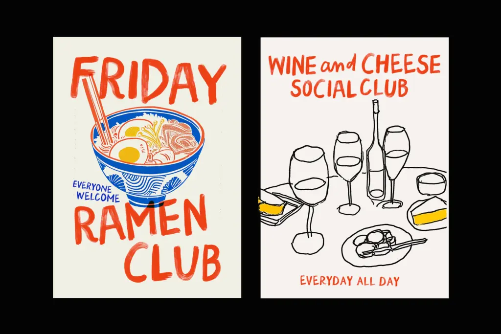
The BIG style is bold, all-caps lettering with real weight and texture in the strokes — paint pooling at the ends of some letters, thinner drag marks on others. It has the energy of sign-painted lettering on a restaurant window rather than anything formal. The SMALL companion is lowercase and comparatively calmer, though still loose and casual, and it’s meant to be paired with BIG rather than used entirely on its own.
Character set and features
Both styles come in two versions: the full-colour SVG bitmap builds, which carry the painted texture, and plain regular (non-SVG) versions for situations where an app doesn’t support colour fonts or you need a flat, single-colour outline instead. That’s a genuinely useful fallback, since SVG fonts are still inconsistently supported across design software.
There’s a case-swap trick worth knowing before you commit to a layout: toggling between uppercase and lowercase keystrokes in the BIG font produces different alternate letterforms, which is how you get variation without a separate alternates panel. The SMALL font includes OpenType ligatures aimed at making adjacent letters connect more naturally, closer to actual hand lettering. Getting the ampersand-style
What we liked, and what we didn’t
Strengths
- The SVG bitmap build carries genuine brush texture, not a filtered approximation of one.
- Case-swap alternates and ligatures give real variation without extra manual work.
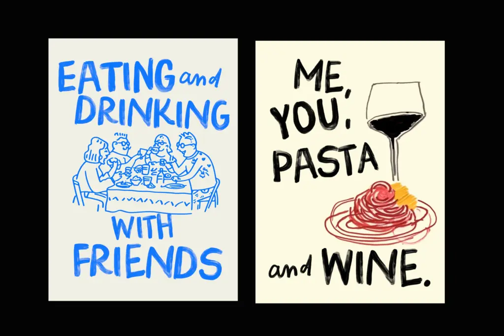
- Bonus vector illustrations extend its use beyond just typesetting words.
Trade-offs
- English-only support with limited diacritics restricts it for multilingual projects.
- SVG format support is inconsistent across software, so the flat regular fallback is a compromise, not the main event.
Pasta and Wine is a characterful, hand-painted display font that does one job well: loud, playful, food-and-drink-adjacent branding. It's not built for reading at length or for anything that needs a formal tone, but for the niche it targets — cheeky posters, menus, greeting cards — the texture and included illustrations earn their keep.

Tmfonts writes independent reviews of typefaces: what each font does well, where it falls short, what it suits, and where it is sold.