
Letters from Madelyn Font Free Download
Is Letters from Madelyn free to download?
Letters from Madelyn is a commercial font sold on Creative Market, so the full version needs a paid license. Get it from the official listing: Letters from Madelyn font download.
Need something free? These script fonts from Google Fonts are free for personal and commercial use:
Design style
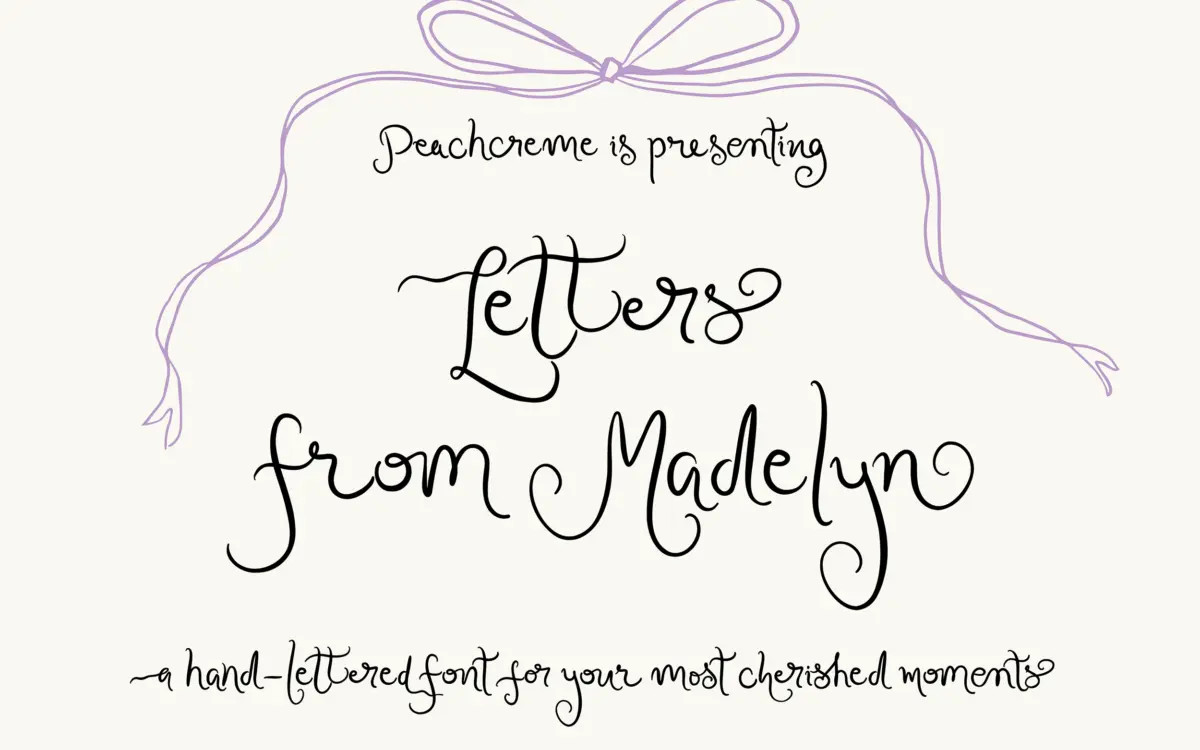
Letters from Madelyn sits in the modern calligraphy camp: connected lowercase strokes, moderate contrast between thick and thin, and a general lean toward informal script rather than the tighter, more upright feel of formal copperplate. It reads as handwritten rather than engraved, which suits its stated purpose. The three weights — Regular, Semi-Bold, Bold — give it more range than most scripts in this bracket, where you’re often stuck with one density and have to fight the font to make it work at a different scale or contrast level.
The bones are traditional calligraphy, but the finish has been pushed toward something a bit more contemporary: terminals are less fussy than classic copperplate, and the loops are restrained rather than ornate. It won’t read as antique. That’s a deliberate trade-off — designers wanting a strictly vintage wedding look may find it a touch too clean, while those wanting something current but still handwritten will find it closer to the mark.
Character set and features
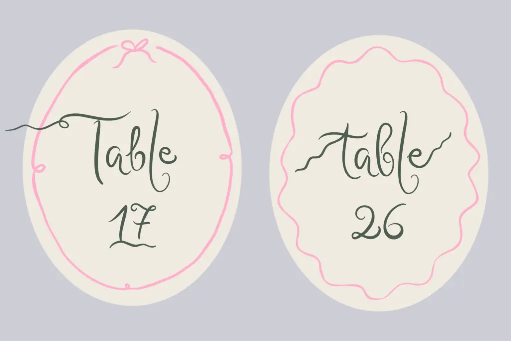
The headline feature is the alternate and ligature system: 82 ligatures and at least two alternates per lowercase letter, with some letters carrying up to ten variations and both entry and exit swashes. That’s a genuinely deep set for a script font at this level, and it matters in practice — scripts live or die on whether repeated letters within a word look identical and mechanical, or whether the software can vary them convincingly. With this many alternates available, a competent OpenType-aware layout (Illustrator, InDesign, or anything supporting stylistic alternates and contextual ligatures) can vary repeated letter pairs and avoid the flat, stamped-out look that plagues cheaper scripts.
The trade-off is setup time. A font this dependent on manual alternate selection is not a drop-in solution — you need to actually go in and swap glyphs, or use a program that supports the OpenType features, to get the benefit. Anyone setting type in a basic word processor or a program without OpenType support will get a serviceable but flattened version of what the font can actually do.
Use cases
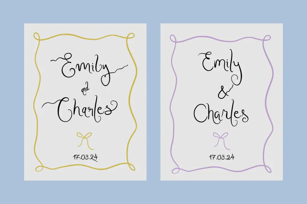
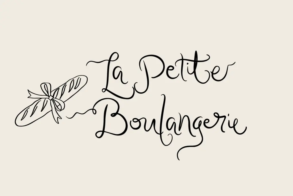
This is squarely an invitation and short-copy font: wedding suites, save-the-dates, place cards, boutique branding elements, monograms, packaging accents. The swash system rewards being used at generous point sizes where the alternates and connecting strokes are legible and the flourishes have room to breathe. At small sizes or in dense paragraph text, the joins and swashes will start to clot, which is true of nearly every script this ornamented — it is not built for body copy and shouldn’t be asked to do that job.
The three-weight structure is genuinely useful for branding work: Regular for a primary wordmark, Bold for emphasis or a secondary lockup, without reaching for a different typeface entirely. For a designer building out a wedding stationery suite or a small brand identity that needs a handwritten signature element, this gives more flexibility than a single-weight script would. Just budget the time to actually work through the alternates — the font’s value is largely locked behind that manual process.
What we liked, and what we didn’t
Strengths
- 82 ligatures and up to ten alternates per letter allow genuine variation across repeated letters
- three weights (Regular, Semi-Bold, Bold) give it more range than most single-weight scripts
- entry and exit swashes on lowercase letters suit monograms and short display lines
Trade-offs
- requires manual alternate selection or OpenType-aware software to show its best qualities
- dense swashes and connections make it unsuitable for small sizes or paragraph-length text
Letters from Madelyn is a well-built modern calligraphy script with an unusually deep alternate system for its category. It rewards time spent setting type properly and three weights extend its use beyond a single invitation card, but it's not a font for anyone wanting a quick drop-in result or body copy.

Tmfonts writes independent reviews of typefaces: what each font does well, where it falls short, what it suits, and where it is sold.