
Lazydog Kids Font Free Download
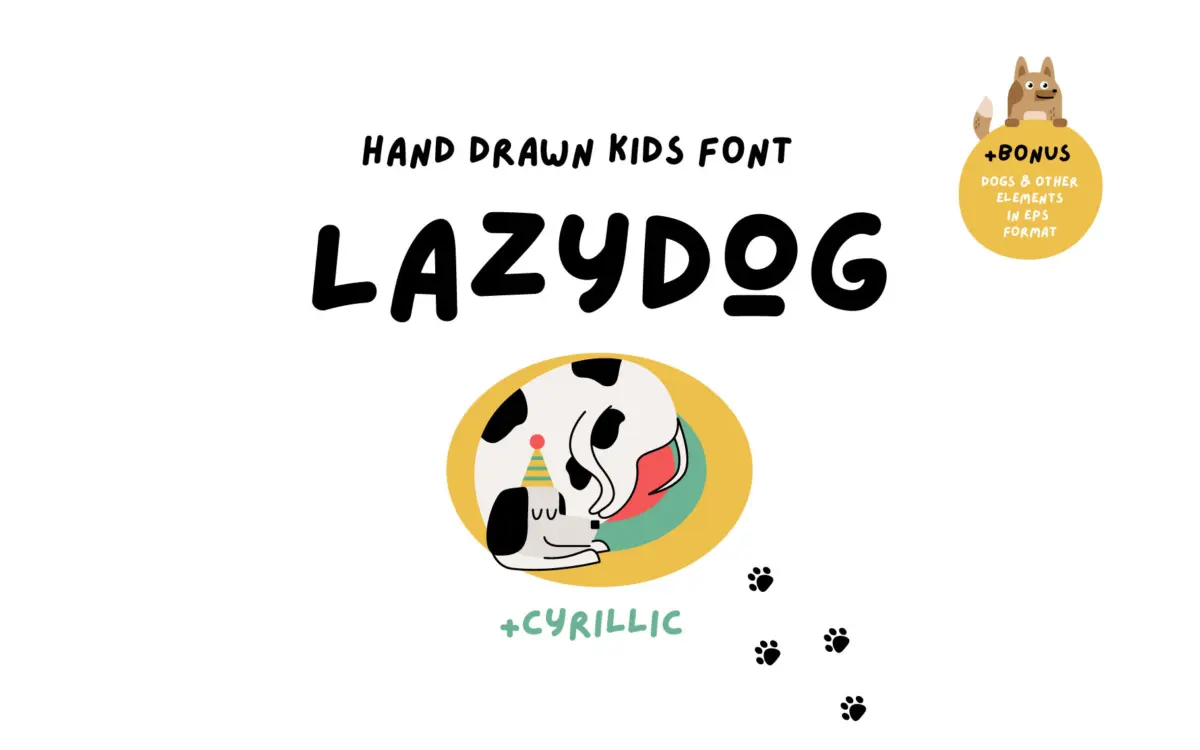
Is Lazydog Kids Font free to download?
Lazydog Kids Font is a commercial font sold on Creative Market, so the full version needs a paid license. Get it from the official listing: Lazydog Kids font download.
Need something free? These script fonts from Google Fonts are free for personal and commercial use:
Design style
Lazydog is built to look like a kid’s own scrawl, not a designer’s tidy imitation of one. The baseline drifts, stroke weight varies from letter to letter, and the joins between letterforms are loose rather than polished. This is a deliberate choice: it reads as handwriting rather than script calligraphy, closer to a marker on paper than a pen with contrast. There’s no attempt at elegance here, and that’s the point. It sits in the same territory as crayon lettering and hand-cut stickers rather than wedding scripts or editorial display faces.
The letterforms are rounded and open, with generous counters that keep them from clogging up even when the strokes get uneven. Ascenders and descenders bounce rather than align cleanly, which is where the ‘lazy’ in the name earns its keep. It won’t appeal to anyone looking for a controlled, professional handwriting style — this is intentionally rough, and that roughness is consistent enough to read as a style choice rather than sloppy drawing.
Character set and features
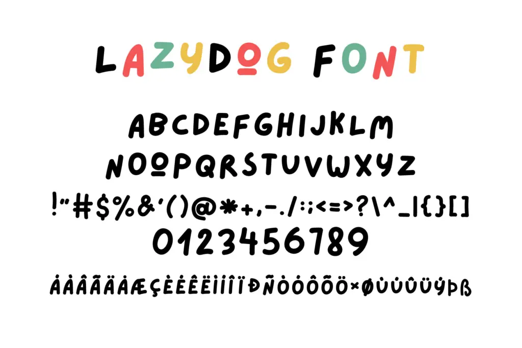
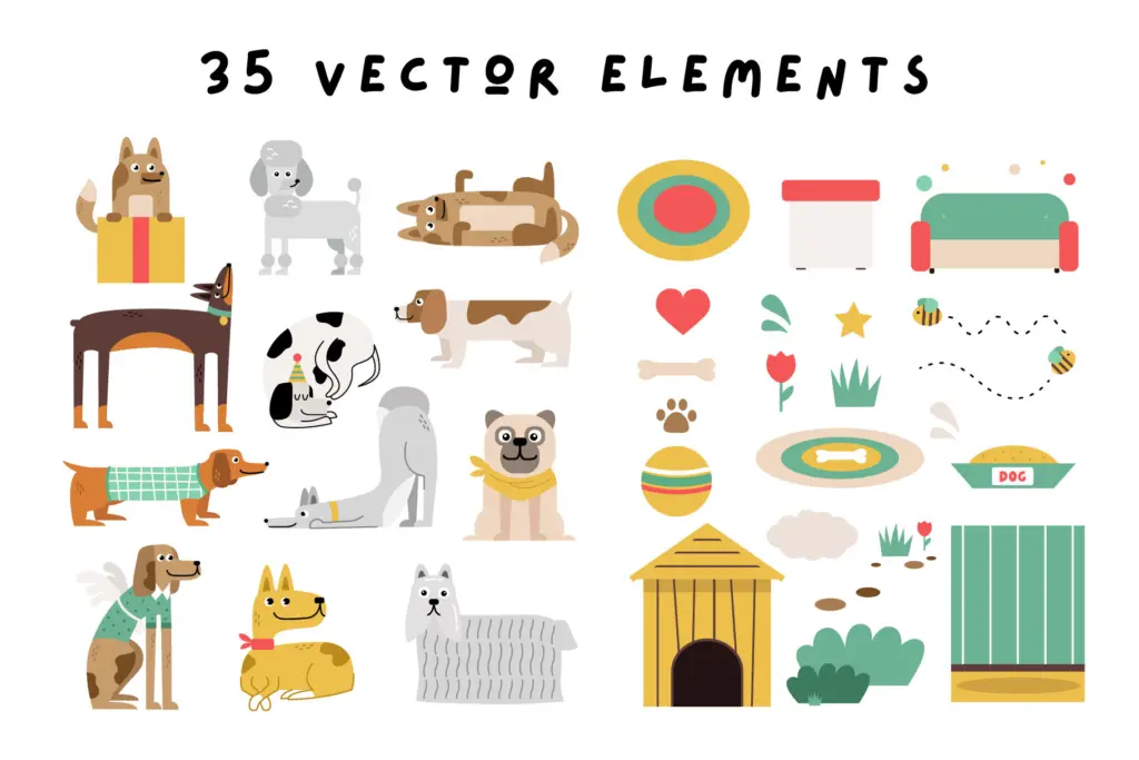
The font ships with Cyrillic support alongside the Latin set, and an update added Vietnamese, so language reach is broader than the average novelty script — worth checking if a project needs anything beyond basic Latin. Alongside the OTF font file, the package includes a set of hand-drawn dog illustrations (in both EPS and PNG) and a small run of matching stickers, which suggests the font was built as part of a themed kit rather than a standalone typeface. That’s useful context: the letterforms and the illustrations share a visual language, so pairing them together will look coherent in a way that a random dingbat pairing wouldn’t.
There’s no indication of OpenType alternates, ligatures, or swash variants in the brief, and the irregular baseline does the job of adding variety instead. That means less flexibility for designers who want to fine-tune individual letter combinations, but also less setup work — the font does its ‘handmade’ job without needing manual kerning adjustments.
Use cases
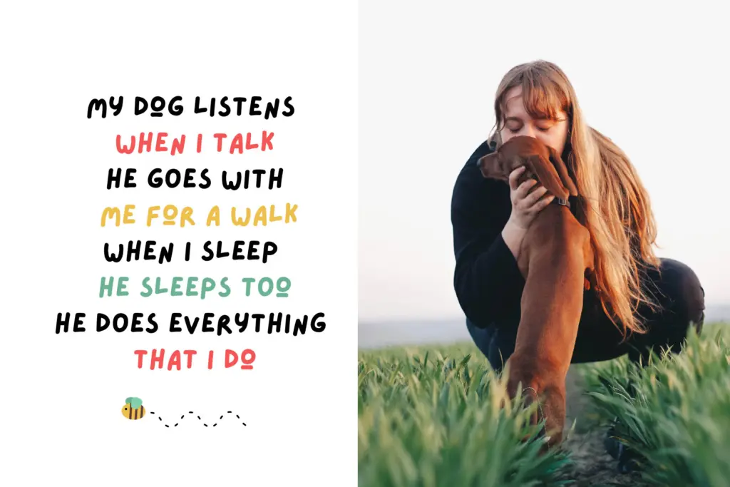
This is a font for projects aimed at children or projects that want to signal playfulness without ambiguity: picture book covers, birthday invitations, stickers, packaging for toys or baby clothing, greeting cards. It reads well as a display or headline face at fairly generous sizes — a book title, a poster headline, a sticker sheet — where the irregularity is a feature to enjoy rather than a texture to squint at.
It is not built for body copy or any setting that needs long paragraphs; the baseline wobble and inconsistent weight would tire the eye quickly at small sizes. It also isn’t the right choice for anything that needs to read as adult, formal, or refined — the whimsy is baked in and can’t be dialed back. Within that narrow lane, though, the bundled illustrations make it a practical, ready-made kit for children’s print and packaging work rather than just a typeface on its own.
What we liked, and what we didn’t
Strengths
- The bundled dog illustrations and stickers share the same hand-drawn tone as the letterforms, so kits look cohesive out of the box.
- Cyrillic and Vietnamese support give it more reach than most novelty scripts.
- The irregular baseline and varied stroke weight read as genuine kid's handwriting rather than a slick imitation of it.
Trade-offs
- Not legible at small sizes or in long text settings — it's a display face only.
- No apparent alternates or ligatures, so there's limited room to vary repeated letter combinations.
Lazydog does one job well: it looks like a child's handwriting and it comes with matching illustrations that make it easy to build a themed project around. It has no ambitions beyond that, and shouldn't be asked to.

Tmfonts writes independent reviews of typefaces: what each font does well, where it falls short, what it suits, and where it is sold.