
Wild Oaklands Handwriting Script Font Free Download
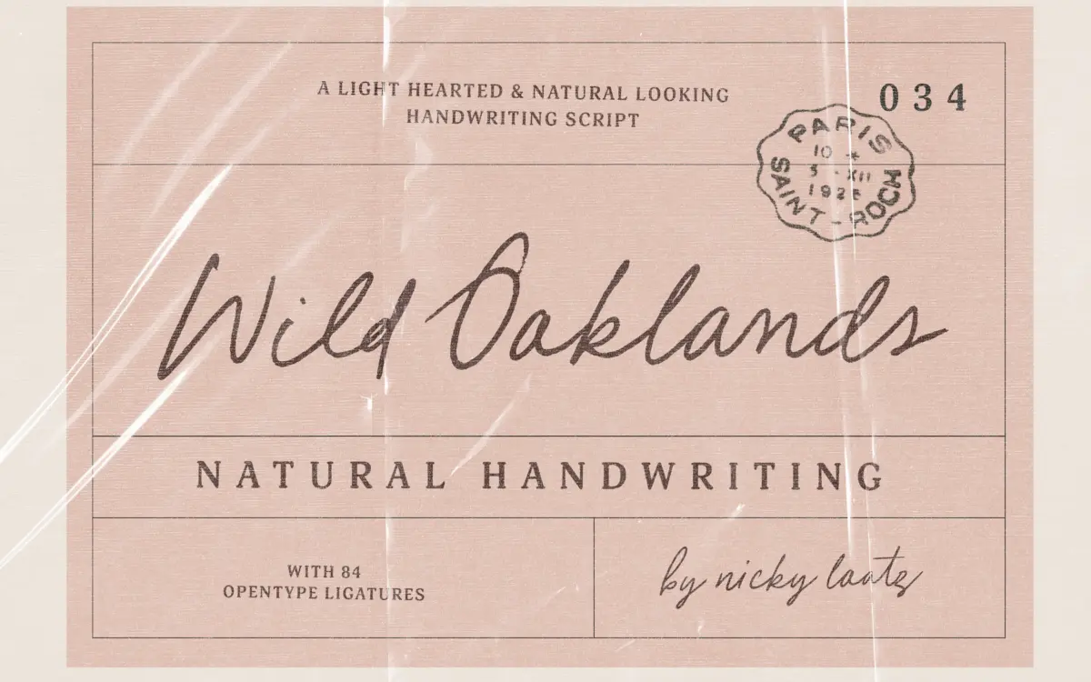
Is Wild Oaklands Handwriting Script free to download?
Wild Oaklands Handwriting Script is a commercial font sold on Creative Market, so the full version needs a paid license. Get it from the official listing: Wild Oaklands Handwriting Script font download.
Need something free? These script fonts from Google Fonts are free for personal and commercial use:
Design style
Wild Oaklands sits in the loose, marker-pen end of the script spectrum. The strokes carry visible ink pooling at the terminals and a slight wobble in the baseline that reads as genuinely handwritten rather than digitally smoothed. Letters lean forward at an inconsistent angle, joins are casual rather than calligraphic, and the overall texture is closer to a note scrawled with a felt-tip than a formal script built on broad-nib logic. There’s no attempt at uniform contrast or geometric discipline here, and that’s the point: it wants to look unplanned.
The regular cut carries most of that personality; the oblique is a companion rather than a separate mood, useful for breaking up repetition within the same layout rather than offering a distinct voice.
Character set and features
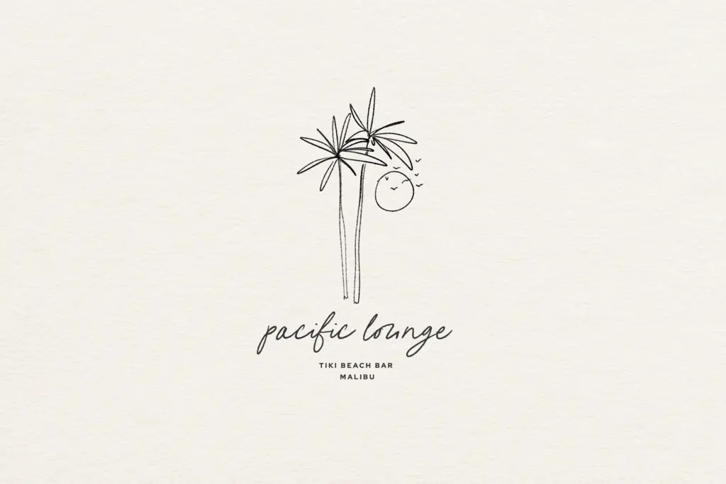
The headline feature is the ligature set — 84 of them, built to swap in alternate joins as words form, so repeated letter pairs don’t stamp out identical shapes across a line of text. This is the feature that actually matters with a font like this, because handwriting scripts live or die on whether they repeat themselves obviously. With OpenType ligatures switched on in a capable layout app, the variation holds up reasonably well across short phrases. Switch them off, or work in software with limited OpenType support, and the font collapses into a much plainer, more repetitive script — worth checking before committing a project to it.
Spacing is loose and irregular by design, which suits single words and short lines but needs watching in longer sentences, where the imprecision can start to look like poor kerning rather than intentional character. There’s no indication of extended language support or a variable axis here — treat this as a Latin-only, static two-style family rather than a broad multilingual system.
Use cases
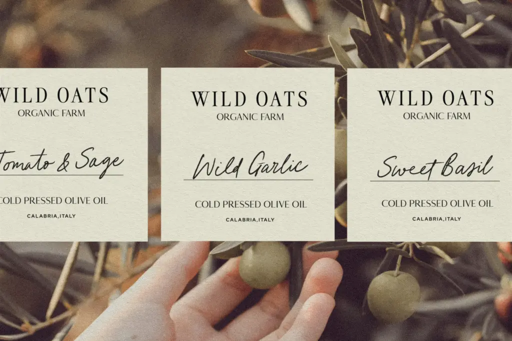
This is a font for the moments a brand wants to sound like a person rather than a company: a handwritten note tucked into packaging, a quote pulled out in a lifestyle blog, a label on a product that wants to feel small-batch. It works well at the sizes those jobs actually call for — mid-size headlines, short callouts, single lines of text — where the ink texture and ligature variation can be appreciated without asking the eye to parse long passages.
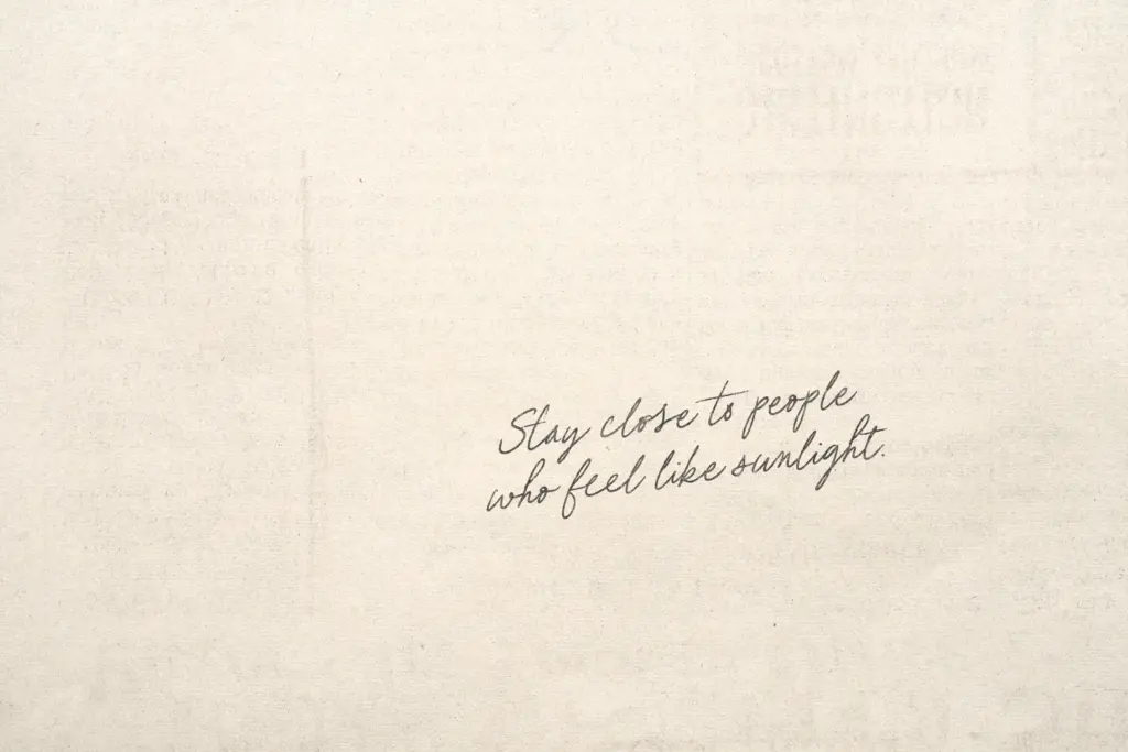
It is not a body-text font, and shouldn’t be pushed there; the irregularity that makes it charming in a two-word label becomes fatiguing across paragraphs. It also isn’t a font for projects requiring a polished, corporate script — the imperfection is baked in and can’t really be dialled back. For wedding stationery, editorial pull-quotes, packaging, and logotypes that want a personal, unforced feel, it does the job it was built for. For anything needing consistency at scale across many languages or long-form settings, look elsewhere.
What we liked, and what we didn’t
Strengths
- Ligature set genuinely reduces repetition in short phrases when enabled
- Ink-pooled terminals and irregular baseline give it a convincing handwritten texture
- Works well at label and headline sizes where its imperfection reads as charm
Trade-offs
- Falls back to a repetitive, flatter script if ligatures aren't supported or enabled
- Loose spacing becomes harder to control across longer lines of text
Wild Oaklands delivers a convincingly casual, handwritten texture that depends heavily on its ligature set actually being switched on. It's well suited to short, personal-feeling text — labels, quotes, notes — but it isn't built for long-form use or heavy multilingual work.

Tmfonts writes independent reviews of typefaces: what each font does well, where it falls short, what it suits, and where it is sold.