
Maple Font Free Download
Is Maple free to download?
Maple is a commercial font sold on Creative Market, so the full version needs a paid license. Get it from the official listing: Maple font download.
Need something free? These display fonts from Google Fonts are free for personal and commercial use:
Design style
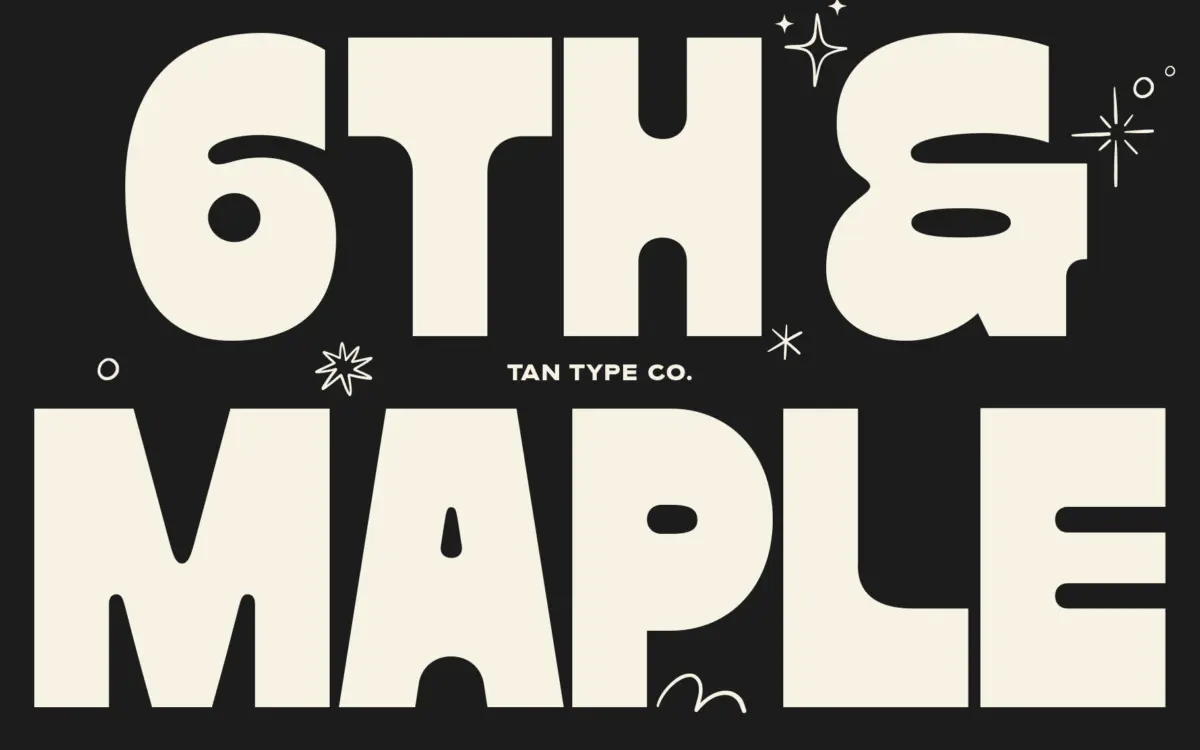
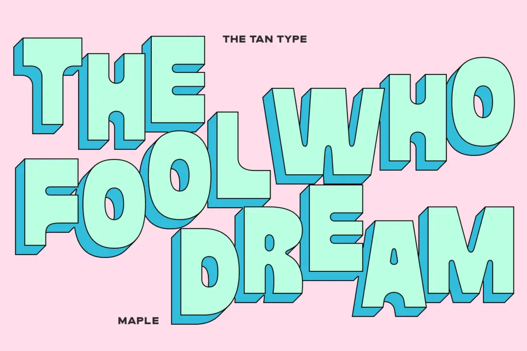
Maple is a heavy, blocky display face built for impact rather than nuance. The letterforms sit close to a slab structure but without formal serifs — chunky, squared-off strokes with almost no contrast between thicks and thins. That evenness gives the face a flat, confident weight that reads as one solid mass rather than a collection of delicate parts.
What keeps Maple from feeling like a brick, though, is a bit of looseness in the curves. Bowls and shoulders aren’t perfectly geometric; there’s a slight hand-drawn irregularity that gives the letters some flow rather than pure rigidity. It’s not a script or a humanist face by any means, but that small imprecision softens what would otherwise be a very stiff, industrial letterform. The overall attitude is blunt and current — this is a typeface that wants to be shouted, not murmured.
Character set and features
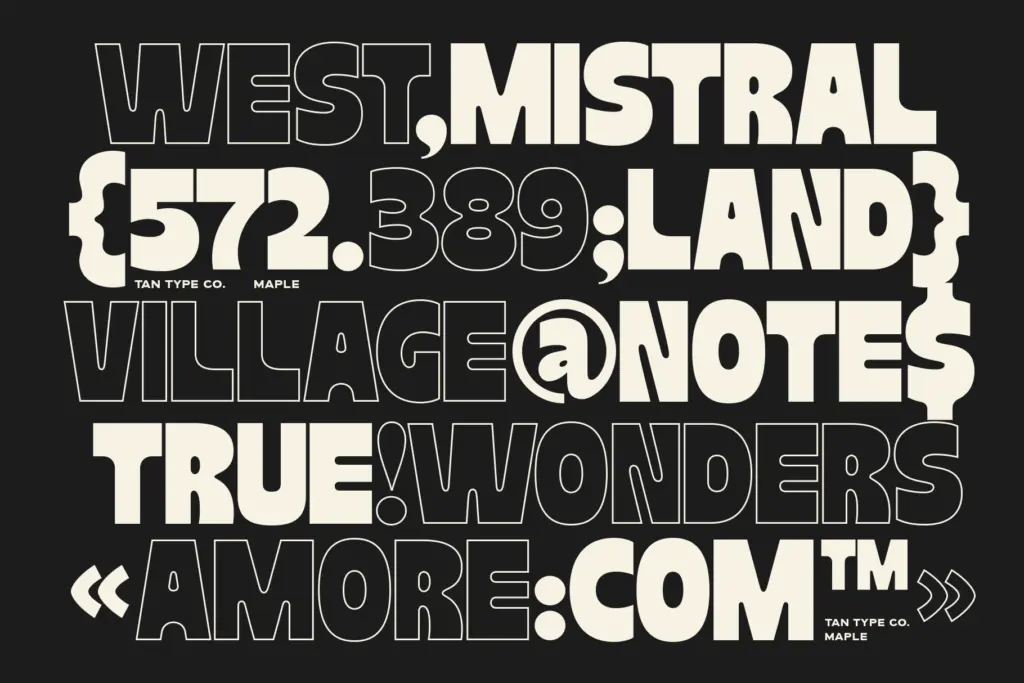
The seller notes multilingual support, so Maple should cover a reasonable range of Latin-based languages beyond basic English, useful if your headline needs accented characters. Beyond that, details on ligatures or alternate characters aren’t specified, and given the heavy, blocky nature of the letterforms, elaborate ligatures wouldn’t add much anyway — this isn’t a face built around ornamental flourish.
Because the weight is so uniform and heavy, Maple’s personality lives almost entirely in its proportions and spacing rather than in stylistic alternates. Designers should expect a fairly no-frills character set: this is a workhorse of a display font, not a font family with a dozen optical tricks. If your project depends on ligatures or swash variants for texture, look elsewhere; Maple’s job is to be bold, not intricate.
Use cases
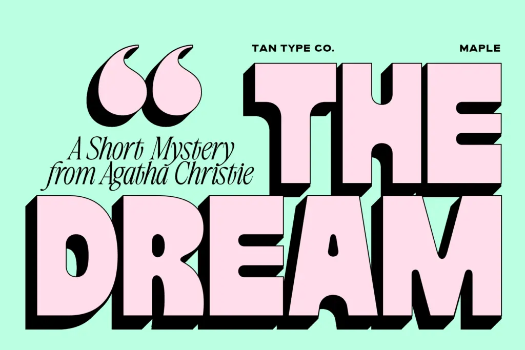
Maple’s natural home is short-form, high-impact text: posters, headlines, single-word logotypes, social graphics, merchandise. At large sizes, the chunky strokes and flat weight produce a strong graphic silhouette, which is exactly what it’s designed for. It has real presence in the sort of
What we liked, and what we didn’t
Strengths
- Uniform heavy weight gives strong, confident presence at large sizes
- Slight irregularity in the curves keeps the blocky forms from feeling stiff or purely geometric
- Multilingual support extends its usefulness beyond basic English headlines
Trade-offs
- Counters close up and legibility drops fast at smaller sizes or in longer text
- Character set appears fairly plain, with little in the way of ligatures or stylistic alternates
Maple is a solid, no-nonsense heavyweight display face that does one job well: making a short line of type look loud and confident. It's not built for reading at length or for subtle branding work, but for headlines and posters it delivers real graphic punch.

Tmfonts writes independent reviews of typefaces: what each font does well, where it falls short, what it suits, and where it is sold.