
Aspire Pasque Font Free Download
Is Aspire Pasque free to download?
Aspire Pasque is a commercial font sold on Creative Market, so the full version needs a paid license. Get it from the official listing: Aspire Pasque font download.
Need something free? These script fonts from Google Fonts are free for personal and commercial use:
Design style
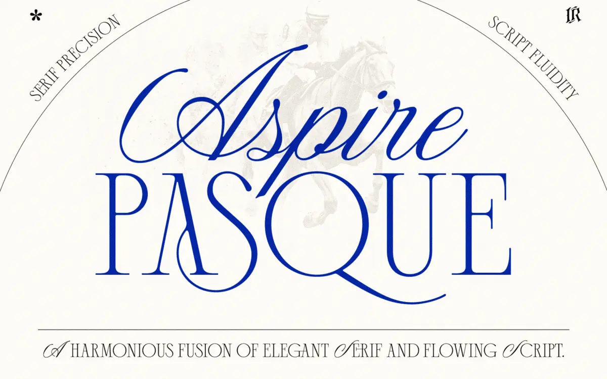
Aspire Pasque is a two-part duo built on a familiar formula: a formal serif paired with a fluid script, sold as a matched set for branding and invitation work. The script carries most of the personality. It leans into moderate contrast between thick downstrokes and hairline entry and exit strokes, with a slant that stays consistent letter to letter rather than wandering, which keeps the baseline feeling controlled even where the connections get busy. The serif companion is quieter — upright, moderate-contrast, with bracketed serifs that read as classical rather than geometric. Neither half is trying to be radical. This is a duo built to sit politely behind a couple’s names or a product line, not to announce itself.
Where the design earns its keep is in how the two styles are drawn to the same rhythm: similar stroke weight, similar x-height proportions relative to their respective roles, so the pairing doesn’t feel like two unrelated fonts stapled together, which is a common failure in duo packages.
Character set and features
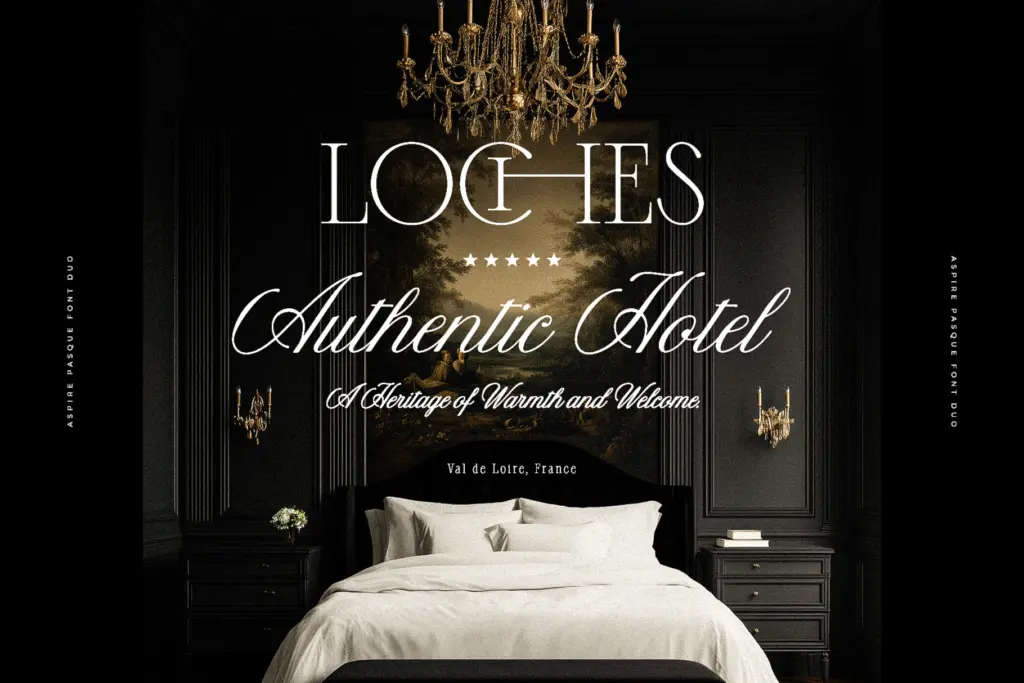
The script includes the ligatures the brief promises, and they matter more here than in most script faces because the letterforms are built to connect — without alternate forms and ligature sets, awkward collisions between certain letter combinations would be far more visible. Contextual alternates smooth over the joins that would otherwise look mechanical, particularly around ascenders and descenders that would collide at tight tracking.
Language support covers English plus Western and Central European characters, which is enough for most branding and stationery work in those markets but won’t stretch to Cyrillic, Greek, or extended Vietnamese diacritics — worth checking before committing to a multilingual project. The serif is the more workhorse of the two: it has the numerals, punctuation, and basic small-caps-adjacent presence you’d want for supporting text, though it’s not trying to be a full editorial text face with the density of features that implies.
Use cases
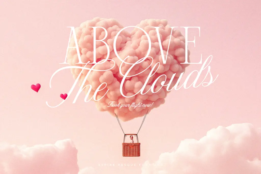
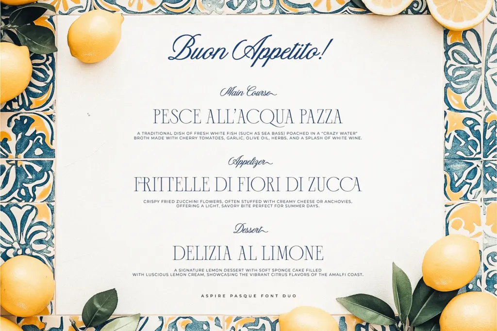
Wedding stationery is the obvious home for this duo, and it’s genuinely suited to it — the script for names and the serif for details, dates, and venue copy is exactly the hierarchy the pairing was drawn for. Luxury packaging and logotype work benefits from the same split: script as the signature mark, serif as the supporting wordmark or tagline. It also does reasonable work in editorial contexts where a single elegant word or drop headline needs to feel handwritten without tipping into casual.
Where it strains is at small sizes or in dense paragraphs. The script isn’t meant to run as body copy, and even the serif, while more legible, is drawn with enough restraint that it wants generous point sizes and line spacing rather than newspaper-column density. Treat this as a display and accent pairing, not a full editorial system, and it does its job cleanly.
What we liked, and what we didn’t
Strengths
- Ligatures and contextual alternates smooth over the script's letter connections convincingly
- Serif and script share consistent weight and proportion, so the pairing reads as one family
- Handles the wedding stationery and logotype brief it was clearly designed for
Trade-offs
- Language support stops at Western and Central European characters, ruling out Cyrillic or Greek projects
- Not built for body text or dense layouts — both styles need generous size and spacing to hold up
Aspire Pasque is a competent, well-matched serif and script pairing aimed squarely at wedding and luxury branding work. It doesn't reinvent the format, but the two halves are drawn with enough shared rhythm that they actually look like a pair rather than a bundle of convenience.

Tmfonts writes independent reviews of typefaces: what each font does well, where it falls short, what it suits, and where it is sold.