
Milk & Clay Font Free Download
Is Milk & Clay free to download?
Milk & Clay is a commercial font sold on Creative Market, so the full version needs a paid license. Get it from the official listing: Milk & Clay font download.
Need something free? These sans serif fonts from Google Fonts are free for personal and commercial use:
Design style
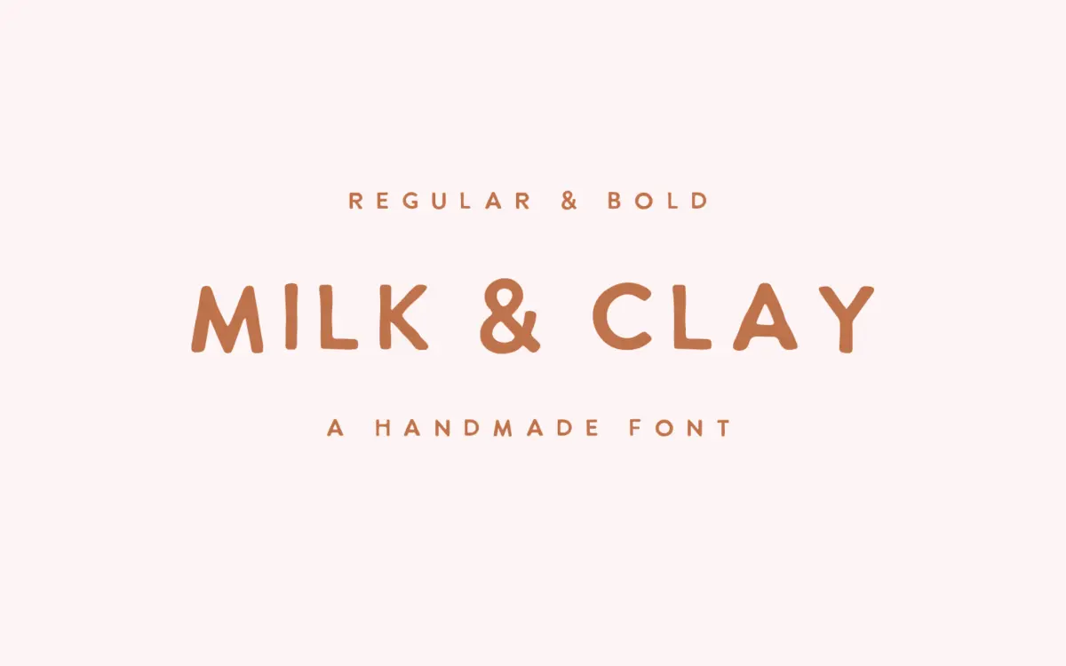
Milk & Clay is a handwritten sans serif with the loose, slightly wobbly construction you’d expect from something drawn quickly with a marker rather than ruled with a pen. Strokes are monolinear, terminals are blunt, and the baseline drifts just enough to read as handmade without tipping into illegible scrawl. It comes in two weights, Regular and Bold, which gives it more range than most single-weight hand-lettered releases.
The letterforms lean toward the informal end of handwritten sans faces — round, a bit squat, with open counters that keep it from clogging up even though the strokes are fairly heavy for a sans. There’s a warmth to it that comes from the imperfections: no two lowercase a’s or e’s look quite identical in spirit, even if they’re technically the same glyph repeated. That’s the appeal and also the ceiling. This isn’t a font with a sharp point of view about form; it’s a font with a point of view about mood. It wants to feel approachable, a little rustic, a little DIY.
Character set and features
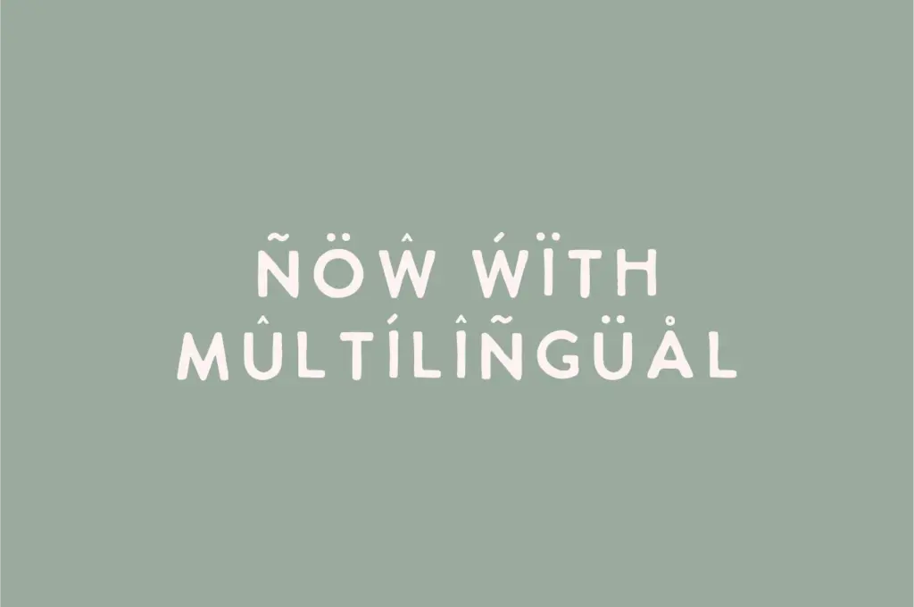
The set covers uppercase, lowercase, numerals and standard punctuation, which is what you’d need for short-form marketing copy and social captions. There’s no indication of extended language support, ligatures, or alternate glyphs beyond the two weights, so treat this as a straightforward Latin character set rather than a font with opentype tricks up its sleeve. That’s fine for its intended use — nobody is setting a novel in Milk & Clay — but it means designers who want swash variants or contextual alternates to break up repetition will need to do that manual work themselves, mixing case or kerning by hand.
At small sizes the handwritten irregularity starts to work against it. The uneven stroke weights and wandering baseline that read as charming in a headline get muddy once you’re setting body-length quotes or paragraph text. This is a display face at heart, even though it’s filed as sans serif, and it performs best where its imperfections stay legible as character rather than noise.
Use cases
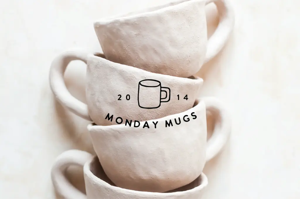
The obvious home for Milk & Clay is exactly what the name suggests: handmade product branding, ceramics packaging, market stall signage, anything trading on a crafted, unpolished aesthetic. It also does well in short Instagram quote graphics and blog headers, where a line or two of text can carry the personality without straining readability. The Bold weight is useful here — it holds up better against busy photo backgrounds than the Regular would on its own.
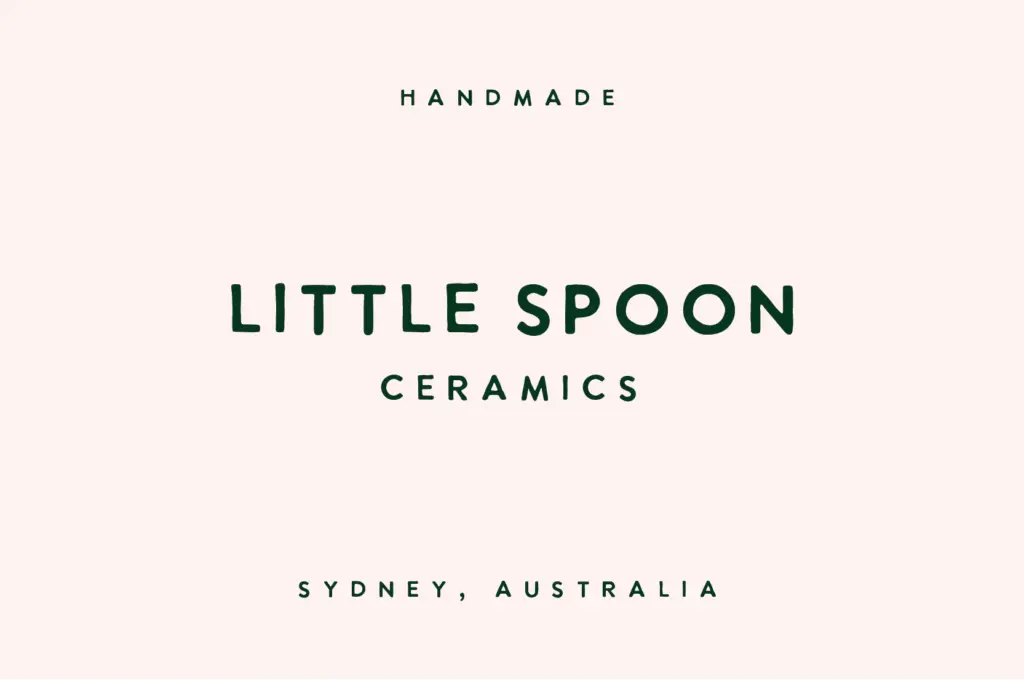
Logo work is plausible for small, artisan-facing brands, though the informality limits it to a specific tier of client. It won’t read as premium or corporate, and shouldn’t be asked to. For anything requiring sustained reading — packaging copy, editorial body text, long captions — it’s the wrong tool. Pair it with a plain sans or serif for supporting text and let Milk & Clay do the talking only where a few words need to feel handmade.
What we liked, and what we didn’t
Strengths
- Two weights give it more range than most single-weight hand-lettered fonts
- The blunt, monolinear strokes suit ceramics and handmade product branding without trying too hard
- Bold weight holds up against busy backgrounds for Instagram quote graphics
Trade-offs
- No ligatures or alternate glyphs to break up repetition across longer text
- Legibility drops quickly at body-copy sizes; it's a display face wearing a sans serif label
Milk & Clay is a solid, unpretentious handwritten sans for craft and small-batch branding, with enough weight variation to give it some flexibility. It's not built for reading at length, and its charm depends entirely on staying short — a few words per placement.

Tmfonts writes independent reviews of typefaces: what each font does well, where it falls short, what it suits, and where it is sold.