
Postcards from Napoli Script Font Free Download
Is Postcards from Napoli Script free to download?
Postcards from Napoli Script is a commercial font sold on Creative Market, so the full version needs a paid license. Get it from the official listing: Postcards from Napoli Script font download.
Need something free? These script fonts from Google Fonts are free for personal and commercial use:
Design style
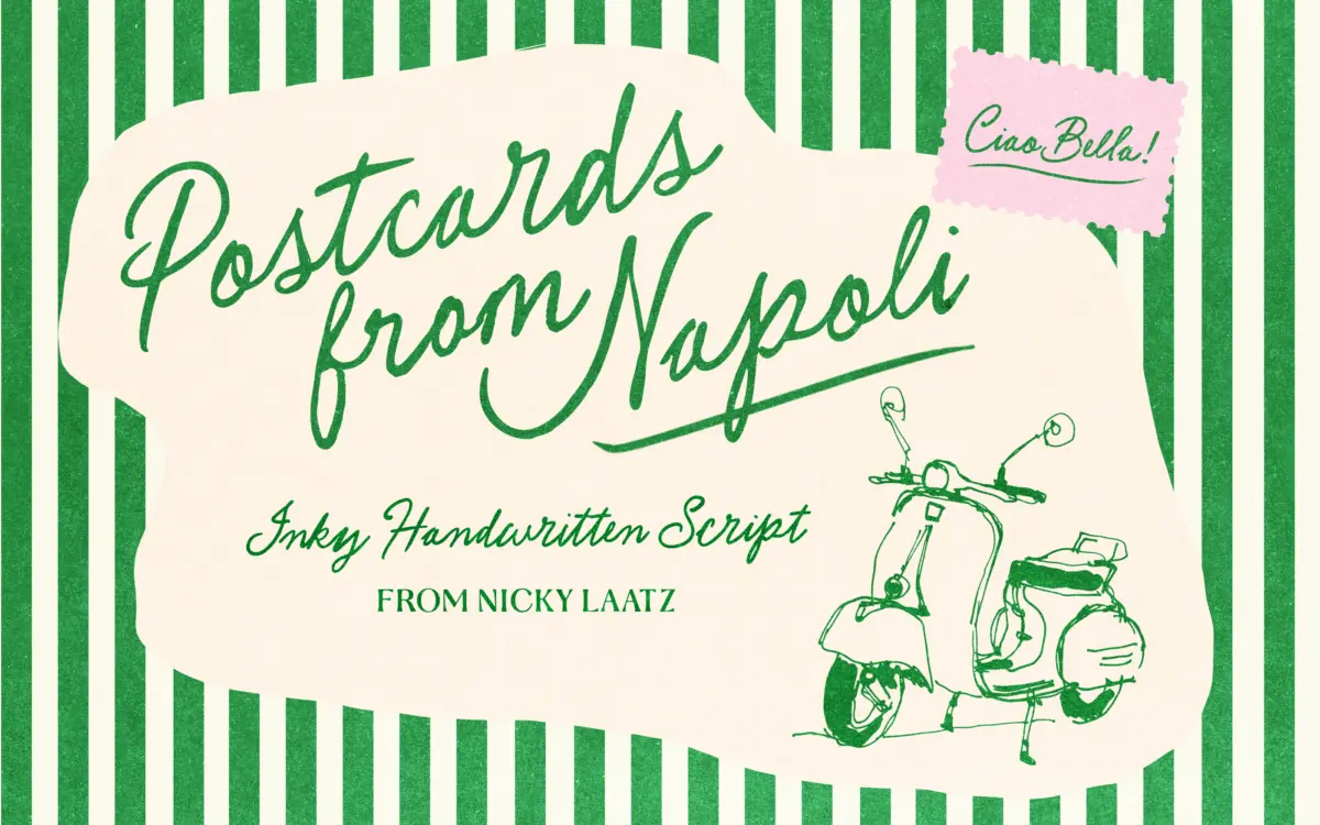
Postcards from Napoli Script sits in the loose, pen-and-paper category of script faces rather than the smoother, more formal calligraphic ones. The strokes carry visible pressure changes and bumpy edges, as though written quickly with a felt-tip or dip pen and not corrected. There’s no attempt to hide the tool marks — ink pooling at the ends of strokes, slightly uneven baselines, letters that lean and bounce rather than sit on a rigid grid. That roughness is the whole personality of the design. It reads as a note scrawled on the back of a postcard, not a formal invitation script.
The letterforms themselves are fairly open and casual, with connections between letters that feel handwritten rather than engineered. Ascenders and descenders swing out with some flourish, but not to the point of illegibility. It’s a script built for warmth over precision — you feel the hand behind it, which is the point, but it also means the design leans hard into informality and won’t suit anyone chasing a polished, corporate script look.
Character set and features
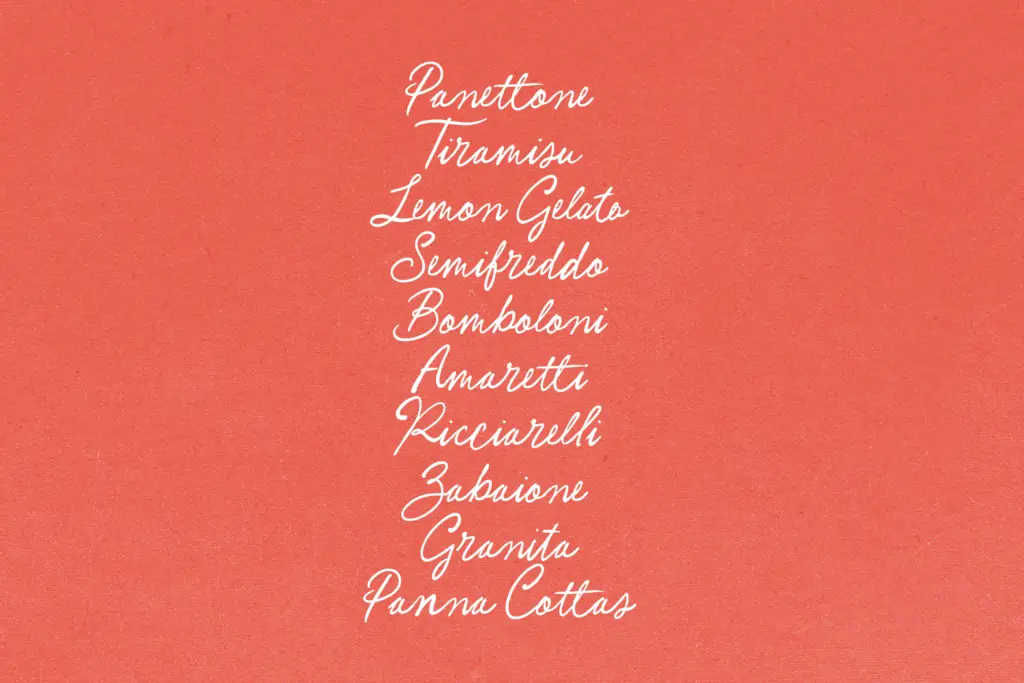
The font includes OpenType alternates and ligatures, which matter more here than in most scripts because the letterforms are irregular by design — repeated letters in a word can look mechanically repetitive if alternates aren’t switched on. Turning them on breaks up that repetition and reinforces the handwritten illusion, so this isn’t an optional extra so much as part of getting the font to work as intended. Designers who set type without checking OpenType panels will get a flatter, more repetitive result than the font is capable of.
It’s also PUA encoded, which means the alternate characters remain accessible in software that doesn’t support standard OpenType features — useful for anyone stuck with an app that ignores ligature and stylistic-alternate tags. Beyond that, there’s no information here about extended language support or a wide weight range, so treat this as a single-style, Latin-focused script rather than a full multilingual family.
Use cases
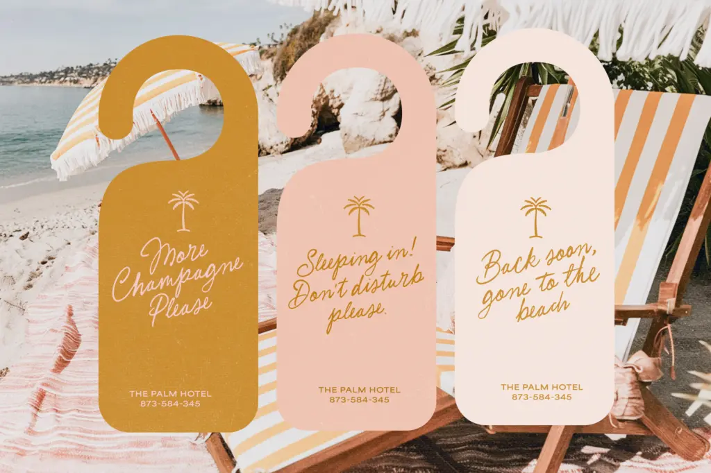
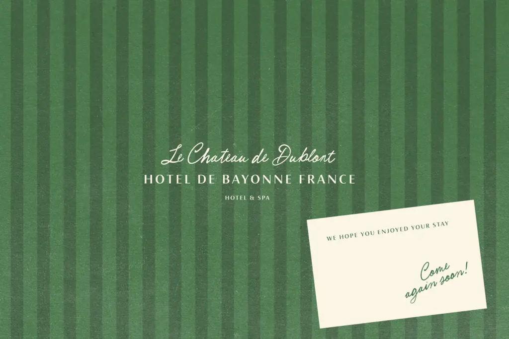
This is a font for projects that want to feel personal and a little unpolished: greeting cards, travel-themed stationery, café signage, boutique packaging, and invitations for events that aren’t formal weddings so much as relaxed, romantic ones. The Italian, dolce-vita reference in its name is doing real work — it fits Mediterranean, food-and-travel, or lifestyle branding better than it fits tech, finance, or anything that needs to look buttoned-up.
At small sizes the roughness can get muddy, so it’s best reserved for headlines, short phrases, logotypes, and hand-lettered accents rather than body copy or dense paragraphs. Pair it with a plain sans or a quiet serif for supporting text, and let this script carry just a few words at a time — a name, a greeting, a short line on a menu or postcard. Overuse across a full layout will tire the eye and undercut the casual charm that makes it work in small doses.
What we liked, and what we didn’t
Strengths
- Genuine pen-and-paper texture with visible pressure changes rather than a clean vector script look
- OpenType alternates and ligatures meaningfully reduce repetition in handwritten-style words
- PUA encoding keeps alternates accessible even in software without full OpenType support
Trade-offs
- Roughness and uneven baselines make it unreliable at small sizes or in dense text
- No indication of extended language support or multiple weights, so it's a single-style tool rather than a full family
Postcards from Napoli Script delivers a convincing rough, handwritten feel that works well for short, personal-feeling headlines and stationery. It's not built for body text or formal work, and its charm depends on actually switching on the alternates and ligatures rather than setting it flat.

Tmfonts writes independent reviews of typefaces: what each font does well, where it falls short, what it suits, and where it is sold.