
Gimme Extra Bold Sans Serif Font Free Download
Is Gimme Extra Bold Sans Serif free to download?
Gimme Extra Bold Sans Serif is a commercial font sold on Creative Market, so the full version needs a paid license. Get it from the official listing: Gimme Extra Bold Sans Serif font download.
Need something free? These sans serif fonts from Google Fonts are free for personal and commercial use:
Design style
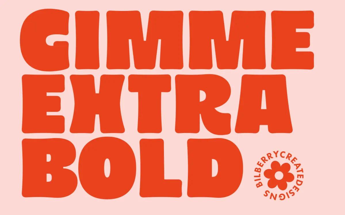
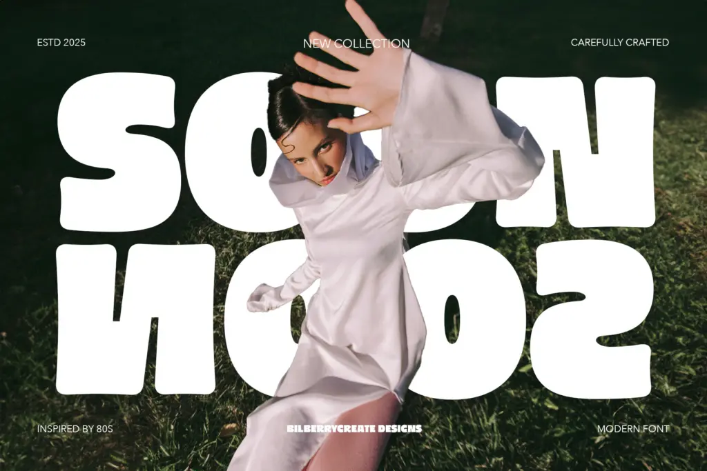
Gimme Extra Bold leans hard into a 1980s revival mood — thick, rounded strokes, generous curves, and a bounce to the baseline rhythm that reads as groovy rather than corporate. The letterforms are built from soft geometric shapes: circles pressed into O and G, squared-off terminals on the verticals, and a general roundness that keeps the weight from feeling aggressive. It’s a novelty face with a point of view, not a neutral workhorse, and it doesn’t pretend otherwise.
The stroke contrast is essentially flat — this is a monoweight design pushed to its heaviest setting, which is part of what gives it that stamped, sticker-like presence. Spacing is generous enough that the letters don’t clot together even at this weight, though tracking still needs an eye kept on it in all-caps headlines, where the density can start to feel heavy in long words.
Character set and features
The set covers uppercase, lowercase, numerals and basic punctuation, with multilingual support extending its reach beyond a purely English-language use case. There’s no indication of alternates, ligatures, or a variable axis — this is a single-weight display font, not a flexible system. That’s fine for what it’s built to do, but it means you’re not going to get subtle variation within a layout; every instance of this font looks like every other instance, which is either a strength or a limitation depending on the brief.
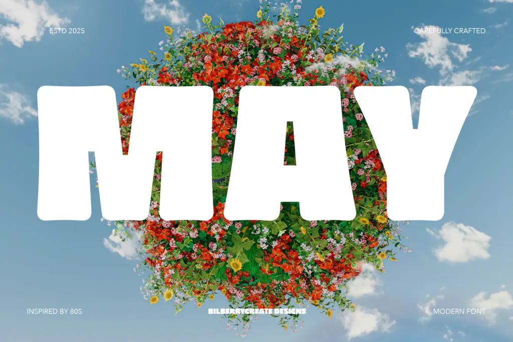
Lowercase is present and usable, but the face reads most confidently in all caps, where the rounded, chunky forms have room to breathe and the retro character comes through clearest. Numerals follow the same heavy, rounded logic as the letters, which keeps them consistent for things like price tags or date stamps on party graphics.
Use cases
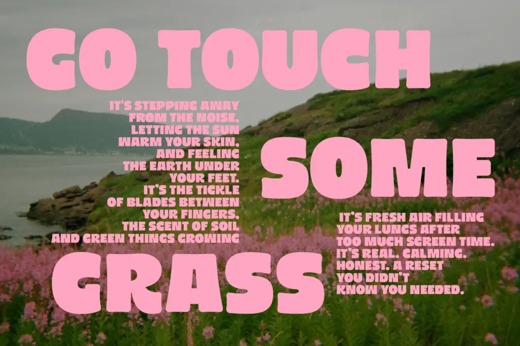
This is a font for short bursts of type, not paragraphs. Think logotypes for retro-themed brands, party and birthday card headlines, packaging call-outs, and social graphics that want to feel loud and a little nostalgic. The 80s-inspired roundness suits anything going for a groovy, hand-of-the-era vibe — throwback branding, roller-rink aesthetics, playful packaging for younger audiences.
It’s less suited to anything requiring restraint or a formal tone; the weight and personality fight against minimalist or editorial contexts. Wedding stationery would need a very specific, playful brief to justify it — this isn’t a font for a traditional invitation, but it could work for a couple leaning into a kitsch or funfair theme. Keep it to headlines, logotypes, and short display lines, and pair it with a plain, quiet body text so the contrast does the work rather than the font trying to do everything itself.
What we liked, and what we didn’t
Strengths
- Confident, rounded 80s character that reads instantly as retro
- Generous spacing keeps the heavy weight from clotting at display sizes
- Multilingual support extends its reach beyond English-only projects
Trade-offs
- No alternates, ligatures or weight variation — one look only
- Lowercase loses some of the personality that makes the caps work
Gimme Extra Bold does one thing — loud, rounded, retro display type — and does it with conviction. It won't flex into body text or formal branding, but for headlines and party graphics with an 80s streak, it delivers exactly the mood it promises.

Tmfonts writes independent reviews of typefaces: what each font does well, where it falls short, what it suits, and where it is sold.