
Hopeless Romantic Society Font Free Download
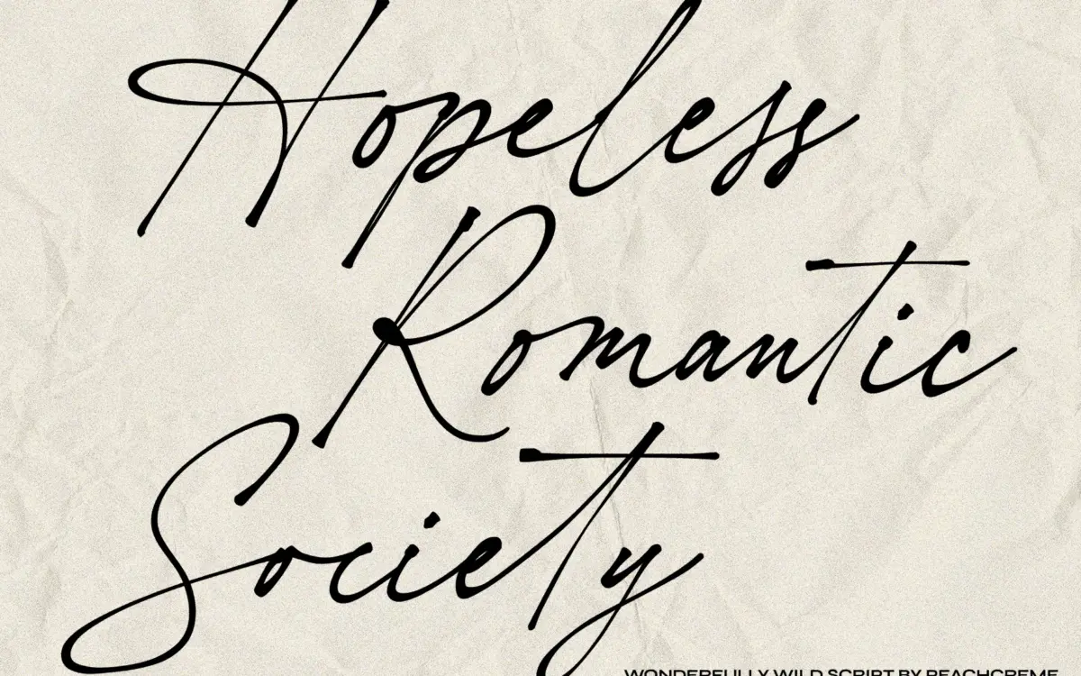
Is Hopeless Romantic Society free to download?
Hopeless Romantic Society is a commercial font sold on Creative Market, so the full version needs a paid license. Get it from the official listing: Hopeless Romantic Society font download.
Need something free? These script fonts from Google Fonts are free for personal and commercial use:
Design style
Hopeless Romantic Society reads as genuine handwriting rather than a polished script pretending to be handwriting. The strokes wobble slightly, baselines drift, and letterforms lean at inconsistent angles the way a note dashed off with a felt-tip pen would. There’s no attempt to disguise this as calligraphy — no formal contrast between thick and thin strokes, no calligraphic entry and exit flourishes. It sits closer to a diary entry or a note left on a fridge than a wedding suite in the classical sense, even though the seller pitches it that way.
The letter construction is loose and slightly uneven, which is the point. Round letters aren’t perfectly round, ascenders and descenders vary in length from letter to letter, and the overall texture feels unrehearsed. That looseness is the typeface’s whole personality. It won’t suit anyone after a controlled, symmetrical script — this is deliberately the opposite of that.
Character set and features
The 55 ligatures are the functional heart of this typeface. In a script this irregular, ligatures matter more than usual: without them, letter pairs would collide or leave odd gaps, since the organic spacing doesn’t follow a predictable rhythm the way a more geometric script does. With OpenType features turned on in an application that supports them, common letter combinations swap in smoother, more natural-looking joins. Skip that step and the font reads noticeably rougher and less resolved — this is not a typeface you can use safely at default settings and expect a finished look.
Because the whole point is variation and imperfection, don’t expect the crisp, repeatable letterforms of a grid-based script. Setting expectations correctly matters here: this is a texture-driven face, not a precision instrument. Anyone needing consistent letterforms across a long headline will find the irregularity works against them at that length.
Use cases
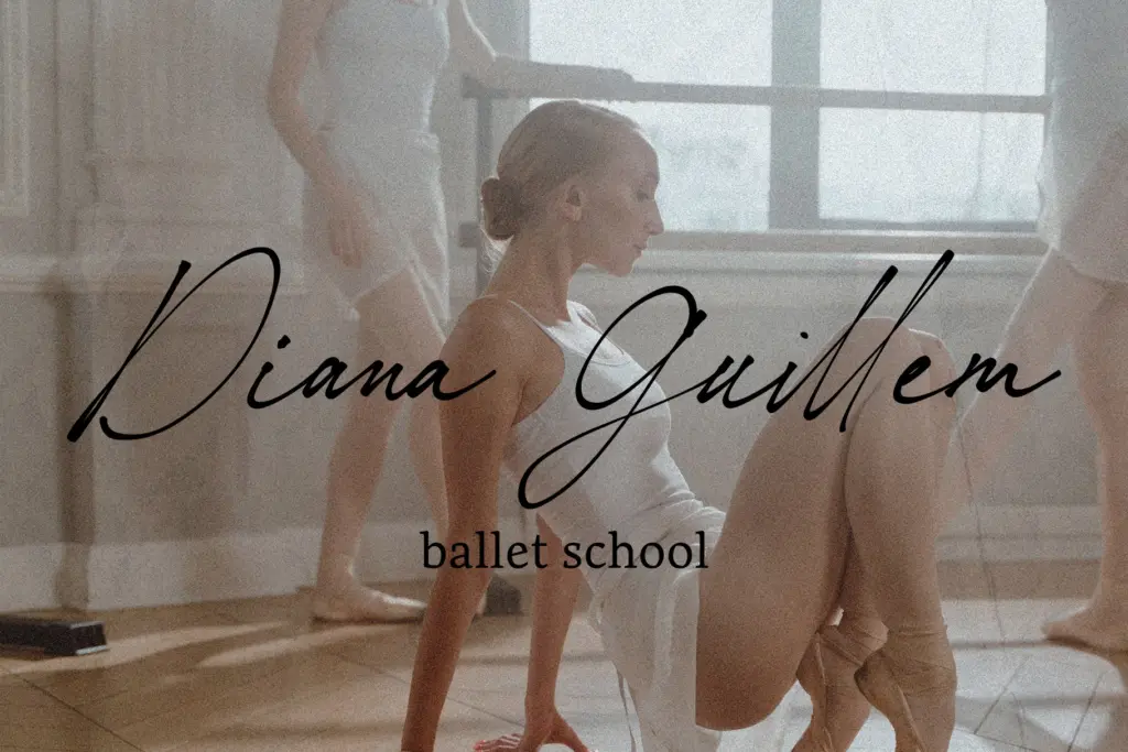
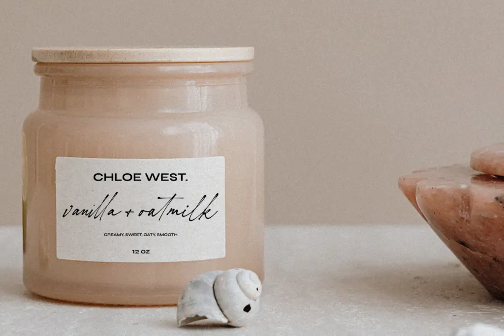
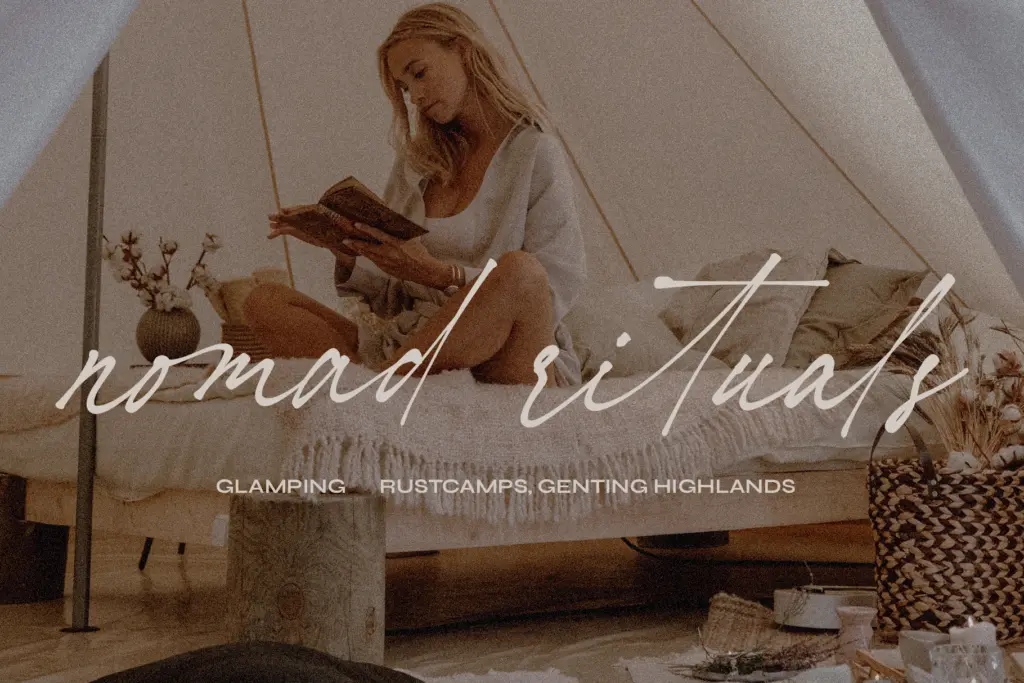
This typeface earns its keep in short, personal-feeling text: a signature line, a handwritten-style note, a greeting card message, a small callout on an invitation. Valentine’s Day cards and informal wedding stationery — save-the-dates, thank-you notes, place cards — are natural fits, playing into the intimate, slightly messy authenticity it’s built around. It also works as an accent in branding for businesses that want to feel personal, artisanal, or unpolished by design — a bakery, a florist, a small studio signing off with a human touch rather than a corporate one.
It’s less suited to body copy or anything that needs to be read quickly and repeatedly, since the irregular baseline and joins slow reading down at length. Large formal signage or anything requiring crisp reproduction at small sizes will expose the wobble in ways that undercut legibility rather than charm. Keep it to short lines, generous size, and contexts where the handmade quality is an asset rather than an obstacle, and it does its job well.
What we liked, and what we didn’t
Strengths
- Genuinely unpolished handwriting texture instead of a stylised calligraphic script
- 55 ligatures smooth out awkward letter pairings when features are enabled
- Works well for short, intimate lines like signatures and card messages
Trade-offs
- Irregular baseline and joins hurt legibility at longer text lengths or small sizes
- Looks noticeably unfinished if OpenType ligatures aren't activated
Hopeless Romantic Society is a convincingly messy handwriting script, built to feel like an actual note rather than staged calligraphy. It needs its ligatures switched on to look finished, and it's built for short bursts of text rather than long-form reading. Use it for the personal touches — signatures, cards, small callouts — and it earns its keep.

Tmfonts writes independent reviews of typefaces: what each font does well, where it falls short, what it suits, and where it is sold.